- Joined
- Feb 10, 2008
- Messages
- 28,684
- Reaction score
- 5,472
Very disappointed how long that cape is. Looks huge.


At this point, I'm trying to convince myself I'm not crazy (by collector standards I mean)
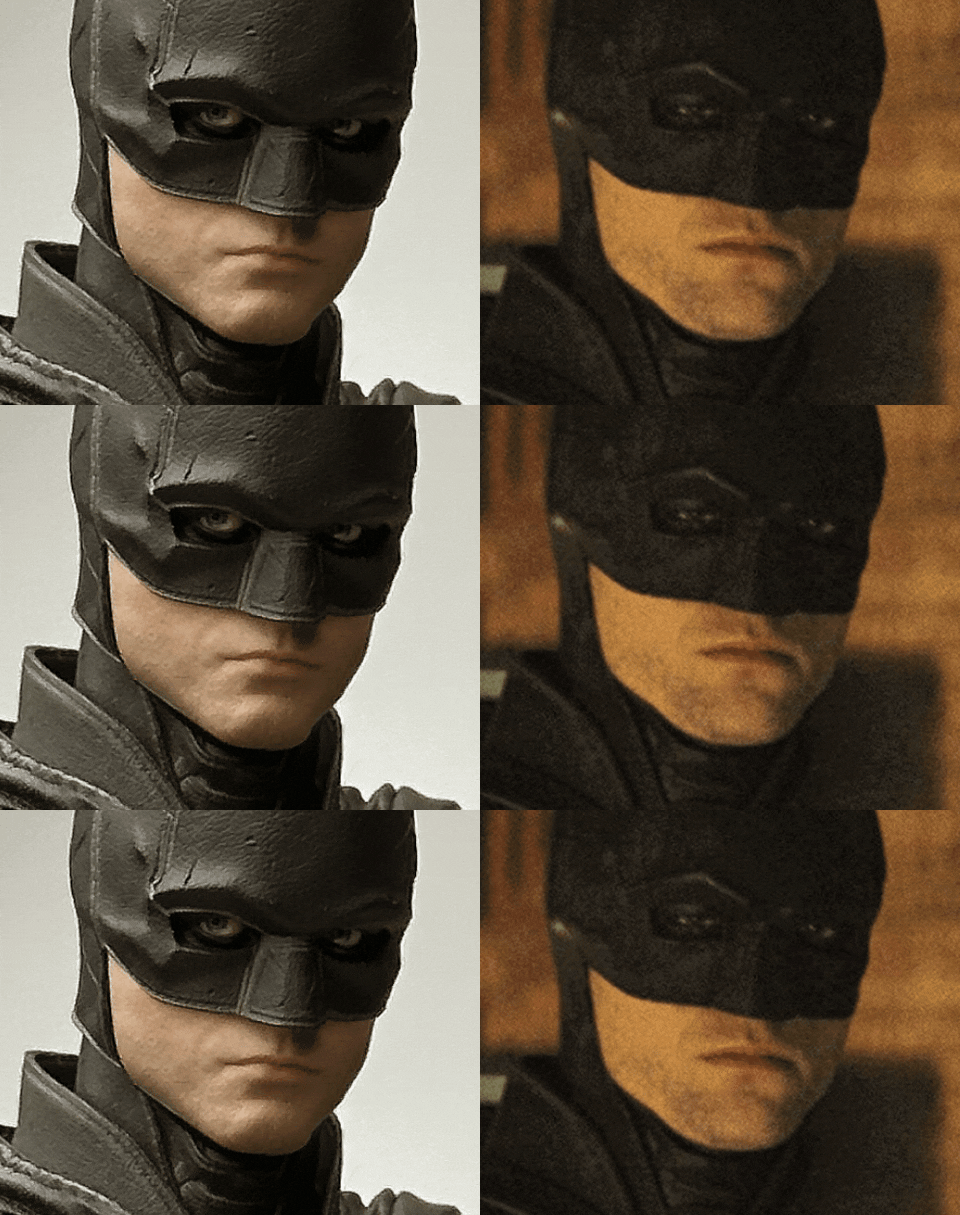
It's his cheeks mainly. It's a very subtle difference at a glance. But it really changes how the face registers in my eyes.
View attachment 697883
View attachment 697889
I know, his mouth is slightly open. lens distortion and such.. there's no such thing as a perfect comparison, but I've looked at countless references and it's all I can see. It's like, his face just needs to taper, and I don't see it in the sculpt.
Glad I'm not crazy... ishYou're 100% on the money - it changes the shape of the overall look.
Personally, the more photos I see, the more I think the "skull" effect of the cowl (and I could even go so far as to say the whole cowl) looks oddly shaped and wrongIt's like his lower face is exploding out of the cowl - not sitting in it.

Dude I think everyone is done with the drama. It’s eaten enough pages in enough threads already.
Can we just talk about toys in peace?


This is gonna vary way too much depending on the reference that you use. Too many factors that goes into this that can have it looking even slightly off. Camera focal length, angle of his face and the angle in which the camera itself is in. Is it angled from down under? Slightly up top with his face tilted slightly one way? What focal length is the camera lens in this one shot using compared to another? Since that can cause the face to look flatter than others. Is Pattinson clenching his jaw? Is he frowning? Is he relaxing his face in one shot but not the other?At this point, I'm trying to convince myself I'm not crazy (by collector standards I mean)
It's his cheeks mainly. It's a very subtle difference at a glance. But it really changes how the face registers in my eyes.
View attachment 697883
View attachment 697889
I know, his mouth is slightly open. lens distortion and such.. there's no such thing as a perfect comparison, but I've looked at countless references and it's all I can see. It's like, his face just needs to taper, and I don't see it in the sculpt.


Oh.. I genuinely just thought it was funnyDude I think everyone is done with the drama. It’s eaten enough pages in enough threads already.
Can we just talk about toys in peace?
He makes money selling pieces to "fix" your figure, of course he's not gonna like it. He gotta make a living !OT's thoughts on the sculpt
View attachment 697908