InArt - The Batman 1/6th Figure

Collector Freaks Forum

Help Support Collector Freaks Forum:

This site may earn a commission from merchant affiliate links, including eBay, Amazon, and others.
Was it easy to remove the material?
I know there is probably an easier way i.e. fine grit sandpaper, but I used a hobby knife since the plastic was soft. it's not hard, but I would try to find an efficient/better way to do it than what I did. Just be mindful of the corners of the sculpt or you may end up with gaps on the sides of the mask. Removing the velcro in the chestplate was a pain in the ass tbh.
 
I know there is probably an easier way i.e. fine grit sandpaper, but I used a hobby knife since the plastic was soft. it's not hard, but I would try to find an efficient/better way to do it than what I did. Just be mindful of the corners of the sculpt or you may end up with gaps on the sides of the mask. Removing the velcro in the chestplate was a pain in the ass tbh.
I did something similar but around the area were the nose starts. Mainly above it taking some off it so it sits in better. You won't see that area so it's OK to cut a bit off.
 
Did someone say scrawny? lol. He’s got arms like a coat hanger and legs like cocktail sticks.

IMG_7758.jpeg
 
Did someone say scrawny? lol. He’s got arms like a coat hanger and legs like cocktail sticks.

View attachment 736317
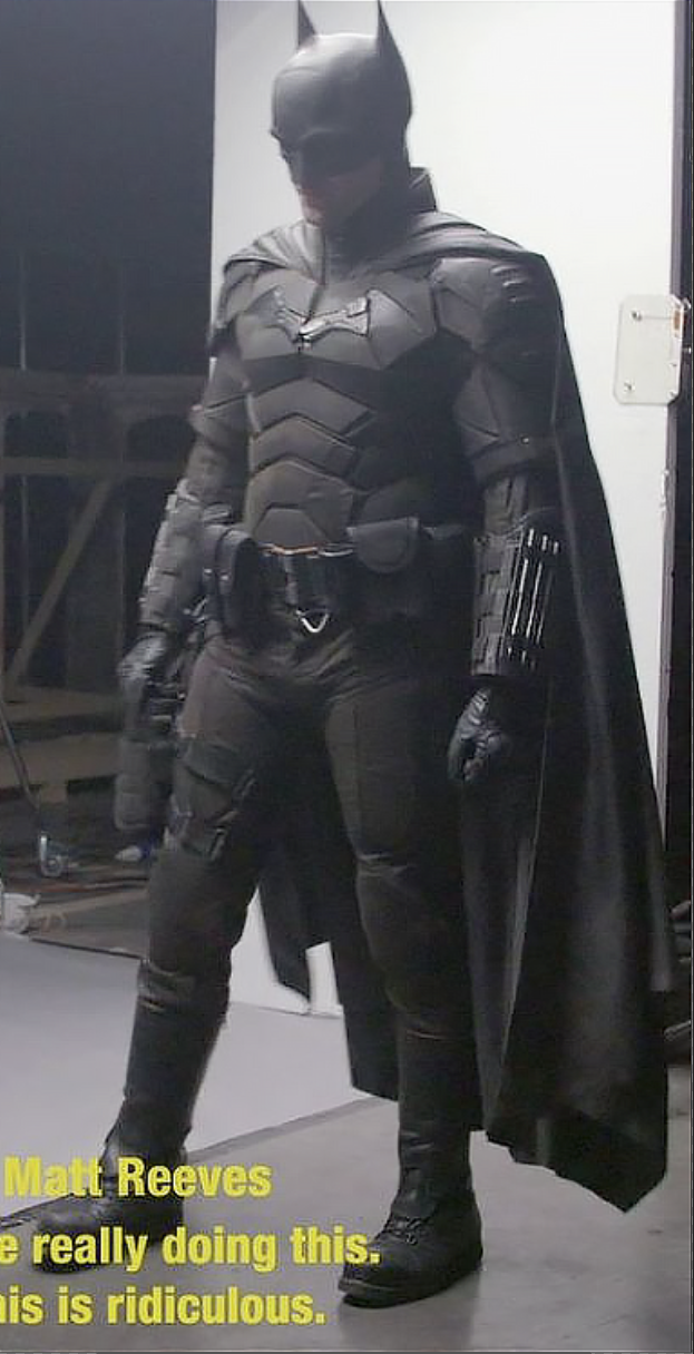
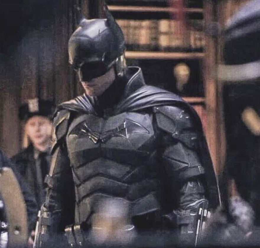
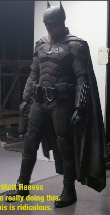
Looks pretty close to his physique to me. I think people have some skewed image in their head on how buff he might have been. His arms were skinny and lanky. Mainly covered in shadow and blending in with the darkness of his cape behind him. He didn't have thick bulky legs either. The pants were baggier on the actual costume compared to the more skin tight way INART made them but his legs weren't big. He isn't Affleck.

The main thing that needs to be adjusted on this figure is the shoulder armor. They stick out too far on the shoulders. It exaggerates the small head problem. They need to sit closer to the center chest plate.

vypi7xi.png
6G2mcVT.png

Lxs4qSe.png
 
Last edited:
I don’t have a skewed image in my head mate. I just think they over exaggerated how thin and long he was. Figure looks like Gumby with a tiny head to me. The figure’s proportions are inhuman looking, his arms are overly long and stick like, and his tiny head kinda makes it worse.

In the pics you yourself posted he looks bulkier when suited up on screen. The figure makes him look downright skeletal in comparison. It’s a shame, because the colors and materials are so nice.


Looks pretty close to his physique to me. I think people have some skewed image in their head on how buff he might have been. His arms were skinny and lanky. Mainly covered in shadow and blending in with the darkness of his cape behind him. He didn't have thick bulky legs either. The


pants were baggier on the actual costume compared to the more skin tight way INART made them but his legs weren't big. He isn't Affleck.

The main thing that needs to be adjusted on this figure is the shoulder armor. They stick out too far on the shoulders. It exaggerates the small head problem. They need to sit closer to the center chest plate.

RsszQ78.png
6G2mcVT.png

Lxs4qSe.png
 
Last edited:
I don’t have a skewed image in my head mate. I just think they over exaggerated how thin and long he was. Figure looks like Gumby with a tiny head to me. The figure’s proportions are inhuman looking, his arms are overly long and stick like, and his tiny head kinda makes it worse.

In the pics you yourself posted he looks bulkier when suited up on screen. The figure makes him look downright skeletal in comparison. It’s a shame, because the colors and materials are so nice.
Lol Gumby with a tiny head is a slight exaggeration Rory lol…
Proportions look spot on with my figure, wouldn’t display him with the unmasked headsculpt anyway ….
Each to their own
 
Lol Gumby with a tiny head is a slight exaggeration Rory lol…
Proportions look spot on with my figure, wouldn’t display him with the unmasked headsculpt anyway ….
Each to their own
Okay, lol, maybe a slight exaggeration. BUT I still think InArt missed with the proportions. I shouldn’t have to avoid the Wayne sculpt due to its size. Other than the masked sculpt’s visible neck seam, the proportions are holding this back in my opinion.
 
Back
Top