- Joined
- Feb 10, 2008
- Messages
- 28,645
- Reaction score
- 5,412
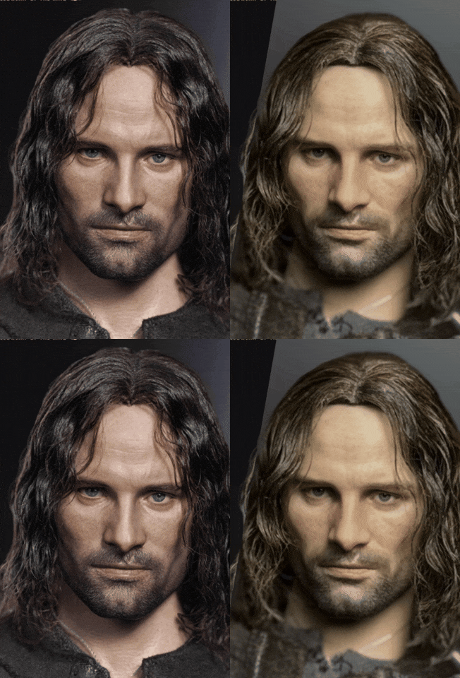
The chin is broader on the right, noticeably so.
(Sculpted hair ver.)
Paint
Lighting
Focal length

The chin is broader on the right, noticeably so.
(Sculpted hair ver.)
Nope. It's quite literally the exact same sculpt except for the tilt of the head being different between these two. The sculpted hair version isn't a different sculpt.The chin is broader on the right, noticeably so.
(Sculpted hair ver.)

Nope. It's quite literally the exact same sculpt except for the tilt of the head being different between these two. The sculpted hair version isn't a different sculpt.


Why are you showing the rooted hair? I said sculpted.Nope. It's quite literally the exact same sculpt except for the tilt of the head being different between these two. The sculpted hair version isn't a different sculpt.

Depends on the scene really.Major difference, and could be the lighting, is the production rooted version hair is lighter than the proto.
Is the darker proto more accurate?

Why are you showing the rooted hair? I said sculpted.
Might be the lighting. Either way I won’t return mine.
Because the sculpted and rooted are the same. They didn't create a brand new sculpt for the sculpted hair version. They didn't do it for the Joker or Batman. It makes zero sense to do so.Why are you showing the rooted hair? I said sculpted.
Might be the lighting. Either way I won’t return mine.
I think your "two major points" that you pointed out hit the nail on the head. How much hair in front of his face and head can definitely affect how "big" his forehead seems to be. It seems like it all comes down to the futzingAfter seeing video reviews, I'm in the camp of it's the same sculpt. In my opinion, just like Viggo's face, the appearance is different based on the angle. Always check to see how much of the hair on top of the head you can see and you'll notice most of these stills are taken much more head one where most of the prototype pics are taken from a higher angle looking down with brighter/warmer lighting. That plus paint differences explain the wider chin/bigger nose.
I played the review videos next to the video InArt posted of the Aragorn (promo and hair dressing) and it really helps see the underlying sculpt as the same.
Two other major points, the color for the beard and eyebrows is a lot lighter on the production sculpt, that makes the brow ridge appear more prominent and gives him more of a scowl. That plus the hair not being brushed forward/in front of his face makes him his forehead appear a lot bigger. I believe that's the reason the sculpted can sometimes look closer to the proto, because it frames/narrows his facial features. I hope someone gets him in hand that can futz the hair closer to the prototype and take a pic from a higher angle with cooler light.
I am a bit worried about the eyebrows but hoping it's mostly lighting. Would prefer not to have to have this repainted but I will if that's what it takes to get to that prototype, which is the best figure/likeness I've ever seen.
I would really love to be right about that. If the underlying sculpt is the same, some hair styling should get us most of the way there.I think your "two major points" that you pointed out hit the nail on the head. How much hair in front of his face and head can definitely affect how "big" his forehead seems to be. It seems like it all comes down to the futzing
The amount of times people have complained about InArt making terrible changes fo sculpts from convention displays only for them to come out and say it’s the exact same sculpt they’ve been showing all along…
Yeah, there’s no way they changed what was universally hailed as immaculate and the best Vigo sculpt ever.
Where’s that post where someone showed a real human being photographed with different angled lighting and different lenses that demonstrated just how misleading photography can be?
That needs to be automatically added to page one of every thread until people learn.
Viggo also just has one of those crazy jaws and chins that can look really square or tapered or round depending on his head position and expression.
Plus, his chin stubble creates the illusion of a sharp taper when the actual bone structure of his chin is quite wide.

I don't know. That first one they made the nose too big and the face too thin. On the last one way too much wool was used for the hair, jaw line is too wide, shoulders too broad, and neck too thick.