You are using an out of date browser. It may not display this or other websites correctly.
You should upgrade or use an alternative browser.
You should upgrade or use an alternative browser.
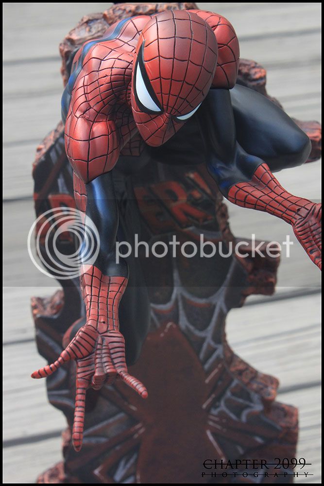
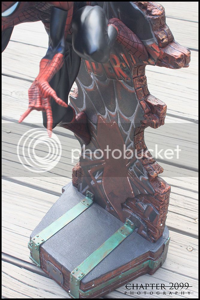
Statue J Scott Campbell Classic Spiderman Comiquette
- Thread starter DHAVAL
- Start date

Help Support Collector Freaks Forum:
This site may earn a commission from merchant affiliate
links, including eBay, Amazon, and others.
Chapter 2099
Super Freak
- Joined
- Jun 21, 2008
- Messages
- 29,762
- Reaction score
- 24
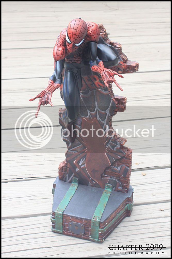
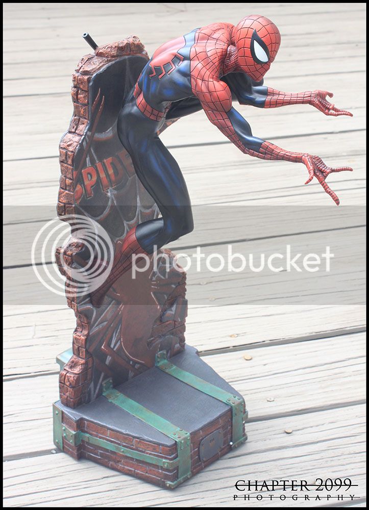
Mine has arrived. It's unboxed and perfect. I honestly like it better than the original. It's a better looking standalone piece, IMO. Pics likely tomorrow.  The Powers That Be in QC are shining down on me.
 The Powers That Be in QC are shining down on me.
Unknown Hero
Super Freak
Mine has arrived. It's unboxed and perfect. I honestly like it better than the original. It's a better looking standalone piece, IMO. Pics likely tomorrow.The Powers That Be in QC are shining down on me.

Sweet! Mine just shipped.
Ickwinzs
Super Freak
mine just arrived, I need to open it up yet to check it.

$10.99
$14.99
DC Comics, 12-Inch Superman Action Figure, Collectible Kids Toys for Boys and Girls
Amazon.com
Chapter 2099
Super Freak
- Joined
- Jun 21, 2008
- Messages
- 29,762
- Reaction score
- 24
I'll get pics up today. Promise.
Unknown Hero
Super Freak
Does anyone have a spidey head that's pretty dark on one side and light on the other? I know SS is trying to create shadow around this statue, but my head sculpt is pretty prominent. It doesn't show up in pics well, but in hand it's easy to notice.
Collectorcol
Super Freak
Yeah, looks like it's been sun faded.
Unknown Hero
Super Freak
Unknown Hero
Super Freak
You're probably right. I can't pull out my blue and red to check. I actually had to box this up and put it in storage.
Collectorcol
Super Freak
Didn't realise you were asking about the new release.
Same as the three heads I've had with my original, that's the effect they went for. MJ has very similar shading also.
Looks good. Looks like another varient that came out better than the original.
Same as the three heads I've had with my original, that's the effect they went for. MJ has very similar shading also.
Looks good. Looks like another varient that came out better than the original.
Unknown Hero
Super Freak
Didn't realise you were asking about the new release.
Same as the three heads I've had with my original, that's the effect they went for. MJ has very similar shading also.
Looks good. Looks like another varient that came out better than the original.
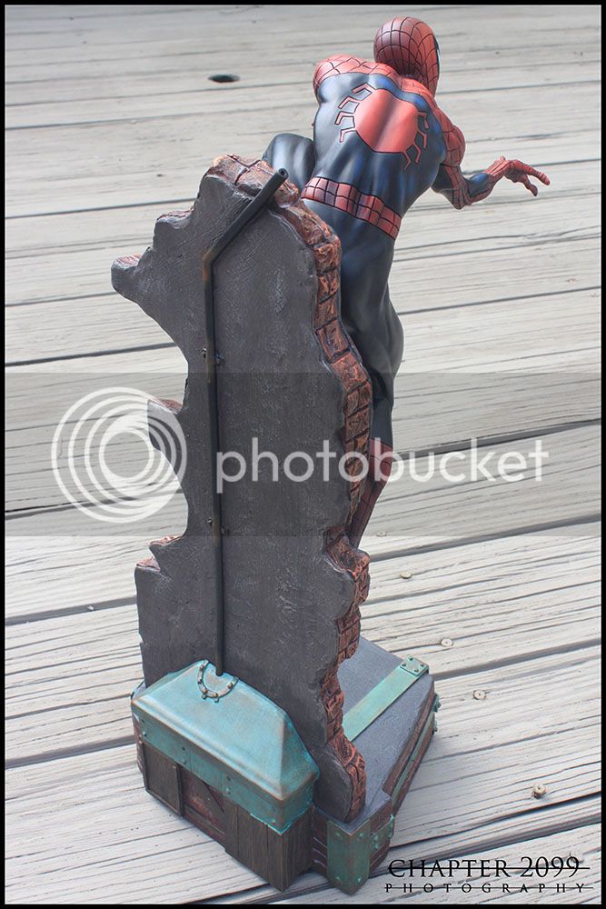
Yea overall the paint app is much better and the leg/peg slides in perfectly without issue.
Chapter 2099
Super Freak
- Joined
- Jun 21, 2008
- Messages
- 29,762
- Reaction score
- 24
Spidey976
Super Freak
Hmmm I think I like this one better than the original. Kind of want it now...lol
Hmmm I think I like this one better than the original. Kind of want it now...lol
I would say I like it equally as well as the original. Looks better in hand color wise, but I still don't dig the wall. Overall a success it seems
Spidey976
Super Freak
I would say I like it equally as well as the original. Looks better in hand color wise, but I still don't dig the wall. Overall a success it seems
Lol... I think it is the different colour scheme that I like. Different enough from the 1/4 Com, and for some reason I think the colours suit the sculpt better. Just my opinion of course. Like I said just different enough to make me want it...lol
Similar threads
- Replies
- 0
- Views
- 102
- Replies
- 0
- Views
- 1K
- Replies
- 12
- Views
- 2K
- Replies
- 24
- Views
- 4K
- Replies
- 3
- Views
- 1K


