user 72759
Super Freak
- Joined
- Feb 6, 2021
- Messages
- 1,363
- Reaction score
- 2,307
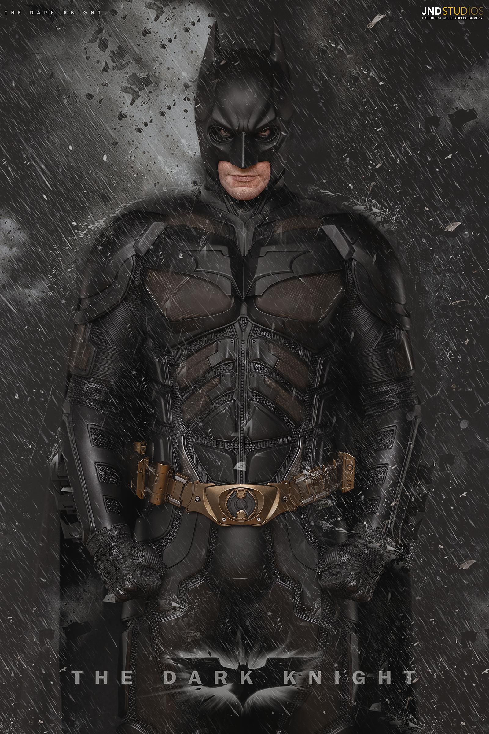
There’s a lot of references where the bottom of the neck appears to be more rounded than the shot here.Bottom of neck is wrong and bottom of emblem chest off too. Also I don’t see why companies make the v of it the Adams-apple so large too.


I went with a more rounded look for mine too. I think what’s clear though is that center piece of the neck is pretty thin and clings tightly to the undersuit. All these companies make it much thicker than it should be.

I think the issues I have with this statute are mostly minor, the biggest minor one is that every single surface seems too crisp and geometric with no rounding to any of the edges. The real suit has angular designs with softened edges. This statue looks like an F117 while the real suit looks like an F22 is the only way I can describe it. They could have just ran a smooth brush over all the edges and made it look so much more realistic.
I think what’s a more major issue is the gigantic eye openings with too sharp of a ridge beneath and the wide eyed expression. This combined with the center of the cowl’s face being too short makes it look like his eyes are being peeled open and gives him a vulture sort of look, much like the QS001.

Edit: the collar Kevlar is WAY too geometric and the cape still exits the collar too far from the midline just like the QS001
Attachments
Last edited:


