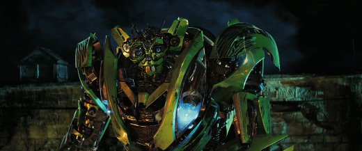
I think the biggest problem is Donnie, he's too cluttered and I only see this.


This.

I could tolerate the rest of their designs if they could just eliminate them
At the very least I hope Raph loses/breakes the shades during combat.
I guess the new designs aren't any busier than these getups.

I don't understand why they gave him a do rag...

Bay doesn't agree.So.. after stewing a few days, and reviewing the designs... I don't care for them.
They're interesting interptretations, but the seem to be extremly overdone. They look a little too Rob Liefield for me. Very 90's with extranious crap piled all over them.
Take Leo, for example. I think his design would be much improved by removing the torso armor, and keeping only the shin and forearm gaurds.
Donnie? Too much gear. scale it back a little. Have a FEW pieces of tech here and there, not being so very loaded down. his look makes me think of All the noise Samwise Gamge made running everywhere covered in pots and pans.
Scene: The turtles stealfully run, one by one, and jump acrossa rooftop. the move silently, like shadows, not alerting anyone to their prescense.
CLANG CLANG CLANG SLAM BANG as donnie runs and jumps, landing in a heap.
Raph looks..... well..
AHNULD HAS PUMPED HIM UP
Mikey actualy works for me, from what little we've seen. His hoodie and sunglasses are minimalist, and works, more or less.
The shredder... Looks like a World of warcraft character, and those predator blades are a bit much.


I do....

 yeah... we definitely seen him wreak havoc with his artistic take before.
^ The look on their faces says it all really..
Haha yeah!
On a side note guys the first film is on youtube (in full)...
Haha yeah!
On a side note guys the first film is on youtube (in full)...
It's going to be douchey if they name him Oroku Saki...

Enter your email address to join: