I’m still waiting for Defender & Supreme Strange. And here I thought they were sure locks and was iffy on MOM Xavier… My wallet is pleased that they’re so slow though, so there’s that. But man, not a single figure has even tempted me in what seems to be ages.
You are using an out of date browser. It may not display this or other websites correctly.
You should upgrade or use an alternative browser.
You should upgrade or use an alternative browser.
1/6 NEXT Hot Toys MCU Figure...?
- Thread starter Wor-Gar
- Start date

Help Support Collector Freaks Forum:
This site may earn a commission from merchant affiliate
links, including eBay, Amazon, and others.
jeremycanrana
Freaked Out
- Joined
- Mar 20, 2021
- Messages
- 143
- Reaction score
- 165
You both are right, I hadn't thought about all these figures we should have seen before She-Hulk.
I'm glad there's a Moon Knight one announced though.
When it comes to Ms Marvel they might be waiting for her The Marvels updated suit.
I'm glad there's a Moon Knight one announced though.
When it comes to Ms Marvel they might be waiting for her The Marvels updated suit.
I actually love The Wasp's new short hair. The one I wasn't a fan of was her first "bob" style.
I love the one they released already so much but I'd love to see an updated version.
I can see why they went with the shorter hair, to make homage to the comics (along with her new suit), similar to Endgame Captain Marvel
Also, I'm waiting for She-Hulk to be made ! I've been slowing down on figures lately but that's one I'm looking forward to get!
She-Hulk would be an interesting figure for sure!
We still haven’t seen anything for Ms. Marvel either. Maybe they’re slowing down. Shocked at no Mr. Knight either.
Still, I’ve had a spot reserved for She-Hulk since I started collecting. The sooner they announce her the better.
Yep, with the amount of shows and movies that have come out (and some yet to come), no surprise they seem to be a bit behind on all these figures.
You both are right, I hadn't thought about all these figures we should have seen before She-Hulk.
I'm glad there's a Moon Knight one announced though.
When it comes to Ms Marvel they might be waiting for her The Marvels updated suit.
G'aaahhh I can't wait for Ms Marvel!!!!
darthkush
Super Freak
- Joined
- Sep 17, 2015
- Messages
- 2,239
- Reaction score
- 165
I'm glad they announced the new Black Panther. Hoping the line is expansive and we get most of the cast and Namor.
I think they will wait till the Marvels to do Ms.Marvel. What I'm really waiting on is SheHulk. She's a dopo for sure.
I think they will wait till the Marvels to do Ms.Marvel. What I'm really waiting on is SheHulk. She's a dopo for sure.

$10.99
$14.99
DC Comics, 12-Inch Superman Action Figure, Collectible Kids Toys for Boys and Girls
Amazon.com
Starfleet Captain
Super Freak
Now that the What If Captain Carter has been released and, what are the odds that HT will now release the live action CC from MoM?
- Joined
- Sep 23, 2008
- Messages
- 12,920
- Reaction score
- 2,138
Now that the What If Captain Carter has been released and, what are the odds that HT will now release the live action CC from MoM?
That’s the only Phase 4 figure I even want. Oh, and Captain Samerica. But yeah, we need that live-action Hayley CC with jetpack asap.
- Joined
- Oct 14, 2016
- Messages
- 5,711
- Reaction score
- 5,781
I’m guessing Haley Atwell wasn’t really on HT radar untilDr Strange 2 so there is a small chance they have been negotiating for Atwell’s likeness rights since middle this year. This sort of thing can take awhile so if they are successful and decide to do it I don’t think we will see anything until middle of next year at least.
Just finished rewatching both GOTG movies, my absolute favorites of the MCU, then rewatched the GOTG trailer for the 20th time and I am even more pumped for GOTG3.
I think GOTG3 will be the last Marvel property I go all out on. Phase 4/5 doesn’t interest me much, neither do the big Avenger movies at the end, so this likely for me is my goodbye to the MCU, one last great movie.
Anyone else think they will do the entire team in their comic inspired outfits? I’m REALLY hoping we get 10+ figures from this movie. Probably doubtful, but one can dream:
Star Lord - Team Suit
Mantis - Team Suit
Nebula - Team Suit
Drax - Team Suit
Rocket - Team Suit
Groot - w/extendable arms (seen in trailer)
Kraglin
Gamora
Cosmo
Adam Warlock
High Evolutionary
Rocket and Lylla
Stakar (Stallone’s Character)
I really think we have a great shot for most of these. Drax is just a headsculpt with the team suit now, along with Mantis and Nebula, so easy releases. Star Lord, Gamora, Rocket, Groot are all guaranteed. I could easily see Cosmo in a deluxe set with someone. Could see Kraglin or Stallone as a Toy Fair exclusive type deal.
- Joined
- Oct 14, 2016
- Messages
- 5,711
- Reaction score
- 5,781
Doubt it would have anything to do with itI wonder if the Hawkeye (Disney + show version) figure will still be green lit in light of the recent snowplow accident.
- Joined
- Dec 1, 2017
- Messages
- 2,669
- Reaction score
- 1,839
Ok, so I know some will disagree with me on this, but after seeing the most recent Ant-Man trailer I have to say I love the costume on Kang and will order this immediately if it is consistent with Hot Toy’s recent releases:
Attachments
Typically awful take on the costume, supremely awful actor with negative aesthetics, but I've had Kang on my shortlist since forever, so I'll have to shell out the cash and get it. And then look for a spare DX019 Wayne head...
- Joined
- Dec 1, 2017
- Messages
- 2,669
- Reaction score
- 1,839
Well I at least the color scheme seems to match the comics (as I remember, caveat, it has been a long time) and the helmet and face cover should obscure the face enough or yeah you can put a head on there that is more consistent with how you visualize him.Typically awful take on the costume, supremely awful actor with negative aesthetics, but I've had Kang on my shortlist since forever, so I'll have to shell out the cash and get it. And then look for a spare DX019 Wayne head...
What don’t you like about his costume Victor? Too many lines/panels or color scheme?
I dislike the actor, the face was never going to be obscured enough for my liking. But they didn't even get the basics right. Kang is supposed to be wearing a liquid metal mask. But that's too much hassle so they just told their overworked CGI workers to put a blue filter on him. It looks awful.Well I at least the color scheme seems to match the comics (as I remember, caveat, it has been a long time) and the helmet and face cover should obscure the face enough or yeah you can put a head on there that is more consistent with how you visualize him.
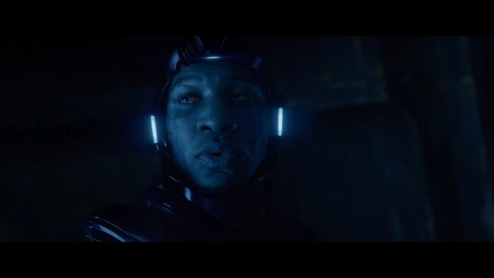
I'm literally looking at a guy painted blue with an After Effects filter. Who thought his eyebrows being visible was okay? It's embarrassing. You could put Alain Delon in that get up and he'd look awful.
I've seen fanart of the same dude that's better.
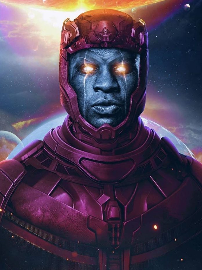
That looks cool. It harmonises his features instead of working against them.
Kang's whole thing is that he's a space take on certain real world cultures. Egyptians, Romans, Assyrians, etc. It's why he's wearing a tunic despite being from such a technologically advanced era. This guy is dressed like a generic bad guy from any space shooter. And the helmet is goofy with its ridiculous lights all over.
I was expecting something like this at the very least:
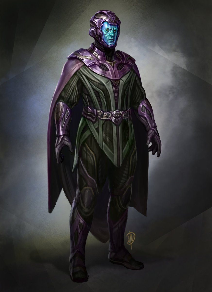
But nope. Awful plasticky sheen over a pleathery textured filtered through cheap, PS3-level CGI and a random, unremarkable guy to boot.
Whatever. I'll get the dolls and swap the heads at least. Bale wasn't my fancast, but he's close enough and since the MCU wasted him, I won't have two characters with the same face.
- Joined
- Dec 1, 2017
- Messages
- 2,669
- Reaction score
- 1,839
I just went to look at some Kang images, and to my eye, the Ant-Man version of Kang is very reminiscent of how Kang appears in the comics. I say that knowing full well that Victor and others know a lot more about Kang and his background than I remember. But visually the MCU depiction of Kang is similar as depicted below:
Attachments
- Joined
- Dec 1, 2017
- Messages
- 2,669
- Reaction score
- 1,839
I dislike the actor, the face was never going to be obscured enough for my liking. But they didn't even get the basics right. Kang is supposed to be wearing a liquid metal mask. But that's too much hassle so they just told their overworked CGI workers to put a blue filter on him. It looks awful.

I'm literally looking at a guy painted blue with an After Effects filter. Who thought his eyebrows being visible was okay? It's embarrassing. You could put Alain Delon in that get up and he'd look awful.
I've seen fanart of the same dude that's better.

That looks cool. It harmonises his features instead of working against them.
Kang's whole thing is that he's a space take on certain real world cultures. Egyptians, Romans, Assyrians, etc. It's why he's wearing a tunic despite being from such a technologically advanced era. This guy is dressed like a generic bad guy from any space shooter. And the helmet is goofy with its ridiculous lights all over.
I was expecting something like this at the very least:

But nope. Awful plasticky sheen over a pleathery textured filtered through cheap, PS3-level CGI and a random, unremarkable guy to boot.
Whatever. I'll get the dolls and swap the heads at least. Bale wasn't my fancast, but he's close enough and since the MCU wasted him, I won't have two characters with the same face.
Yeah I can see your point. I get why you don’t like it. I don’t find it nearly as objectionable and I think this will be our only Kang. They may possibly do some “battle damaged” version but what we see above is likely to be his main look.
And I agree a look like this you provided would be superior to what they seem to be doing in the movie …
Attachments
It's just so lazy. The MCU is all around too lazy nowadays. Pleather and cheap CGI. I think we'll get more Kangs, one for A5 and another for A6 at least. Now, will these be Kangs 2.0, Rama-Tut or whatever else, remains to be seen. They already did the Immortus look with Loki's ending (and it also looked awful, like a printed t-shirt). As per rumours A6/SW will have another Kang variant going by the Beyonder, which to me means they'll just be doing the 2015 arc and having Kang doing God Emperor look but calling himself Beyonder. A5/TKD is trickier, but I imagine we'll get another Kang, but more grand. Maybe they'll merge Rama-Tut and have him being like a Space Pharaoh. I'm not expecting much after this, but we'll see. If I get to save money, the better. Just this version with a Bale head on top would satisfy me and allow me to cross Kang off my list.Yeah I can see your point. I get why you don’t like it. I don’t find it nearly as objectionable and I think this will be our only Kang. They may possibly do some “battle damaged” version but what we see above is likely to be his main look.
And I agree a look like this you provided would be superior to what they seem to be doing in the movie …
Similar threads
- Replies
- 122
- Views
- 7K
- Replies
- 54
- Views
- 3K
- Replies
- 118
- Views
- 8K
Latest posts
-
Action Figure Asmus Toys: Devil May Cry 5 Dante
- Latest: Brokenhandpuppet
-
-
Jazzinc Dioramas 1/6 Ultimate Catwoman (Batman Returns, 1992)
- Latest: Captain Clown


