Statue Pablo V. & Andy B. New Sideshow Hulk PF with Variants!!! 1/4 scale !!!

Collector Freaks Forum

Help Support Collector Freaks Forum:

This site may earn a commission from merchant affiliate links, including eBay, Amazon, and others.
Pablo V. & Andy B. New Sideshow Hulk PF with Variants!!! 1/4 scale !!!

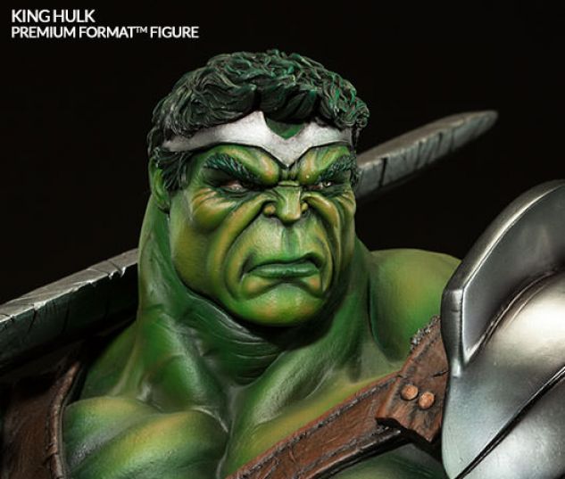
Something about King Hulk rubs me the wrong way. I don't like the way the armor on the left arm looks and the crown isn't my favorite.

What rubs me the wrong way about it is that it reminds me of John Romita Jr's artwork from the comic series...and that makes me throw up in my mouth.


Sent from my iPhone using Tapatalk
 
Re: Pablo V. & Andy B. New Sideshow Hulk PF with Variants!!! 1/4 scale !!!

Something about King Hulk rubs me the wrong way. I don't like the way the armor on the left arm looks and the crown isn't my favorite.

What rubs me the wrong way about it is that it reminds me of John Romita Jr's artwork from the comic series...and that makes me throw up in my mouth.

Sent from my iPhone using Tapatalk

What rubs me the wrong way is he reminds me of this guy turned green, sporting a tiara...

MTE5NDg0MDU1MjQ5NDU0NjA3.jpg

background.jpg
 
Everyone who has King Hulk loves it, and at least Canale gave it a realistic facial sculpt with attitude, whereas only the RUlks Ex has that for all of these PFs.
 
Everyone who has King Hulk loves it, and at least Canale gave it a realistic facial sculpt with attitude, whereas only the RUlks Ex has that for all of these PFs.

The green reg had attitude, people just don't like the hair. And the reason I like the green ex head is because it looks like hulk is suffering, as he should. That head sculpt is probably showing banners emotion
 
The green reg had attitude, people just don't like the hair. And the reason I like the green ex head is because it looks like hulk is suffering, as he should. That head sculpt is probably showing banners emotion

Not entirely the case with the Reg. Fr some it is based on Ed Macguiness's work and that is a turn off. The Ex head is more realistic, but not based on anyone's work I personally love. Don't get me wrong they are great sculpts but not my taste. Which is fine. Personally, no one has nailed a 1/4 Hulk sculpt to my liking, but again that doesn't mean they aren't amazing sculpts. Just not for me.
 
I just saw the RULK in person at a comic and I was very very let down. The one thing that impressed was the size. That thing is huge.

but the paint app was just terrible. And I don't think iit's a case of "oh that's just a bad one, send it back to SS and get a replacement". The shading on the skin tone Suuuuucked. Like they had the airbrush setting to wide or something. So bland. Only a couple of tones.
The face, oh my goodness. Seriously the head is big enough to think there is room for detailing and preciseness. The teeth were just blob by and not a smooth coating.

I think the green won't be up to standard. Even with the delays. Those photos we have seen haven't been that impressive compared to what's shown on their website. I won't great paint app. Multiple fine skin toning. Not just this bland dry look paint app where as on the website it looks darker, dirtier, and kind or wetter.

sculpting is great but it's nothing when you have a bad paint app over it.
 
lighting plays a big part on the "look" of a piece.

I honestly didn't notice that much variance from the sample from Con - with the exception of the base. Looks a bit more sloppy (at least the one I received).
 
Yeh the lighting things gets brought up always when a bad jobs done. I don't want to show this piece in the dark. And it's obvious to see lighting or not the paint app is pretty much totally different.

But look at the feet on the green comparing SS website and production pieces. You can tell it's was any off.

pity because the sculpt is just awesome
 
what I meant by lighting changing the look of a piece was - under certain lighting a piece can look "wetter" or more vibrant or even appear like it's glowing in the dark. The show-room floor of comic con has some pretty bright lights so you can see all the nuanced details... and honestly it looked about the same from the production. My first broken sample was sloppy but the replacement had proper shading and detail on the toenails feet and muscles.
 
what I meant by lighting changing the look of a piece was - under certain lighting a piece can look "wetter" or more vibrant or even appear like it's glowing in the dark. The show-room floor of comic con has some pretty bright lights so you can see all the nuanced details... and honestly it looked about the same from the production. My first broken sample was sloppy but the replacement had proper shading and detail on the toenails feet and muscles.

Kinda like that dress pic that has been going around on Facebook
 
When I first got this forum, I used to take what everyone's opinion was to heart... But now, meaning no disrespect, I could care less. Every statur I've owned I read countless complaints about before purchasing them. And all of them showed up looking better than expected.

Especially the newest cap.

That's what you should do. Most people here are just trying for interwebs cool points
 
When I first got this forum, I used to take what everyone's opinion was to heart... But now, meaning no disrespect, I could care less. Every statur I've owned I read countless complaints about before purchasing them. And all of them showed up looking better than expected.

Especially the newest cap.

Exactly, If I bought statues based off the complaints of others I wouldn't own any statues. If it's actually bad when you get it then return it. But every piece I've ever bought has come pretty much perfect and the ones that did have problems were taken care of.
 
Back
Top