Mason Storm
Freaked Out
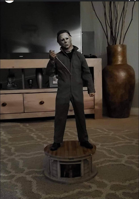
they altered the photos to make the mask look as good as it gets, those photos of the mask were so good they screamed shat. but they were altered photos to help sell the piece. the mask on the 1/3 statue is nothing like the myers mask from part 1, its decent but not great, the mask on this 1/4 was exactly what you want. the 1/3 has a great look and stance and fantastic base but the mask still is way off and this statue is just an all round disaster, at least the 1/3 statue has 10/10 for everything besides the mask, all the rest is fantastic on the 1/3. this statue has awful work on the images on the base, an awful mask, awful hair, and some genius thought having michael myers with a closed fist looked good, he is the 1 horror slasher icon you would not have a closed fist or showing any emotion at all. proto looked too good to be true, final product looks too bad to be true


