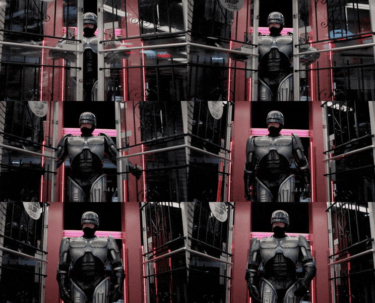
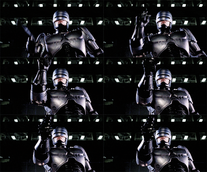
On the video it looks a lot better. Hope the actual statue going to turn out this good If so than I will consider it. But I would like the one from RoboCop 1.


On the video it looks a lot better. Hope the actual statue going to turn out this good If so than I will consider it. But I would like the one from RoboCop 1.


Seeing this Officail photo and the ones on display, i take it comes with swap out hands or arms?Official photo.
This is what I see as well. Not a fan of that base.The helmet is far too elongated. The visor looks too wide as a result.
I too prefer the look on 2, just not as iconic as 1. They need to get the proportions right, otherwise just buy the hot toys one and pose how we like. Oddly enough hot toys looks more in proportion than this.Robocop 2 has a better pose also. The first version is too sideways IMO. Especially with the way the base is made it will be hard to display to look decent.
Yes I have to agree!I too prefer the look on 2, just not as iconic as 1. They need to get the proportions right, otherwise just buy the hot toys one and pose how we like. Oddly enough hot toys looks more in proportion than this.
Probably. On the videos it looks a lot better. Also it is growing on me so there is a chance that I am going to pre-order it.It could just be picture distortion that makes the Robocop 1 statue's head look a bit off......
Probably. On the videos it looks a lot better. Also it is growing on me so there is a chance that I am going to pre-order it.

It looks in propotion to me. There is the video. This is about Robo 2 but the sculpt is the same:It is not lens distortion.