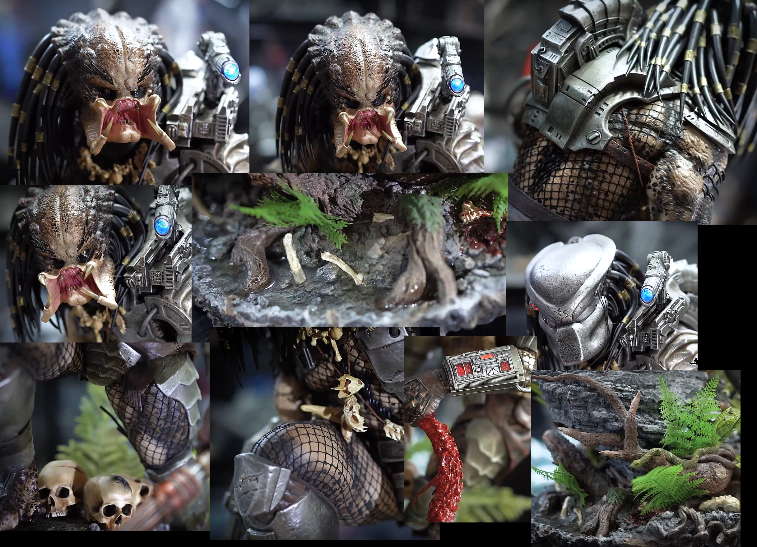
Prime 1 responded to my message regarding the misaligned dots and paint apps on some of the photos. They agreed that the dots are crooked and suggested I wait for photos from other collectors. Basically the same thing everyone else says, I'm just surprised to hear it from them. Hopefully they (and the more positive collectors out there) know something I don't. We'll see.
You are using an out of date browser. It may not display this or other websites correctly.
You should upgrade or use an alternative browser.
You should upgrade or use an alternative browser.
Prime 1 Big Game Jungle Hunter Predator 1/4
- Thread starter Unknown Hero
- Start date

Help Support Collector Freaks Forum:
This site may earn a commission from merchant affiliate
links, including eBay, Amazon, and others.
albundyland
Super Freak
- Joined
- Nov 2, 2012
- Messages
- 910
- Reaction score
- 70
Unpopular opinion, but this is my favourite Jungle Hunter statue based on what I've seen so far.
Same with me. This is by far my favorite Predator out there in terms of sculpt and concept. Luckily I'm a casual Predator fan, so ignorance is bliss. Haha.
- Joined
- Feb 1, 2009
- Messages
- 10,118
- Reaction score
- 3,803
If there was any statue that would beat this one for me, it's the CM. But that one is far out if reach for me. But for overall presentation with the hunter victim this will be an epic and solid center piece in the collection. And the fact they went with the Cover pose is sentimental for me. When I was younger and a aspiring comic artist I got the chance to meet Stan Winston at a Comic Con one year. I didn't have anything for him to sign but a drawing I had done of the Predator Cover so I'm going to have that framed and displayed with this piece.
Just praying the shipping doesn't kill me.
Sent from my SM-G975U using Tapatalk
Just praying the shipping doesn't kill me.
Sent from my SM-G975U using Tapatalk
I just wish these pics weren't messed with, the color saturation is crazy lol and thanksHey RonnyHaze, these are pics of the production piece [andto the forum!]

Some clearer pics.....I agree. Focal length is always going to play a massive role and strong, single-point lighting can be used to simulate the appearance of gloss on surfaces that are satin at best. And we know that reflective surfaces can help to enhance the depth of both color and sculpt, which is why the dull environment for the photo on the right makes the entire thing look ugly.
Some screenshots from Leo's videos for those who can't open them:

Either there's still some color grading happening here or his studio lights are extremely cool by nature, but it's a more neutral look than the photos. No crazy contrast settings or texture enhancements.
Fingers crossed for the collector who took all those City Hunter shots to buy this one as well. He'd provide clean photos in a completely normal room. Until then, this may be the closest we've gotten:

And another.....That is the best picture of it yet. I think it looks good there. Even the teeth are painted better than the first images. I think the paint on the dots and giraffe colors could be better. But it is the best picture yet.
View attachment 511998

$14.99
DC Comics, 12-Inch Superman Action Figure, Collectible Kids Toys for Boys and Girls
Bopster USA Inc
xpl0sive
Super Freak
That's been shared already I believe.
@RonnyAze
Seen this already, it's from the same source most ppl have been sharing I believe and that's what has me nervous. The head paint is too muddy, not enough gloss, and the armor is awful (for the price) it doesn't have that same patina like the proto. This is based on the price too keep in mind. I am waiting for more pics, not losing it yet but I'm iffy.
Seen this already, it's from the same source most ppl have been sharing I believe and that's what has me nervous. The head paint is too muddy, not enough gloss, and the armor is awful (for the price) it doesn't have that same patina like the proto. This is based on the price too keep in mind. I am waiting for more pics, not losing it yet but I'm iffy.
Glad to see you on the Forum man. Already discussed it privately with you, but I definitely agree im iffy. Ill keep the P.O for the intent on giving it a review for my channel (will be starting reviews again), whether or not I keep it is another story. Hoping it wows me in person, but Im far from optimistic.
Collectorcol
Super Freak
eighthsamurai
Super Freak
Cancelled my order...
Just got exactly the same hike to the UK. What a joke.
Well as a 20+ year fan the franchise (most of my life), I pray this wows me in person. Loved the proto of this statue and even contemplated not getting the CM or Winston Maquette due to how much I loved it. Ultimately bought the others since the orice was too good to refuse. Legit $7.5K delivered for both.
The CM is my fav piece but can never seem to find one in Australia. How did you track one down for 3-4k in Aus? Man that's such a sweet deal, especially with the custom head.
Sithlord75
Super Freak
Just got exactly the same hike to the UK. What a joke.
Just had my come through this morning. Cancelled too.
Already paid $1050, so let’s see if they honour the full refund, including the NRD.
The CM is my fav piece but can never seem to find one in Australia. How did you track one down for 3-4k in Aus? Man that's such a sweet deal, especially with the custom head.
I paid $5.5K AUD for him on the Australian Facebook Statue group. $4K for the SS Maquette exclusive. Killer prices for both pieces. Most of the rare stuff never makes it onto eBay. Gotta be on those groups.
albundyland
Super Freak
- Joined
- Nov 2, 2012
- Messages
- 910
- Reaction score
- 70
If you're still interested in this piece, why don't you guys get them to hold it until shipping costs go down? No harm in that. If it's still ridiculous, cancel.
Collectorcol
Super Freak
If you're still interested in this piece, why don't you guys get them to hold it until shipping costs go down? No harm in that. If it's still ridiculous, cancel.
Nah, I'm done. Not even ordering locally, never going to own a Prime1 now.
Ouch! Got my email this morning, shipping only increased $110 but I went with economy (I'm in the US) Gonna ask them to hold, and wait around for more images I think.Just had my come through this morning. Cancelled too.
Already paid $1050, so let?s see if they honour the full refund, including the NRD.
- Joined
- May 2, 2017
- Messages
- 2,116
- Reaction score
- 351
Ouch! Got my email this morning, shipping only increased $110 but I went with economy (I'm in the US) Gonna ask them to hold, and wait around for more images I think.
So what was the total shipping for you with Economy?
Similar threads
- Replies
- 2
- Views
- 523
- Replies
- 0
- Views
- 266
- Replies
- 0
- Views
- 859
- Replies
- 22
- Views
- 3K


