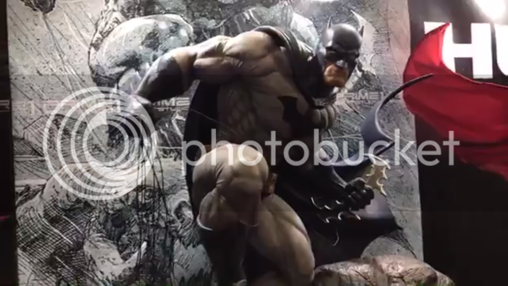
Prime 1 Studio - 1:3 Jim Lee 'Hush' Batman

Collector Freaks Forum

Help Support Collector Freaks Forum:

This site may earn a commission from merchant affiliate links, including eBay, Amazon, and others.
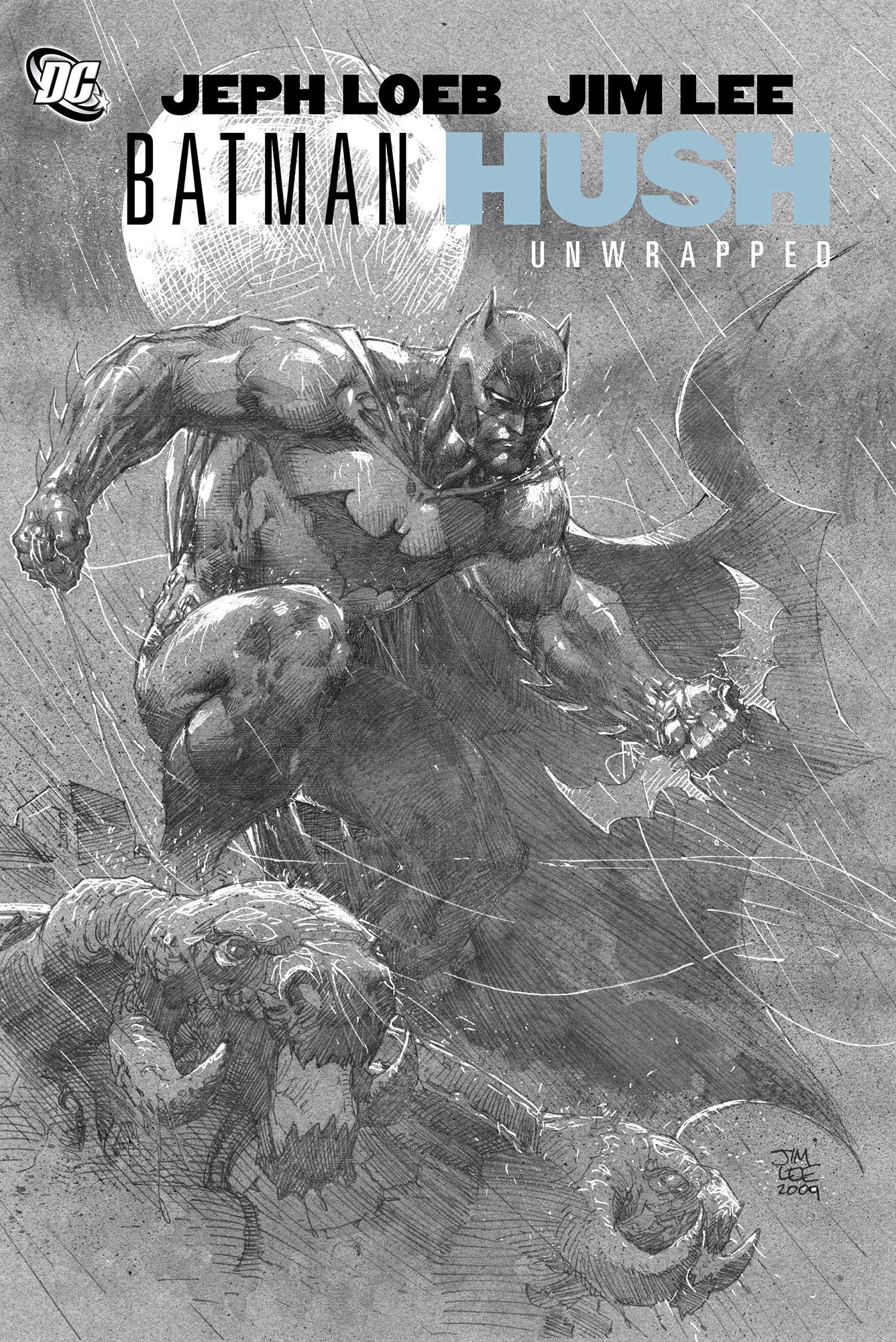
Unfortunate design choice for the stance. What's really sad is the pose of Batman in the picture right behind the statue looks so much better.

Yup, I agree. His stance/crouch looks unnatural...He looks unbalanced. I wonder if Bats will come with another switch out portrait where he's looking down, like in the picture..that might help with the overall look.
 
Unfortunate design choice for the stance. What's really sad is the pose of Batman in the picture right behind the statue looks so much better.

It's the Jim Lee art that was eventually used as cover for the Uwrapped Hardcover edition of HUSH. It's the exact pose that Prime 1 tried to copy, but I guess there are some 2D artworks that doesn't look as good in 3D.

91S6EO9orDL.jpg
 
This angle is perfect. You guys are being hyper critical, this will be an epic piece

FEC709B2-3DDA-4460-9785-546118BE5F3D_zpsctpgx7ms.png
 
Yeah, I think the only difference is the head was looking a different direction, it's well done to imitate that pose on the cover even down to the cape
 
Pose looks awkward ... something off about it. But everything else about is awesome, so wish it was a standing pose (like every other version of prime 1 Batman) :lol
 
Pose looks awkward ... something off about it. But everything else about is awesome, so wish it was a standing pose (like every other version of prime 1 Batman) :lol

Yeah, you nailed it. That's exactly how I feel about the piece.
 
I think I figured it out .... On the cover art, Batman seems the perched up really high and he’s just waiting to pounce into action. However, the statue makes it look like he’s ackwardly climbing out of a ditch.
 
The details are amazing and is faithful to its subject matter, howeber I personally think they should have tweaked the pose so it isn't as awkward looking. Props to them for trying something new though, and nailing the execution, just could have been better IMO
 
Looking great. My only gripe with it is the left leg. Is stands lower than on Lee's art and makes Batman look a little unbalanced. Raise the f....g leg and you've got a winner.
 
Maybe it will look better if it’s displayed high on a top shelf, above eye level (with a moon in the background).
 
Beautiful piece, his chin is huge but not something that would stop me from getting this. Most likely will be my first prime 1 and DC piece.
 
Yeah definitely like this batman. This piece needs to be displayed high. Its perfect. For me anyways


Sent from my iPhone using Tapatalk
 
Back
Top