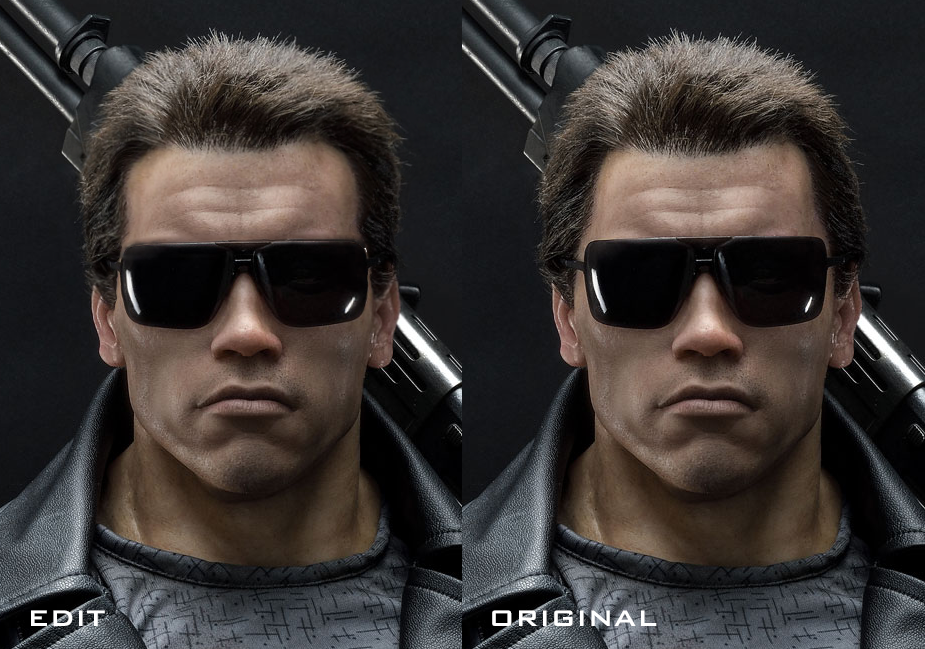
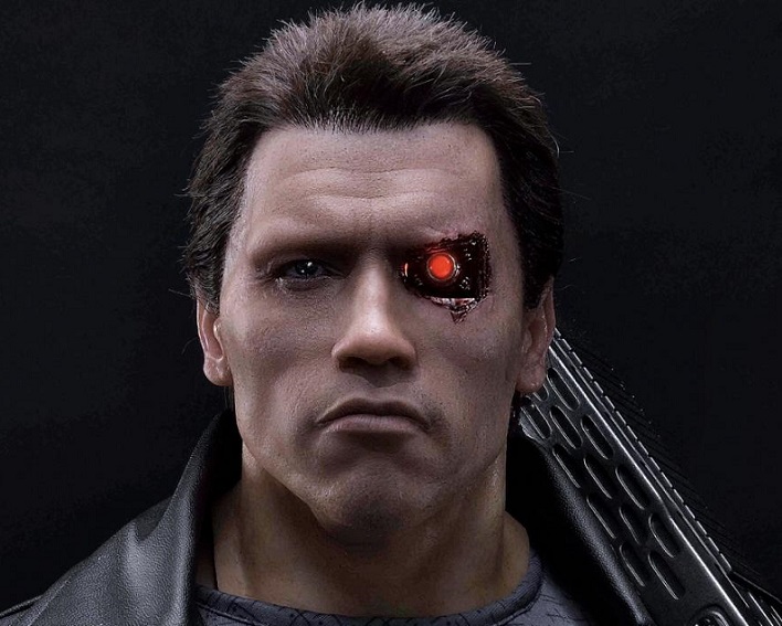
Its ridiculous how such little changes make this look a million times better. I for one dont mind the original, but damn its surprising how much cleaning up the hair does. Great job as always Blade
You are using an out of date browser. It may not display this or other websites correctly.
You should upgrade or use an alternative browser.
You should upgrade or use an alternative browser.
Statue Prime 1: The Terminator - T-800 (Police Station Shootout) 1:2
- Thread starter Shoo
- Start date

Help Support Collector Freaks Forum:
This site may earn a commission from merchant affiliate
links, including eBay, Amazon, and others.
Got bored so I did a little Photoshop edit. I follow the artist who sculpted the head on this and he's nailed Arnold before, so I don't think the sculpt itself is what's messing with the likeness.
-Looks to me like they punched the hairline wrong, which makes the forehead appear too small and the face too wide.
-The length of some of the hairs also felt off.
-Checking the film reference, his Gargoyles ought to be shorter on the vertical, longer on the horizontal; in other words, they should cover less of the forehead above the brow and cover more of the sides of the face.
That's basically all I changed, left the sculpt alone.

I am blown away! Oh my, that is such an improvement and actually it is no point blank Arnold. How could they have missed that? The hairline and the forehead are wrong, but Your subtle change has made it a REAL likeness.
I hope you don't mind Blade I went a bit further with your great mod
Works for me, Arnie's got a lot of forehead. I'd try to maintain the downward curve at the front of his hairline, though. That's something the original punch job got right.
Works for me, Arnie's got a lot of forehead. I'd try to maintain the downward curve at the front of his hairline, though. That's something the original punch job got right.
I dunno about that


From the front the hairline seems to be pretty straight across. In fact it even looks like I could make the forehead longer again.
What definitely needs to go are the weirdly excessive forehead lines. I don't know where they got the idea he has those. A faint one mid-forehead, yes, but there shouldn't be a prominent horizontal crease below that.
P. made this hilariously accurate comparison earlier in the thread.
i dunno, maybe. everything except for the face is just a very lazy job the more i look at it.
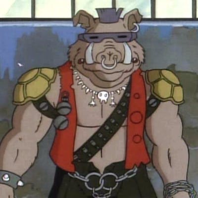
the face, on the other hand, is a piece of art by itself, though it definitely needs a lot of rework in terms of shapes, like people said here numerously, to make it look more like Schwarzenegger and less like Bebop.


Last edited:

$69.99
$79.99
Marvel Legends Series Venom, Marvel Comics Collectible Action Figure 6” - Exclusive
Package Outbound

$6.99
$9.99
DC Comics, Batman Action Figure, 12-inch Super Hero Collectible Kids Toys for Boys and Girls, Ages 3 and Up
Amazon.com

$21.99
$24.99
Marvel Legends Series Vision, Comics Collectible 6-Inch Action Figure
Poseidon Distribution

$10.99
$14.99
DC Comics, 12-Inch Superman Action Figure, Collectible Kids Toys for Boys and Girls
Amazon.com
rjszar
Super Freak
I hope you don't mind Blade I went a bit further with your great mod
View attachment 510847
edit- ok why the hell did that come out so small......
Hairline could maybe be raised even further again
View attachment 510854
Again I don't know why it's so small but save to your computer and zoom.
I gave up on any notion of ever wanting to own this. The majority of people out there just don't see it, but you do. P. of course sees it and so do a few others, but too many people thought this was PERFECT and I knew none of the issues would ever be addressed. DAMN...what this could have been with just the few adjustments you made. And they've been so glaring since the beginning. The figure was constantly displayed right in front of the poster and people couldn't see it. I think there is still an issue with the eyes, but in most cases, you would be displaying it with the glasses on. Now I have to wonder if maybe the creases in the forehead will be less prominent in the production piece. I wonder if some of the hair could be plucked out to give it a proper hairline. I wonder if Doggie Doc could make some correct Gargoyles. I wonder if maybe this could be saved. Does anybody out there think they actually tweaked anything on this? Just can't take a chance on ordering without knowing for sure.
I dunno about that
From the front the hairline seems to be pretty straight across. In fact it even looks like I could make the forehead longer again.
Ah, gotcha. I perceived the statue photos as looking slightly down on his face, so I was apprehensive of straightening the hairline as it would suggest it curves upwards head-on. Looking at them again, the angle looks fairly level though. Good stuff.

I wonder if some of the hair could be plucked out to give it a proper hairline. I wonder if Doggie Doc could make some correct Gargoyles. I wonder if maybe this could be saved. Does anybody out there think they actually tweaked anything on this? Just can't take a chance on ordering without knowing for sure.
The biggest note would be the hair IMO. I wonder if any visible holes would remain after plucking, maybe one could fill them in or paint over them.
I gave up on any notion of ever wanting to own this. The majority of people out there just don't see it, but you do. P. of course sees it and so do a few others, but too many people thought this was PERFECT and I knew none of the issues would ever be addressed. DAMN...what this could have been with just the few adjustments you made. And they've been so glaring since the beginning. The figure was constantly displayed right in front of the poster and people couldn't see it. I think there is still an issue with the eyes, but in most cases, you would be displaying it with the glasses on. Now I have to wonder if maybe the creases in the forehead will be less prominent in the production piece. I wonder if some of the hair could be plucked out to give it a proper hairline. I wonder if Doggie Doc could make some correct Gargoyles. I wonder if maybe this could be saved. Does anybody out there think they actually tweaked anything on this? Just can't take a chance on ordering without knowing for sure.
Yeah, and we haven't even fixed everything - the silhouette of the hair isn't quite right even in the edit, not entirely accurate to that wig he wore. As you said the eye is weird - and something about the mouth is iffy - I just went for what I really think is quite clear and is easiest to correct on the picture- the ridiculous looking forehead. Then there's the pants and boots seeming to be inspired by Hot Toys MMS136 which got those wrong.
Ah, gotcha. I perceived the statue photos as looking slightly down on his face, so I was apprehensive of straightening the hairline as it would suggest it curves upwards head-on. Looking at them again, the angle looks fairly level though. Good stuff.
I messed with the forehead and hairline in the early days of this thread but your adjustment to the gargoyles was great, made me want to reapply those changes to your new pic.
The biggest note would be the hair IMO. I wonder if any visible holes would remain after plucking, maybe one could fill them in or paint over them.
The cranium almost looks like it's caving in on itself so I'd wonder if the underlying shape is just completely wrong anyway. I think it's a write-off as it stands.
Last edited:
The cranium almost looks like it's caving in on itself so I'd wonder if the underlying shape is just completely wrong anyway.
Mmm, that's a concern. Proper hair placement may be able to camouflage it, but hard to say.
Not crazy about the look of the jacket either. Setting the pleather aside, a lot of companies seem to have trouble keeping the lapels from looking comically oversized and Prime 1 is no exception.
I'd honestly have been fine with a fully-sculpted statue, the mixed media is where they're dropping the ball most.
Did another round on this one

I don't know if I have the hair exactly right - P. would know better than me. Maybe should be fuller on the sides, higher on top etc - I'm not sure what's right for the angle.
And here's a pic with the Original lined up with the edit so you can save both to your computer, open and cycle back & forth between them to see exactly what's changing

rjszar
Super Freak
a-dev, you're KILLING me. Please stop. It's better if this just remains a piece of garbage.
Not that it will ultimately matter, but credit to Blade3327 for kicking that off with an excellent mod to narrow the Bebop face and adjust the Gargoyles. It's his comparison pic originally.
The lower face might not be perfect either - in the pic on page one of the thread it certainly looks a bit questionable - could be the pic Blade used was a flattering one.

The lower face might not be perfect either - in the pic on page one of the thread it certainly looks a bit questionable - could be the pic Blade used was a flattering one.

Last edited:
Jacket material confirmed by Prime 1 to be synthetic leather. They said they'll take care to specify this in the future.
csutkakoma
Super Freak
It is probably too late. I am just waiting for their T2 pieces. I am more excited for them anyway.
Do we know they're making T2 stuff?It is probably too late. I am just waiting for their T2 pieces. I am more excited for them anyway.
Similar threads
- Replies
- 404
- Views
- 28K
- Replies
- 0
- Views
- 1K
- Replies
- 0
- Views
- 376
- Replies
- 0
- Views
- 817


