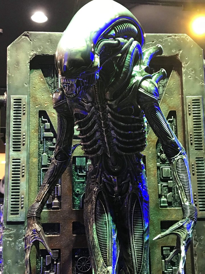
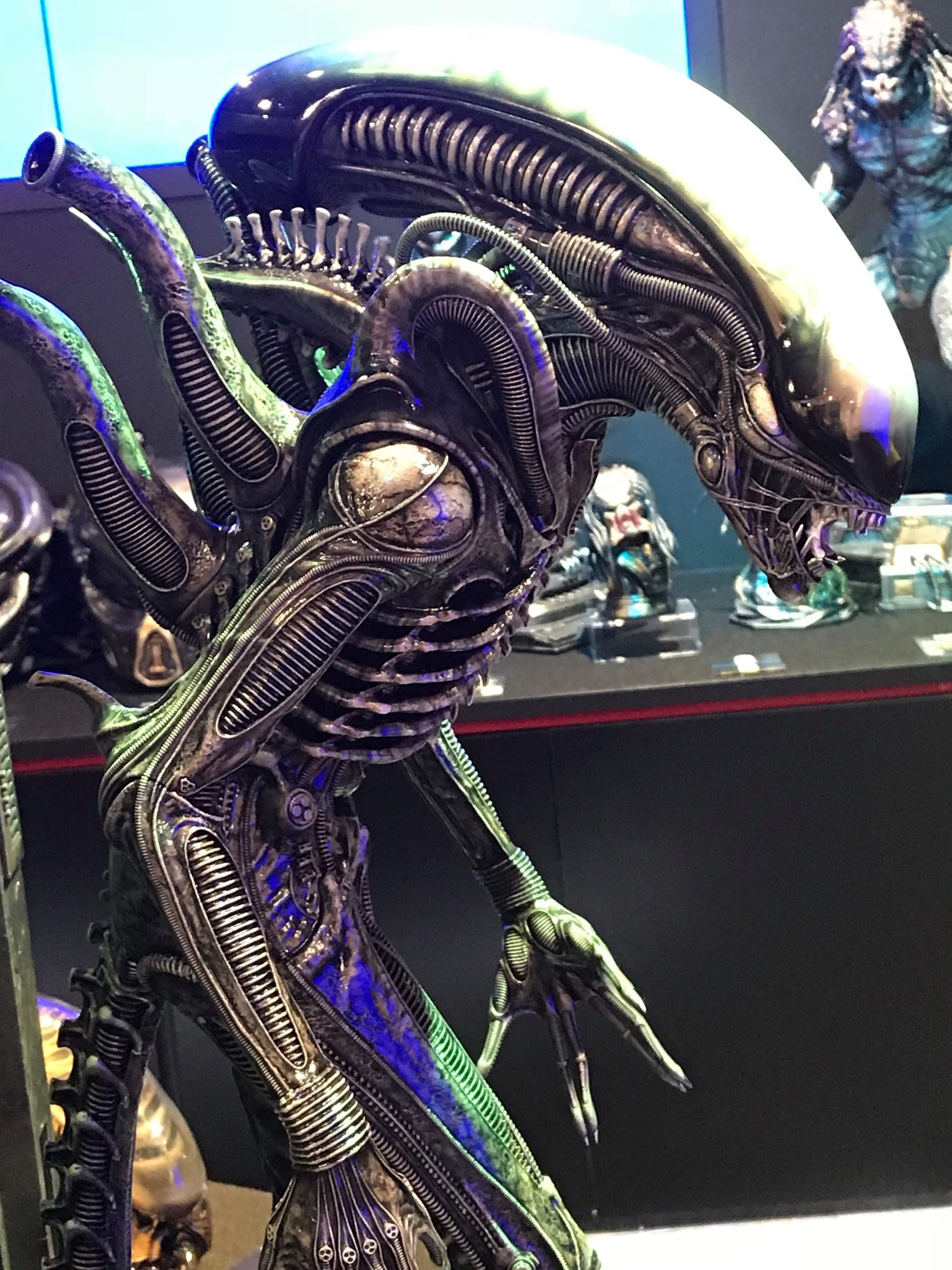
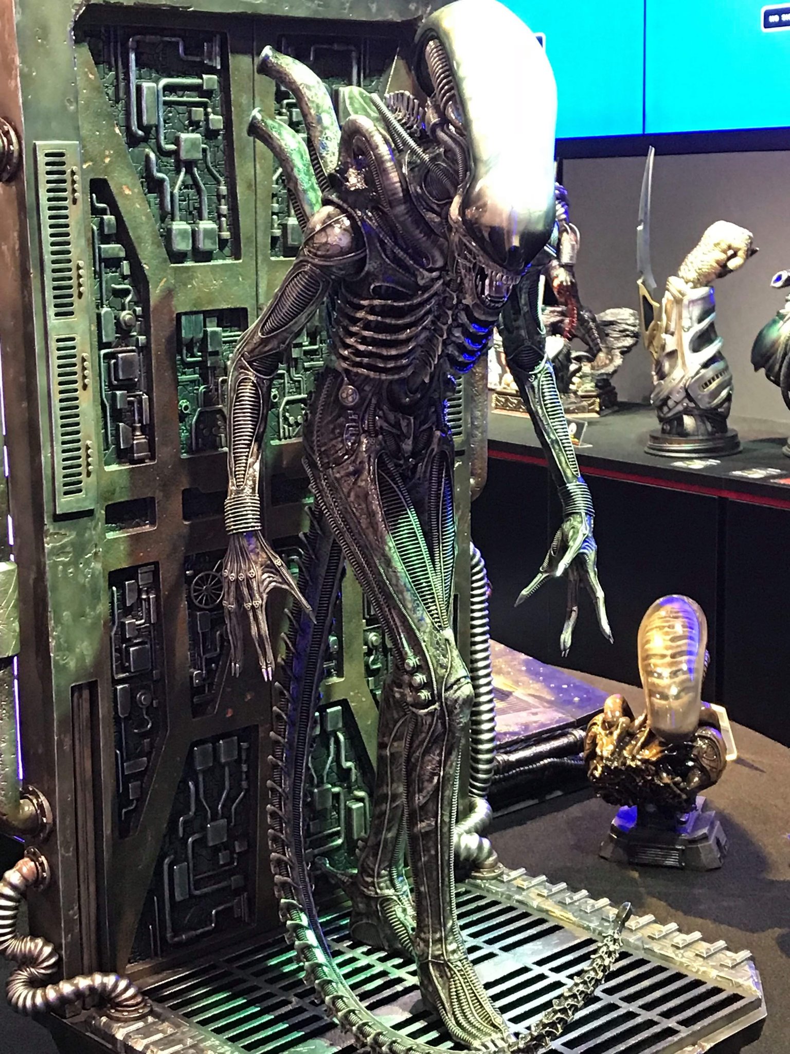
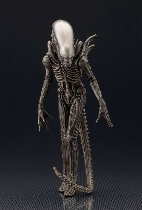
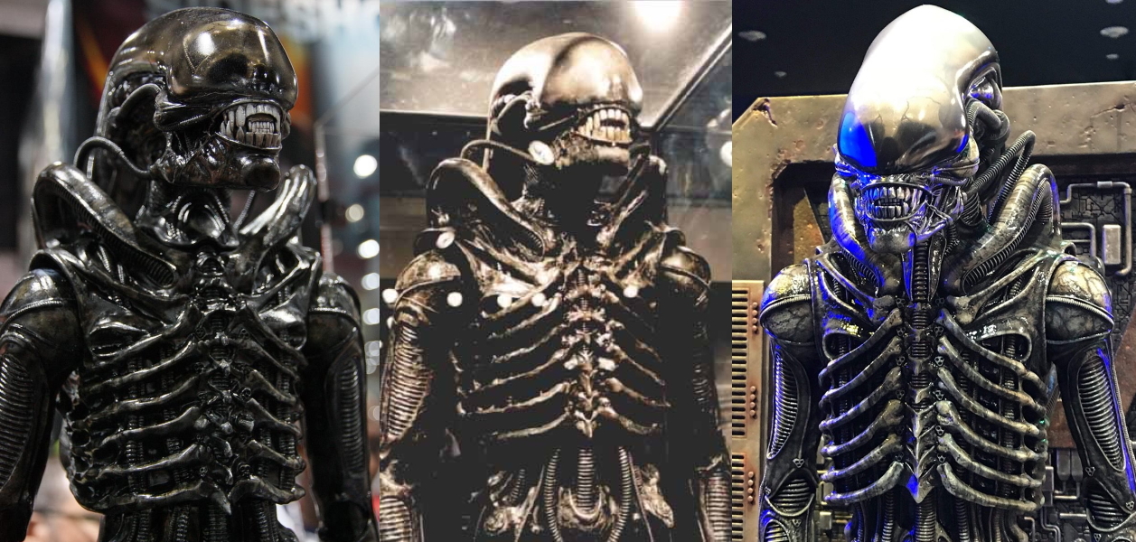
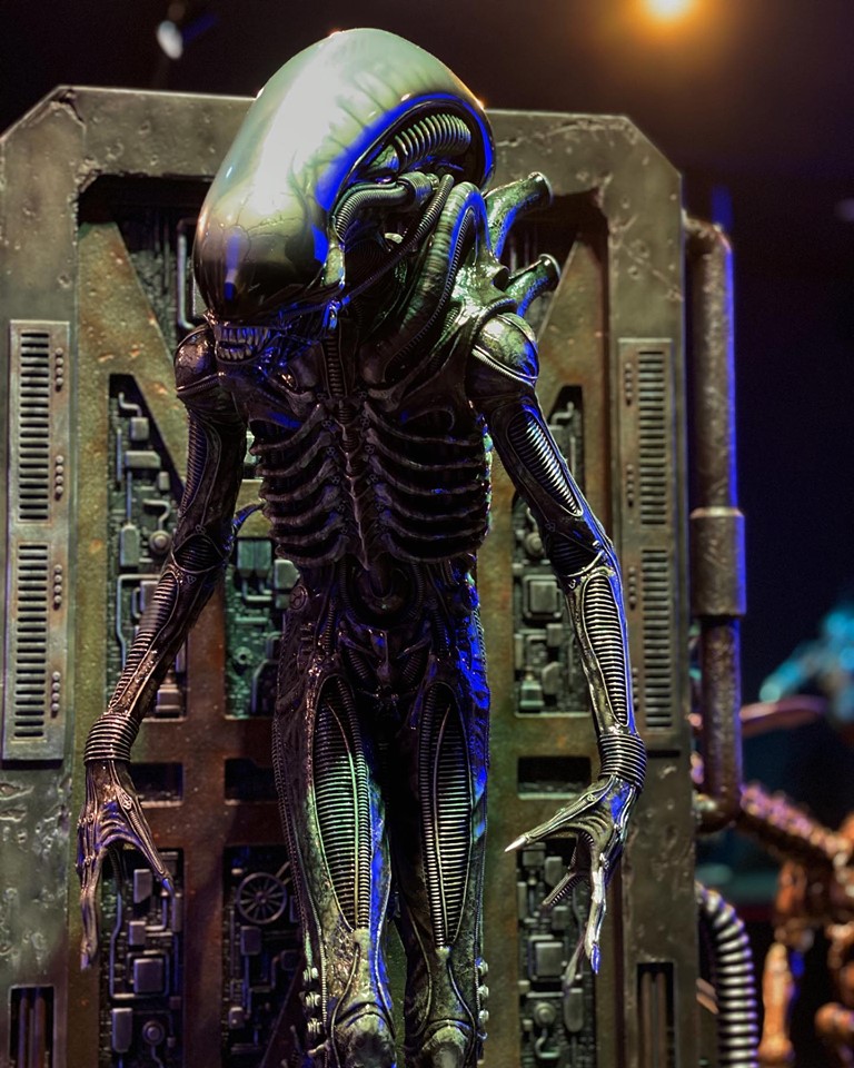
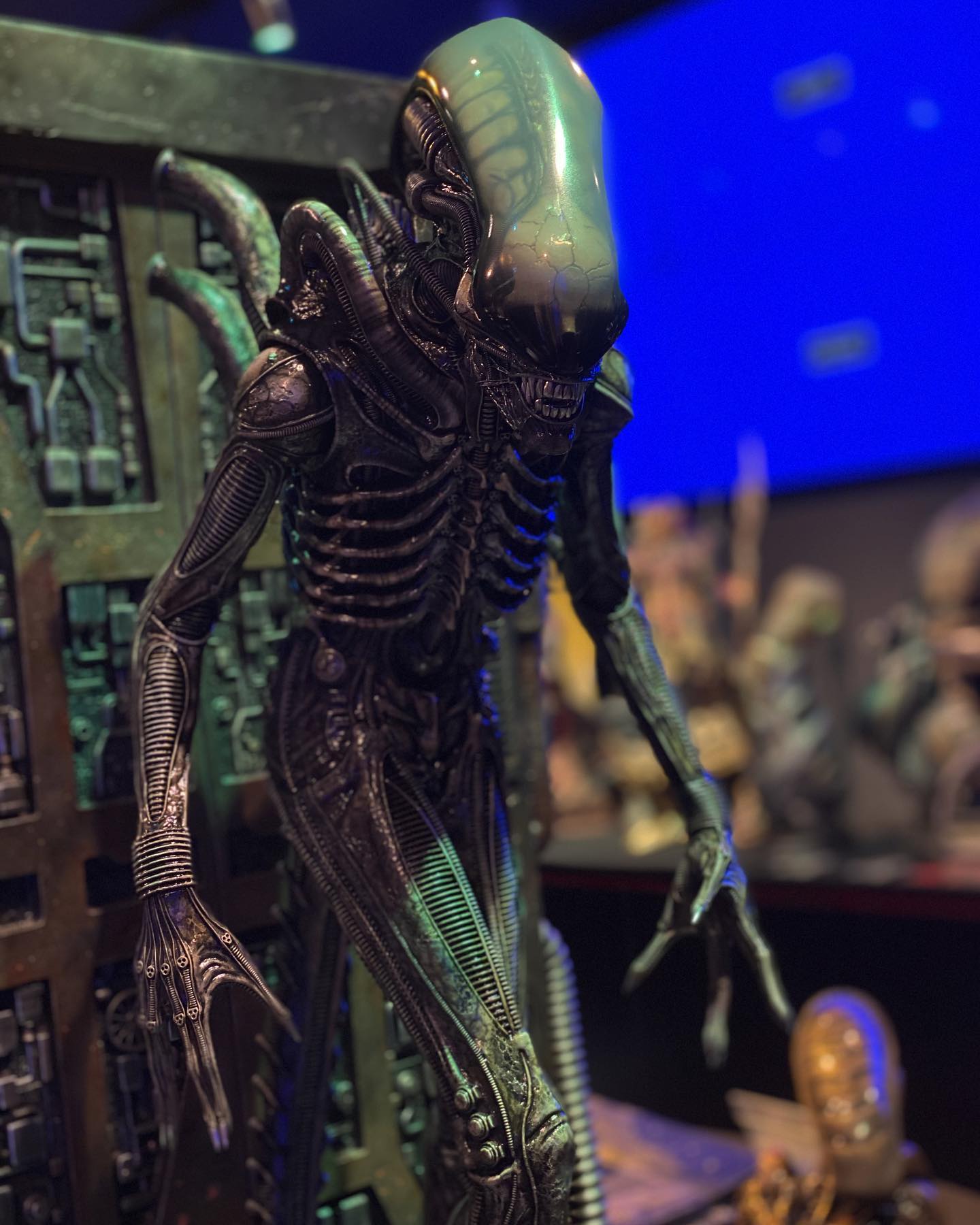
I know this is heavily inspired by the little Koto. But I can't help think that the pose of the Koto is just better (head up more, hands outwards) It's similar, but more refined, they should probably have just outright copied it. I like this regardless, I'm just saying, I do think tilting the head up would improve this, it would give the pose more intent and place his skull more in the main focus point.
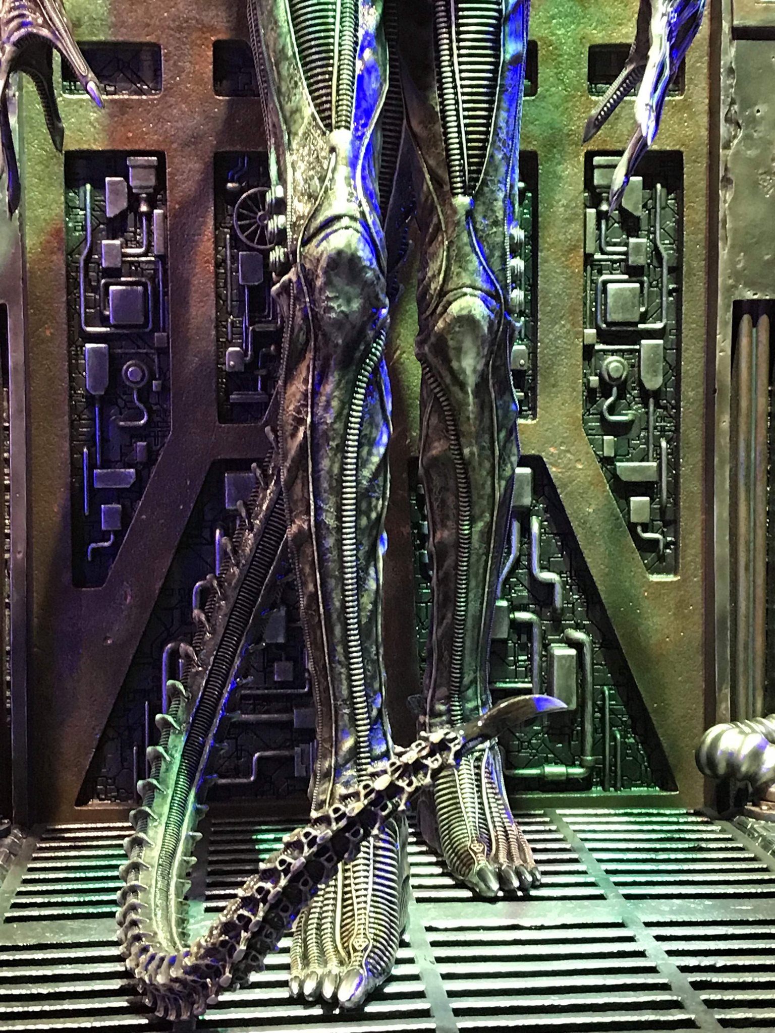
Also, just entirely thinking out loud (don't expect it obviously) I would scrap the rear wall and maybe add an Alien Space suit helmet on the base. Put a flickering bright white light on it facing up at the Alien, just to add an eerie light feature that would look great in a dark room.


