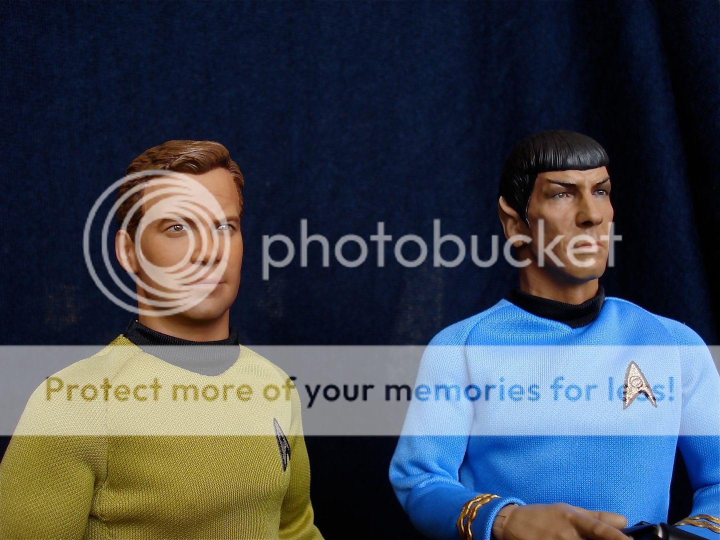
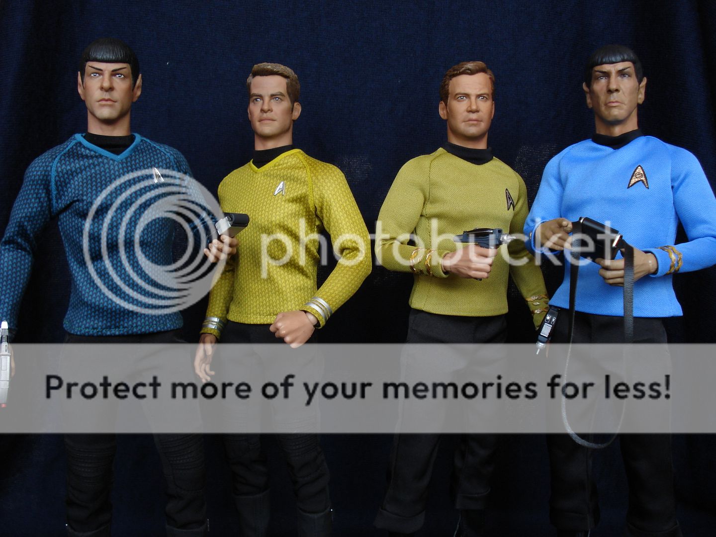
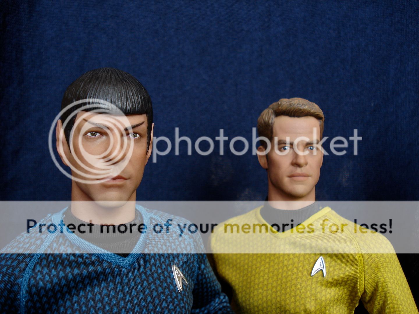
Well, I had some time to mess around and futz with Kirk and Spock last night, so here's a few quick impressions:
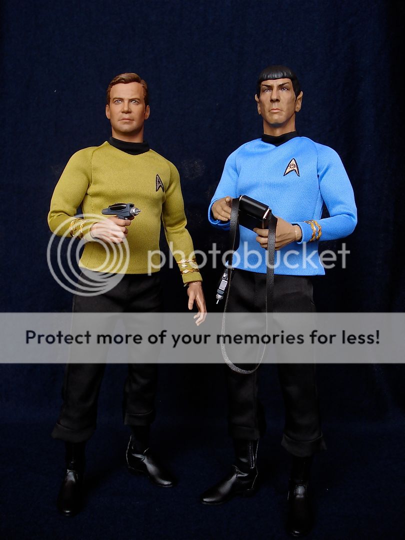
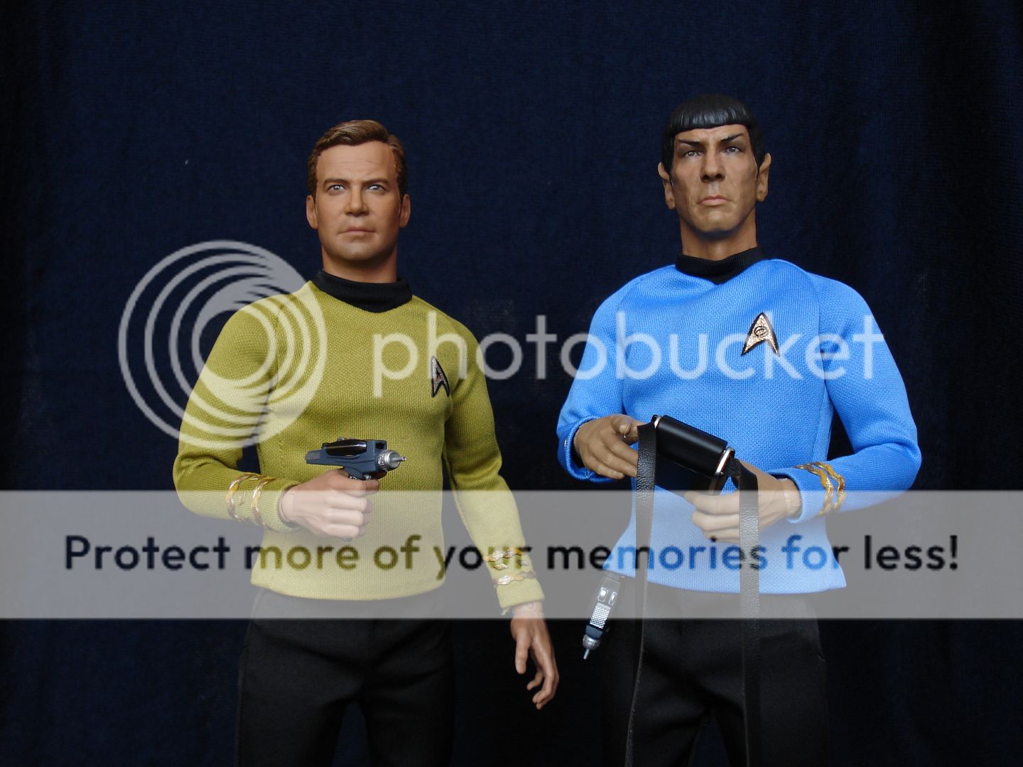
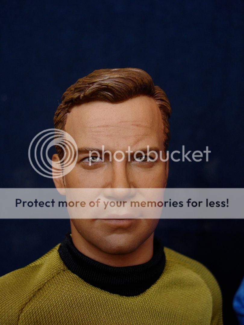
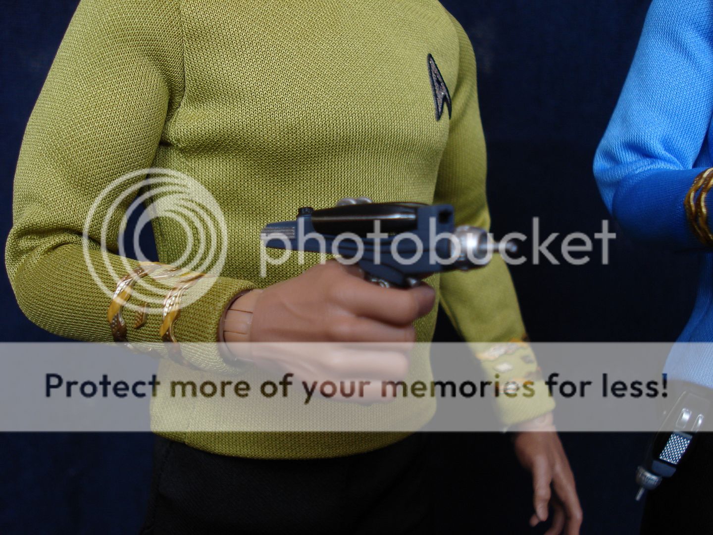
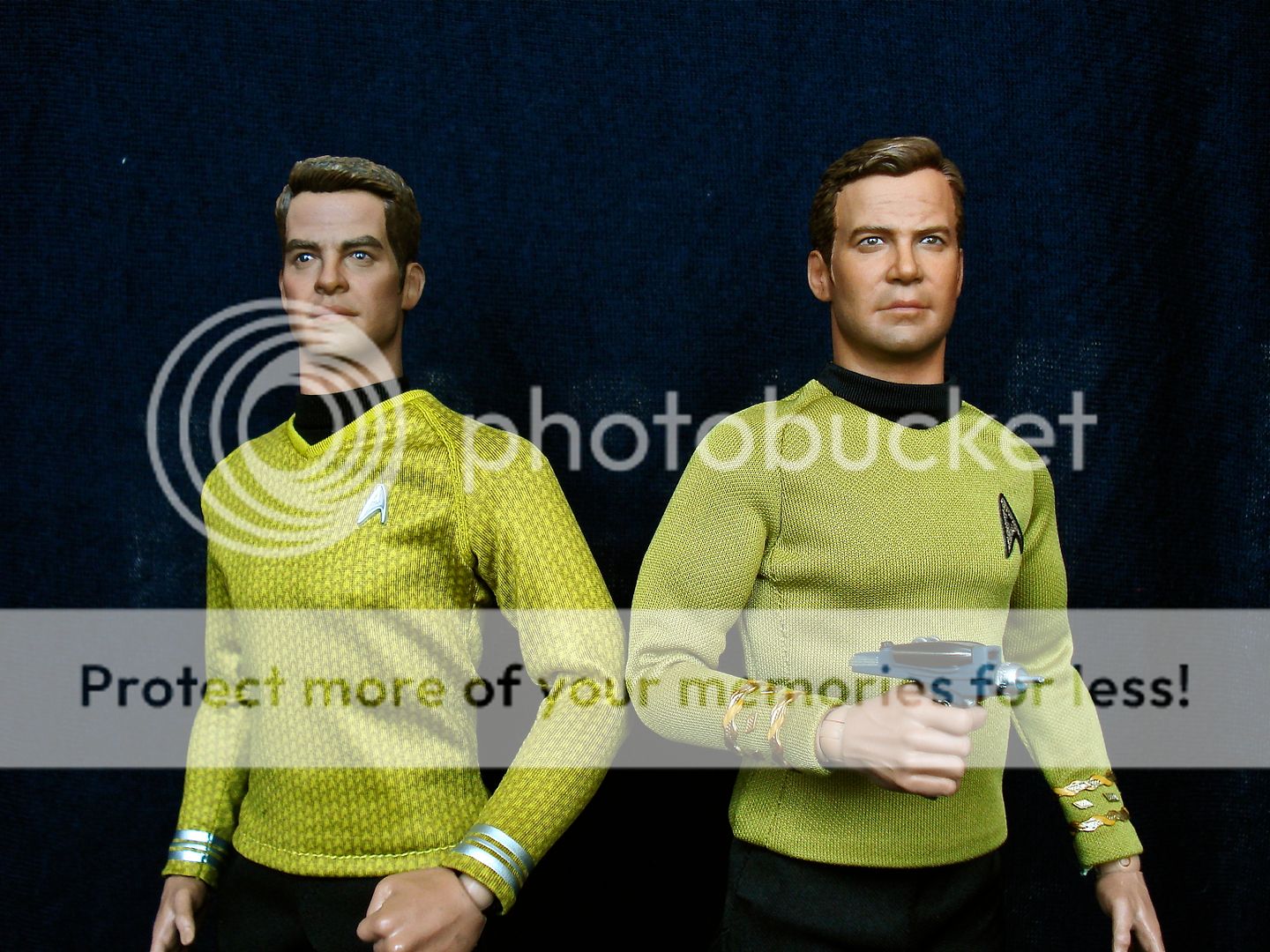
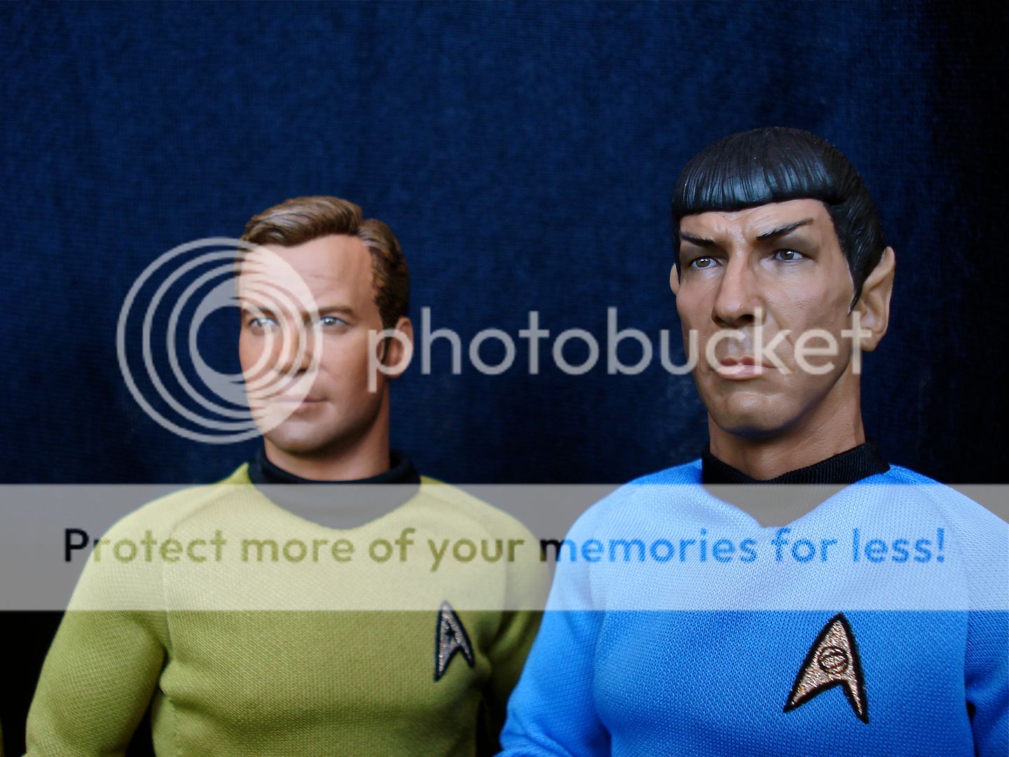
Clearly, Kirk is the winner here. The head sculpt is excellent, with great paint apps and the best likeness I've seen so far. The body that was chosen works great with the fat suit, and the tailoring of the uniform fits perfectly and looks great.
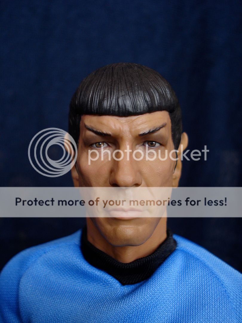
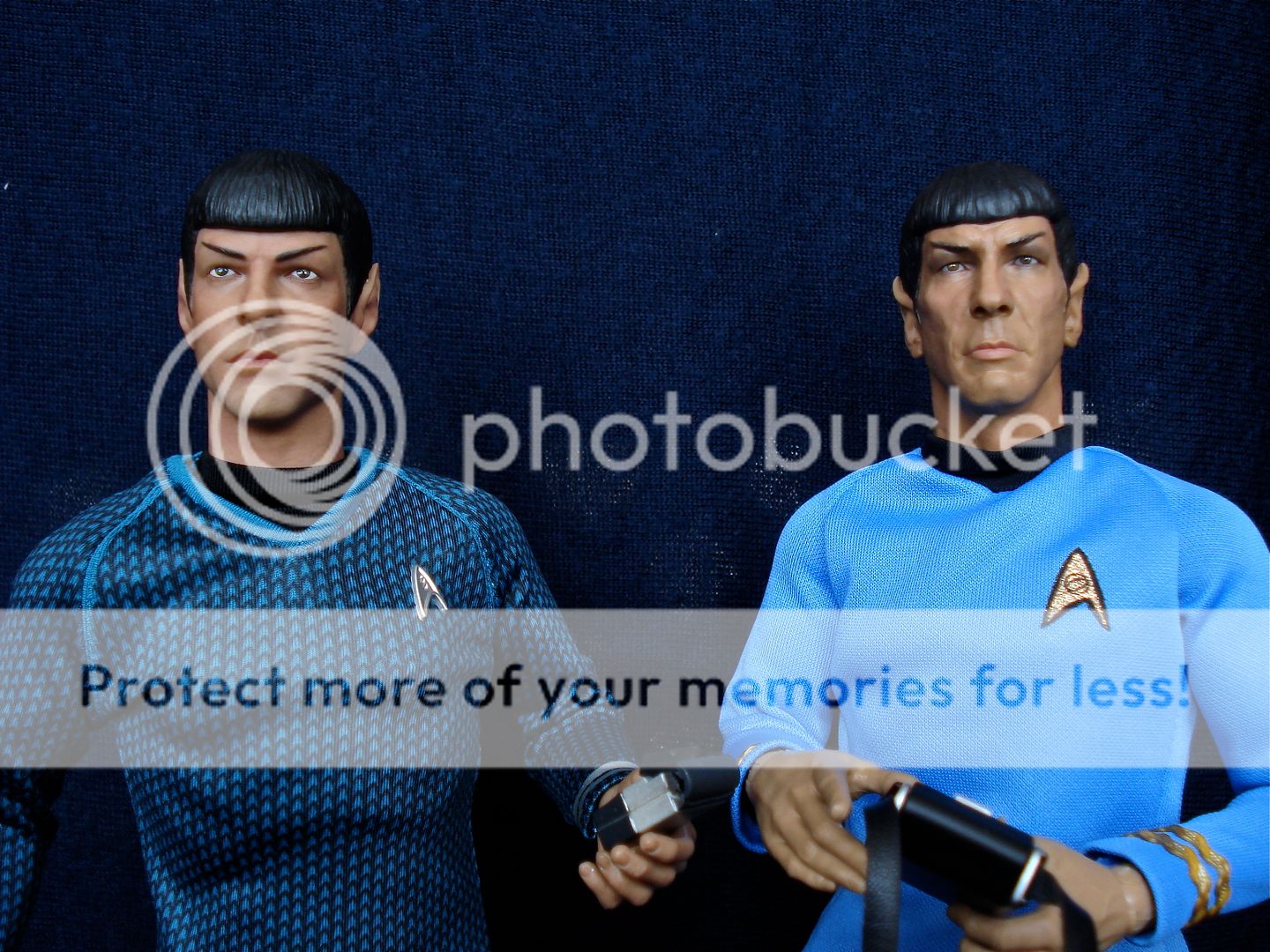
Spock is, in comparison, a bit disappointing. The shirt flares a little bit (and I hesitate to try any water treatment on this material), but that is a minor nitpick, as is the slightly too-buff body (I might even consider using an old Sideshow Buck, its lankiness would suit Spock perfectly). The real problem for me is the head sculpt. There is something odd about it that I can't really put my finger on... Others have already pointed out the "lumpiness", which I prefer to call the exaggerated features, but there's something off about the entire shape of the head... Maybe it is the neck that seems a bit too thick, or maybe it's the cranium that seems "pinched", but there is something that is definitely throwing the whole thing off.
Still, it's a great sculpt, very detailed and life-like. The paint apps are great, no complaints there.
So, overall, great set of figures! Certainly the best Star Trek figures I've seen. The quality of the clothing, the attention to detail, the accessories, the overall look and feel of the figures is simply excellent! Congratulations to QMX and Nanjin for bringing these to life. Now, let's wait for McCoy and the rest of the gang.
A quick word about the packaging.
I usually don't care either way for packaging, but since these are the first officially licensed 1/6 scale Star trek figures, I think the packaging deserves a mention.
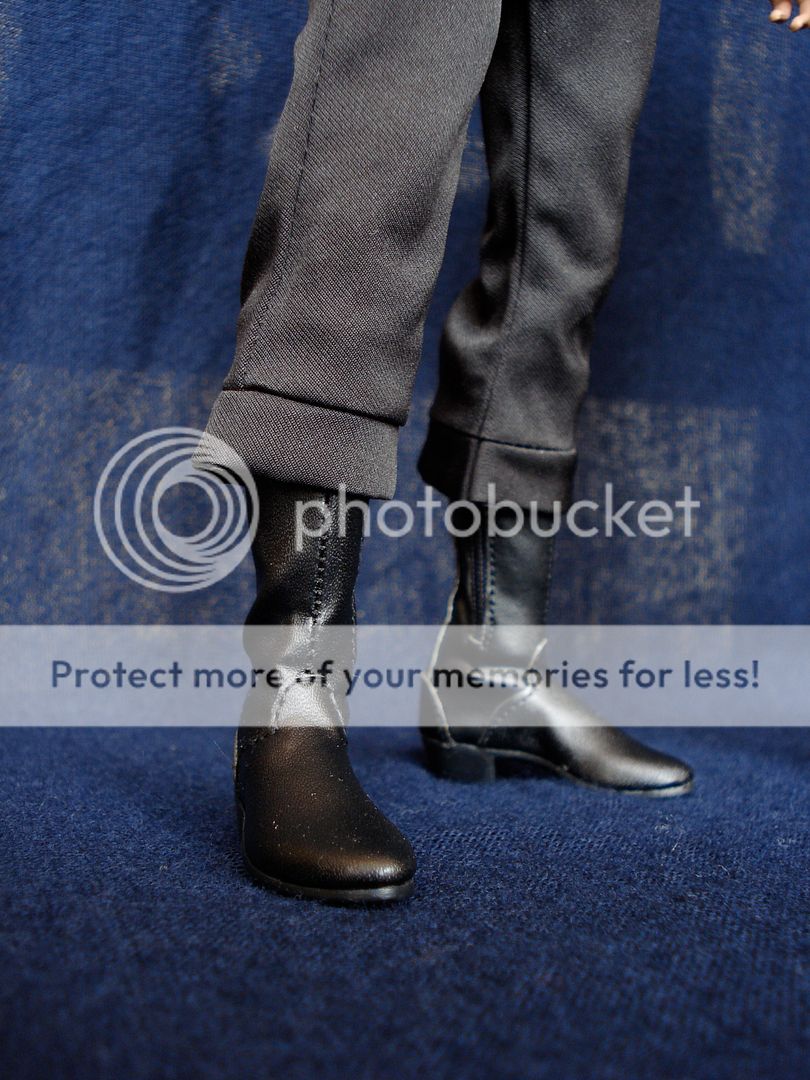
Functionally, it's great. Absolutely no complaints there. Everything is held in place securely, the figures themselves have protective taping around delicate areas like head, hands and boots, and the packaging itself is quite sturdy.
But the graphic design...
I suppose I can understand the QMX is a relatively new company and they want their logo to feature prominently to be easily recognisable and generate awareness for the company, but it's such a missed opportunity to design something truly beautiful.
Star Trek; the colours of the uniforms, the shapes of the insignia and the ship itself, they are all iconic and instantly recognisable. Just look at some of the beautiful packaging that has been done for DVD's and Blu-rays. These boxes could have been fantastic designs. As they are now, I find them quite a let down to the product that is inside.
Anyway, will try to post some picks and perhaps do a more in-depth review this week end.
Again, thanks Nanjin and QMX, these figures are amazing!

