You are using an out of date browser. It may not display this or other websites correctly.
You should upgrade or use an alternative browser.
You should upgrade or use an alternative browser.
Show Your Entire Batman Collection!
- Thread starter -ALI-
- Start date

Help Support Collector Freaks Forum:
This site may earn a commission from merchant affiliate
links, including eBay, Amazon, and others.
haytil
Super Freak
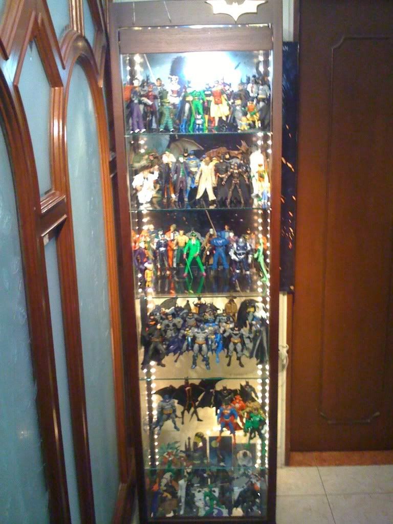
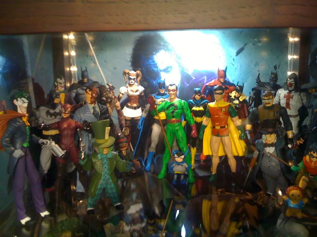
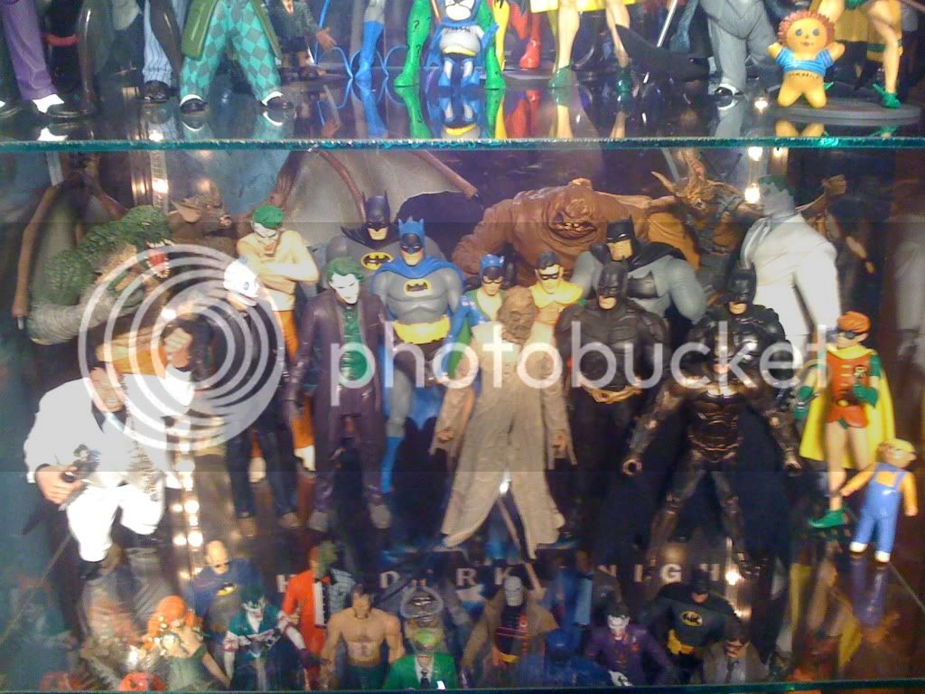
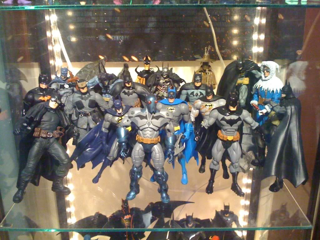
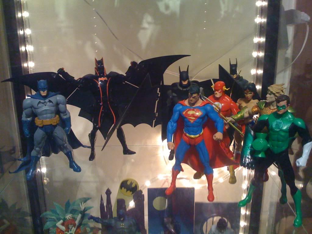
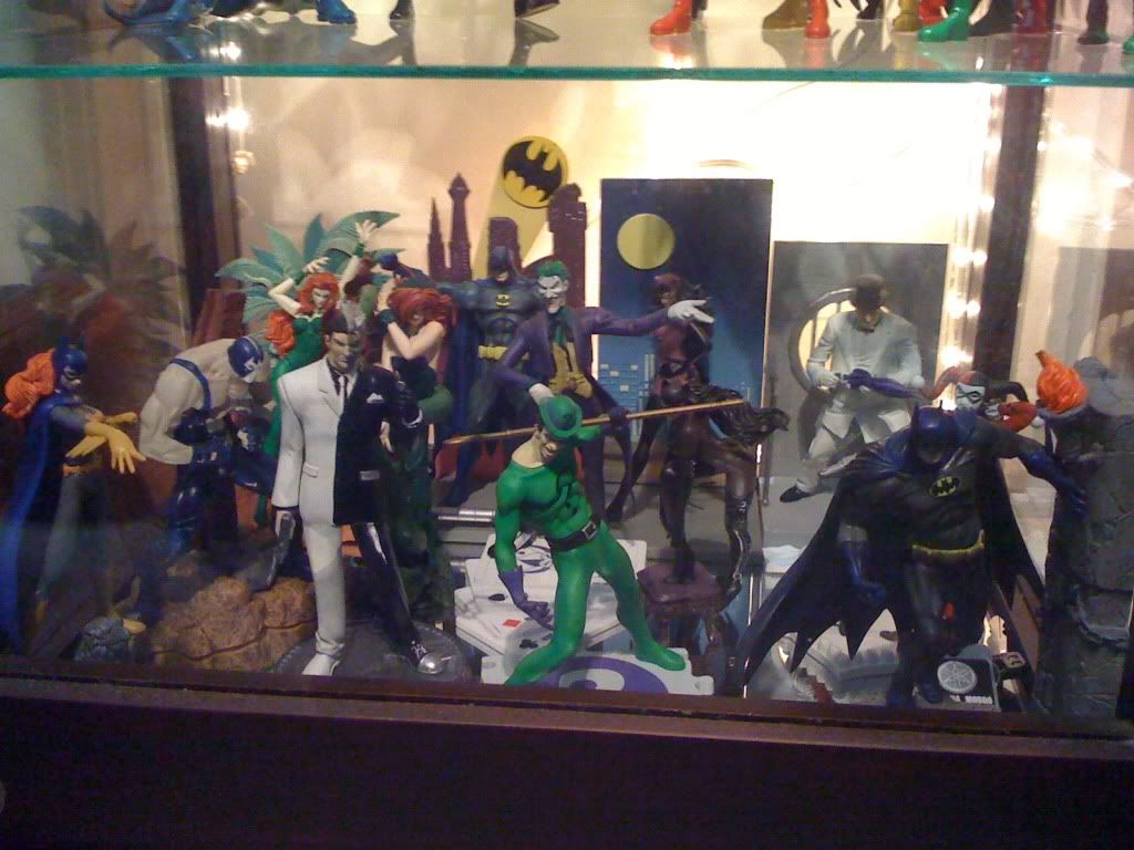
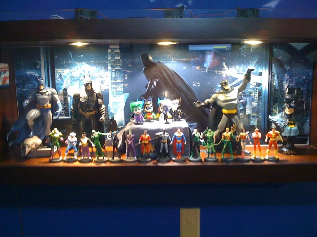
I like that big shelf with action figures from all kinds of different Batman interpretations, all mixed together. Very colorful.
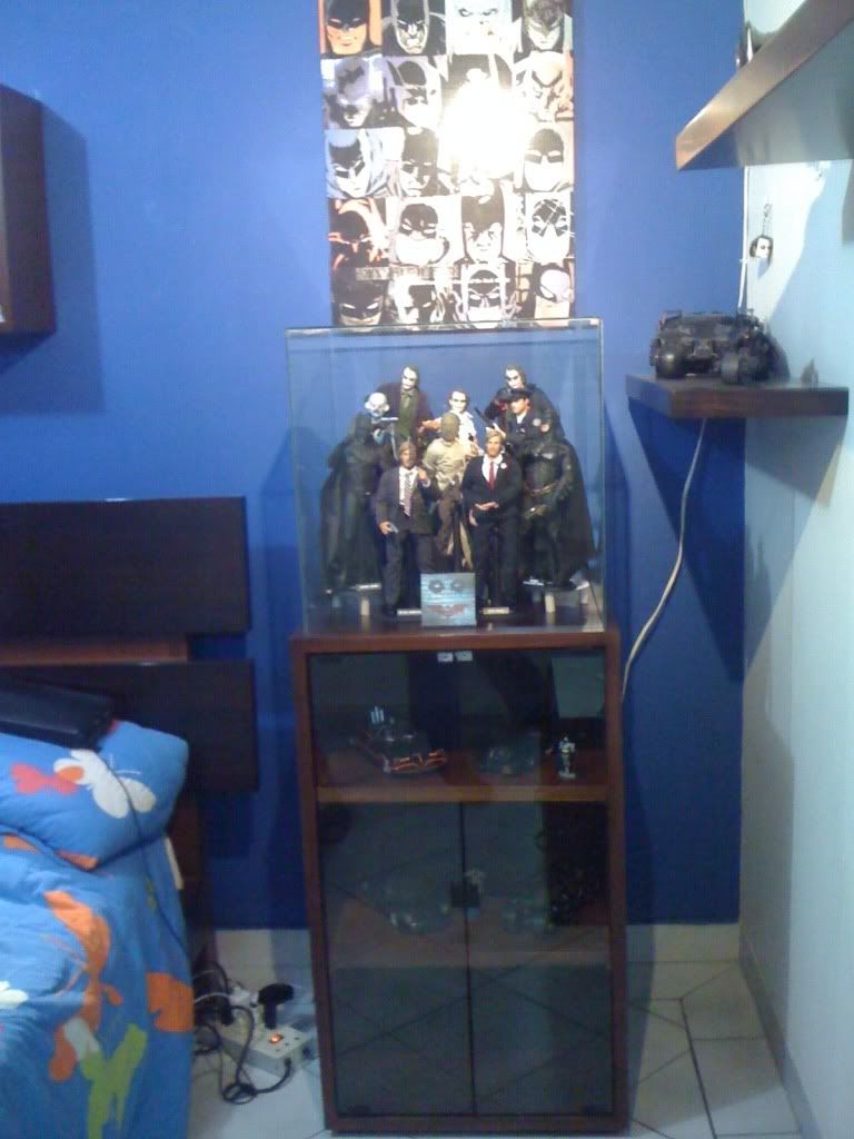
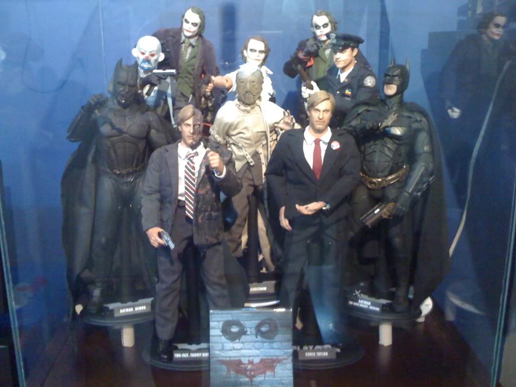
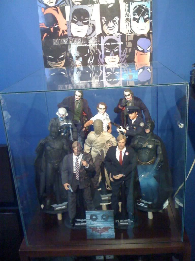
I like what you've done with the dowels to create different levels. It's a great way to take advantage of limited space.

$57.89
Marvel Legends Series Venom, Marvel Comics Collectible Action Figure 6” - Exclusive
Alliance Collectibles

$35.00
$39.99
San Diego 2024 Previews Exclusive Marvel Comics: Wolverine DS-151 D-Stage Statue
Amazon.com

$44.99
Marvel Legends Series Deadpool, Deadpool 2 Adult Collectible 6-Inch Action Figure
S&A Distribution
intothevoid
Super Freak
Yeah a very nice idea and well executed. Though I'd prefer this kind of setup with my DCD 6" collection rather than with 1/6 stuff which I prefer to be displayed in dios/environments.
Some of my latest customs belongs here
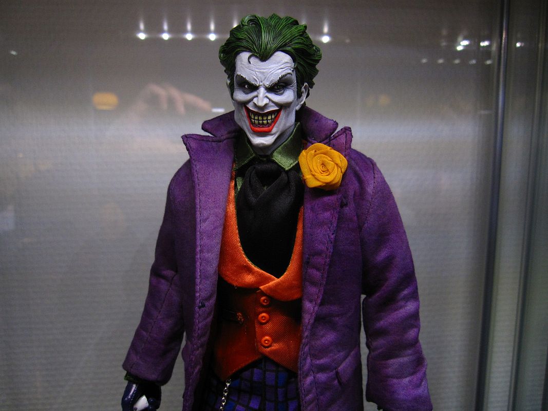
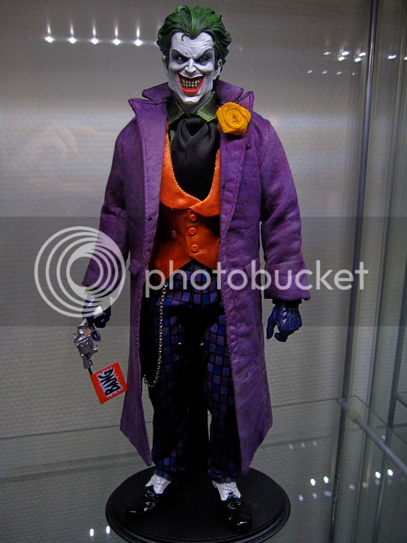
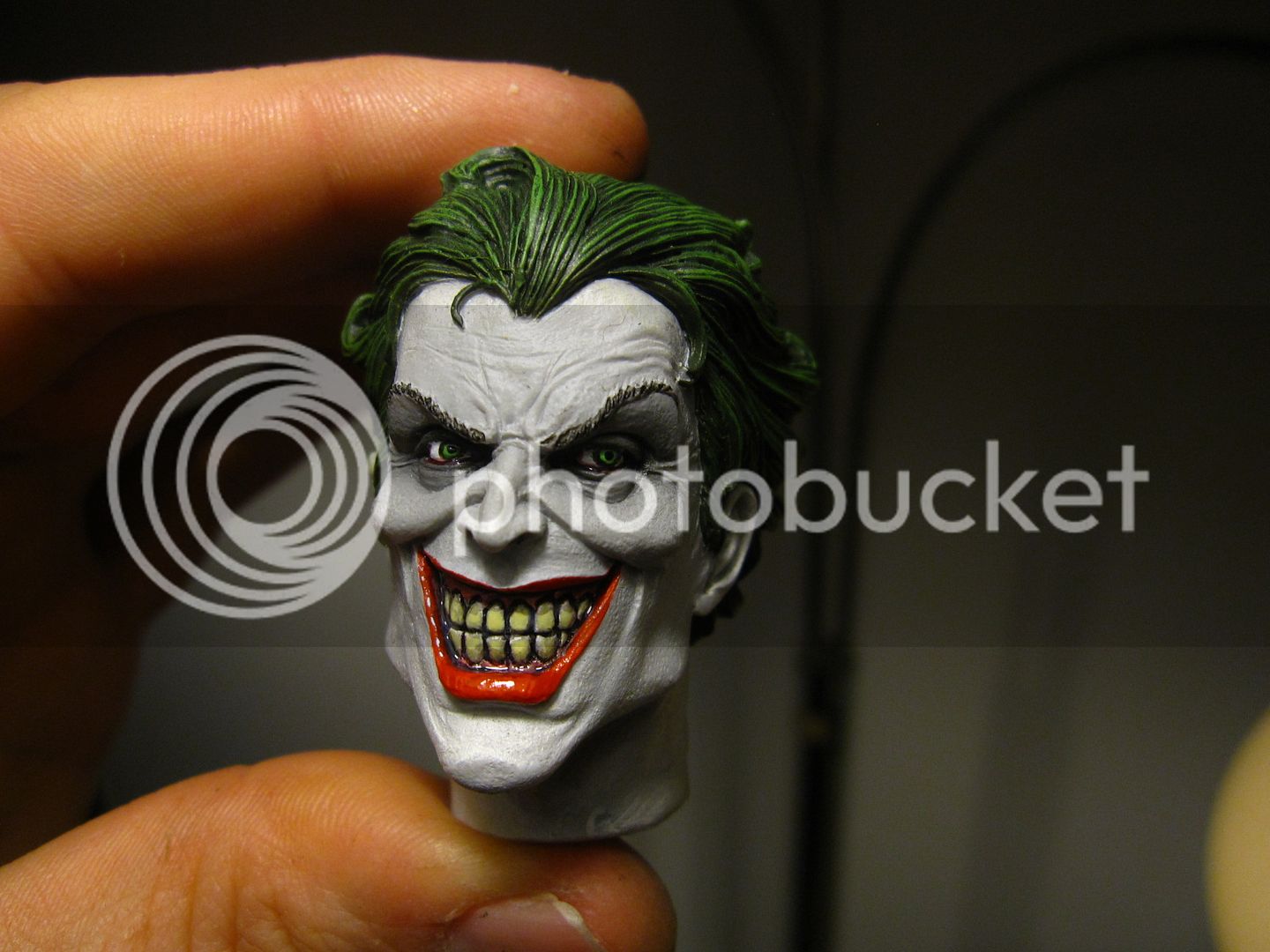
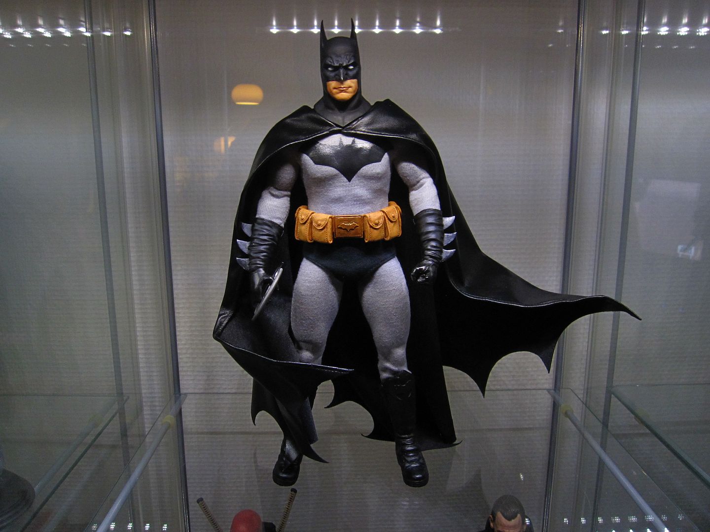
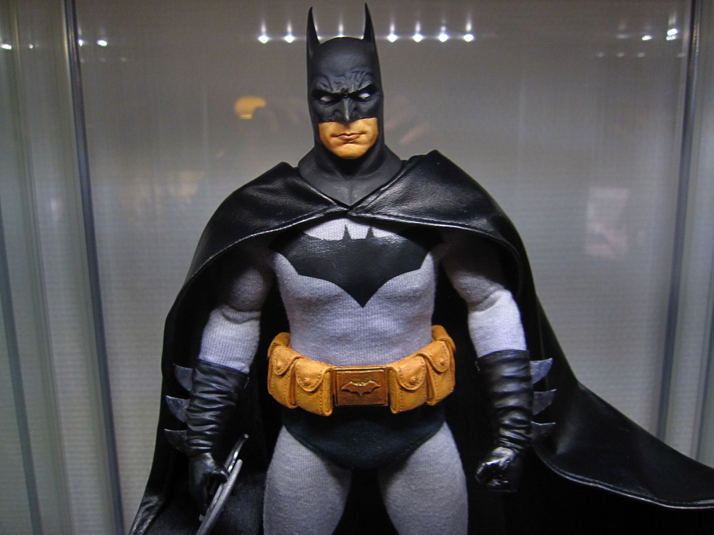
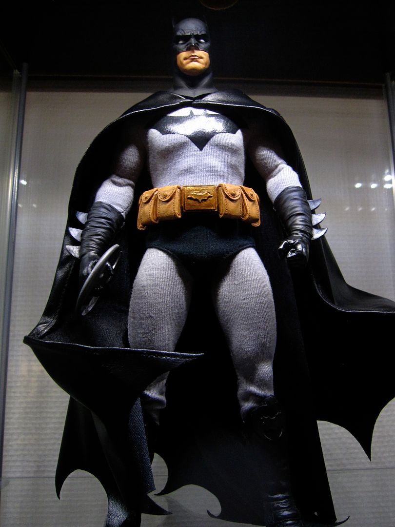
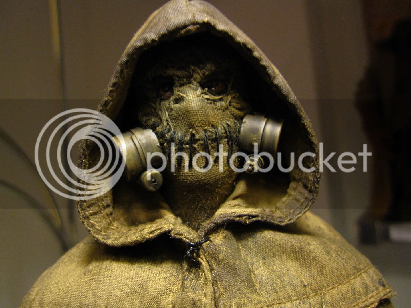
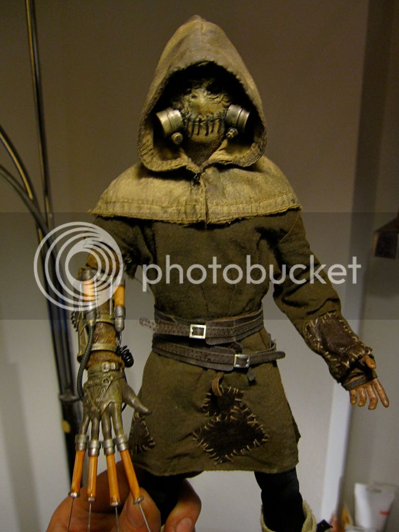


haytil
Super Freak
I like what you've done with the dowels to create different levels. It's a great way to take advantage of limited space.
Yeah, that's a really good idea. Placing them on tiered rows like that looks really cool. I love group shots, and this method gives them depth as well as width, without the usual sacrifice in visibility.
Deorum182, one think that you might think about is finding some thicker, black supports, rather than the thin white columns. If you found something as thick as the stands themselves, you might even be able to make it look like they're part of the stands (i.e., some stands would just look like they have a natural elevate base). Something like that would really step up the class of the display even more.
Anyhow, definitely something I'll have to think about. I use bookshelves, so there's not the opportunity for as much depth or as many tiered rows. But I'm running out of room - maybe if I figured out how to add one layer of rows to each shelf, I could increase my capacity by 30% or so. That might be enough to tide me over until TDKR.
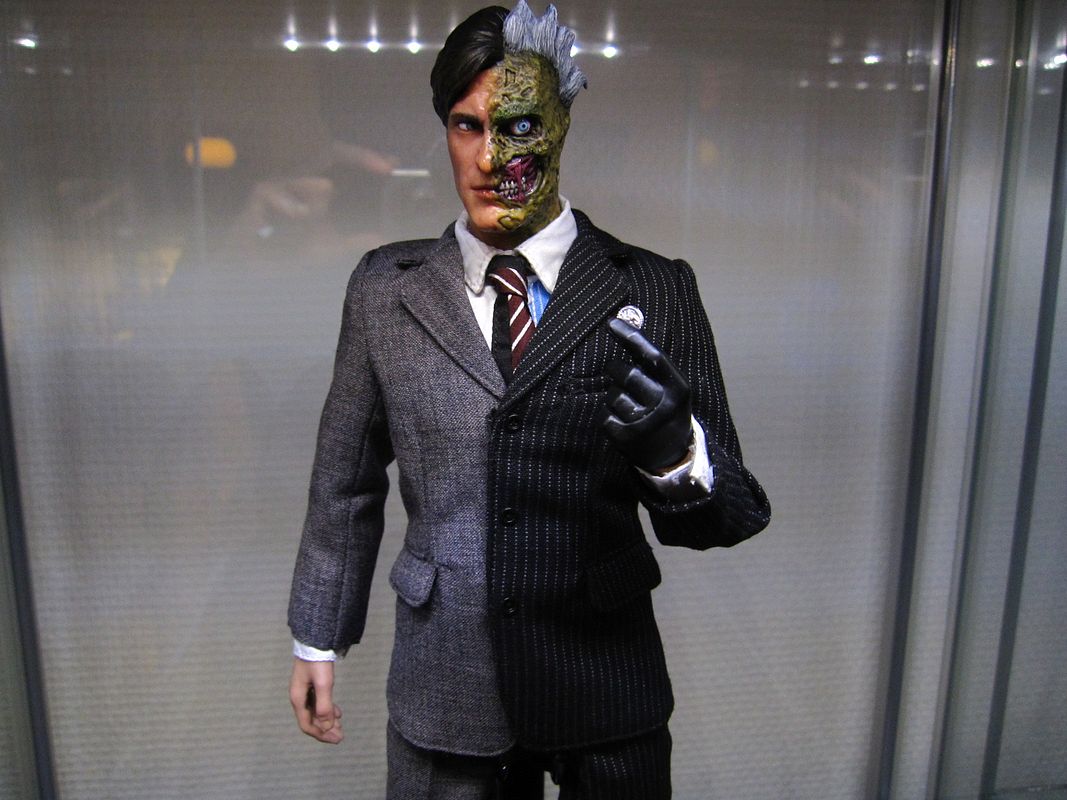
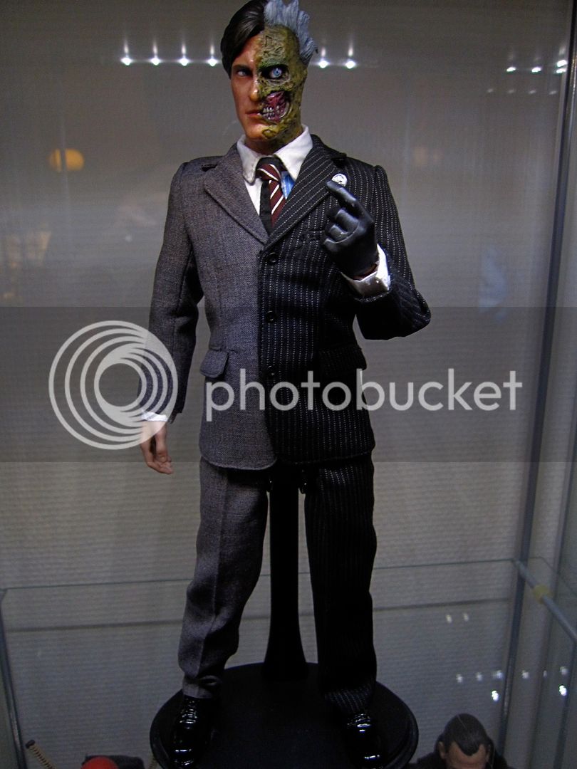
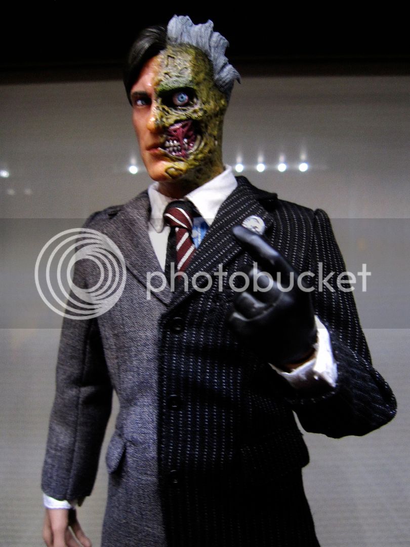
That's a cool Two-Face. I like how you modified the Hot Toys Eckhart head - a totally new twist on an already existing head. The figure and sculpt have got a lot more color than the movie, but without being gaudy in the way that some comic book figures can be.
CTO15
Super Freak
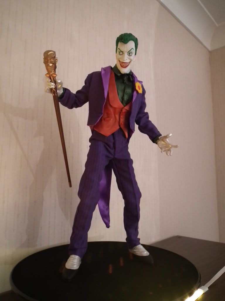
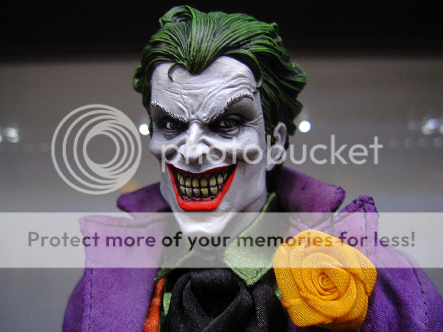
that custom joker is awesome Seb
Mr. EcKo
OG Freak

 Wow Elvis , i love that Scarecrow

The concept you've done is freaking awesome , i want it now!!!

The Joker is insane also , i like em all great job buddy


urascal
Super Freak
Get down Seb! That scarecrow is tight.
0.photobucket.com/albums/c304/elvis1976/new2/IMG_1317.jpg[/IMG]


Man I want that so bad.
intothevoid
Super Freak
Get in line bro 


2ndname
Super Freak
I was going to ask if those figures were all custom figures until I realized who posted them, silly me. Great work Elvis!
Similar threads
- Replies
- 204
- Views
- 18K
- Replies
- 0
- Views
- 200
- Replies
- 226
- Views
- 19K
- Replies
- 1
- Views
- 173


