You are using an out of date browser. It may not display this or other websites correctly.
You should upgrade or use an alternative browser.
You should upgrade or use an alternative browser.
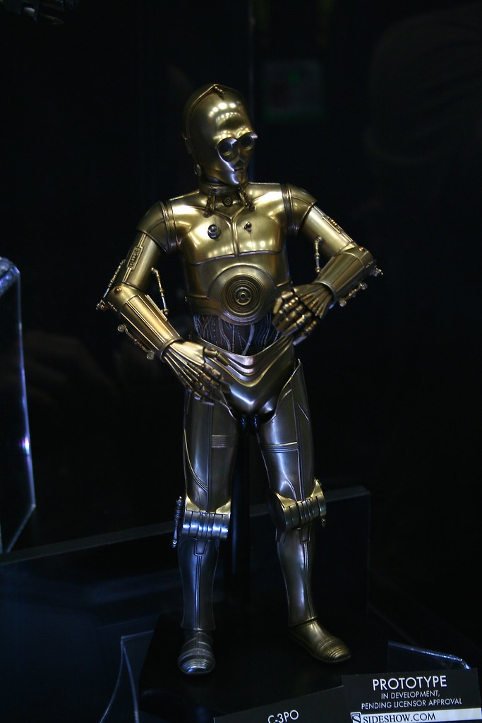
Sideshow 1/6 C-3PO
- Thread starter King Kobra
- Start date

Help Support Collector Freaks Forum:
This site may earn a commission from merchant affiliate
links, including eBay, Amazon, and others.
Pixelpiper
Super Freak
Photo from The Josh.
Damn, all the other photos with the exception of pilot Luke, were so good, but now Josh has dropped the ball. Still amazingly sharp, but the exposure and white balance are off.
Photo from The Josh.

May be the best picture yet... but I don't know. I just don't know.
Pixelpiper
Super Freak
Looking better.

$14.99
DC Comics, 12-Inch Superman Action Figure, Collectible Kids Toys for Boys and Girls
Bopster USA Inc
Darth Waller
Are you on the square?
Photoshop some lit eyes now. 

Photoshop some lit eyes now.
Ask Josh what he thinks about it in person.
Pixelpiper
Super Freak
Photoshop some lit eyes now.
Damn. Like I have nothing better to do… I have to run some of my fresh tomato sauce over to a friend's house, maybe someone else can do the eyes in the meantime?
Pixelpiper
Super Freak
Ask Josh what he thinks about it in person.
Better still, ask him to plead with Sideshow to put the bloody droids on the same level for a new photo. PLEASE! I don't ask for much, but when I do, I expect it to be done right away and to a level of perfection that people will talk about for years.
galactiboy
OT Preferist
Where are the 360 views? I can't recall if we still had them last year... but I'm pretty sure they did in 2012. While I'm stoked by how much we're getting, it's a bummer there's no dios or any extra effort put into this years displays.
Darth Waller
Are you on the square?
Maybe they knew they couldn't compete with the Hot Toys wall of Iron Man. 

- Joined
- Dec 14, 2007
- Messages
- 2,497
- Reaction score
- 27
Open your mouth, 3PO.
All I see is chin now.
All I see is chin now.
Darth Waller
Are you on the square?
He definitely needs a bigger mouth.
user 19388
. . .
- Joined
- Dec 3, 2011
- Messages
- 1,056
- Reaction score
- 45
i always dug this look for 3PO, think I still have this comic somwhere.


- Joined
- Dec 14, 2007
- Messages
- 2,497
- Reaction score
- 27
yeah... mouth needs to be a little more open... but the chin size is the same... I overlaid the images to get sizing right, and they are... taking into account the slight shift in head tilt and camera angles... pretty darned close. I'll be getting him for SURE!!!
Pixelpiper
Super Freak
I'm not sure how companies can keep screwing up 3PO's head. It's extremely basic and very easy to tell during any stage of the 3D design where the faults are. There's enough reference material out there to do a better job than just "good enough". I'm including Tama in the list of companies here, because IMO, they missed the head as well.
jedijim3002
Super Freak
- Joined
- Apr 22, 2010
- Messages
- 12,544
- Reaction score
- 1,434
Looks ok so far. Waits to see final product.
AJEswim
Super Freak
- Joined
- Jan 5, 2013
- Messages
- 280
- Reaction score
- 0
ok so nit picking aside, personally I think the 3P0 and R2 look fantastic and they will be the ones I buy hands down, Idc if the mouth is .001inches too small or what ever. I do however want them to be in scale so I used two photos posted on here earlier and put them in photoshop. WARNING I am not an expert on using photoshop intact I have don't use it often at all, so I may have done this a hard way Idk. Any ways here is a rough look at the scale they will be to each other. I used the Sideshow name cards as references trying to size them equal to each other as best as possible, then moved the image around so that they appeared to be on as equal of ground as possible from what I can tell, in other words this is a very ROUGH reference guide to their height in comparison to each other.


Similar threads
- Replies
- 5
- Views
- 355
- Replies
- 5
- Views
- 446
- Replies
- 3
- Views
- 657
- Replies
- 7
- Views
- 1K


