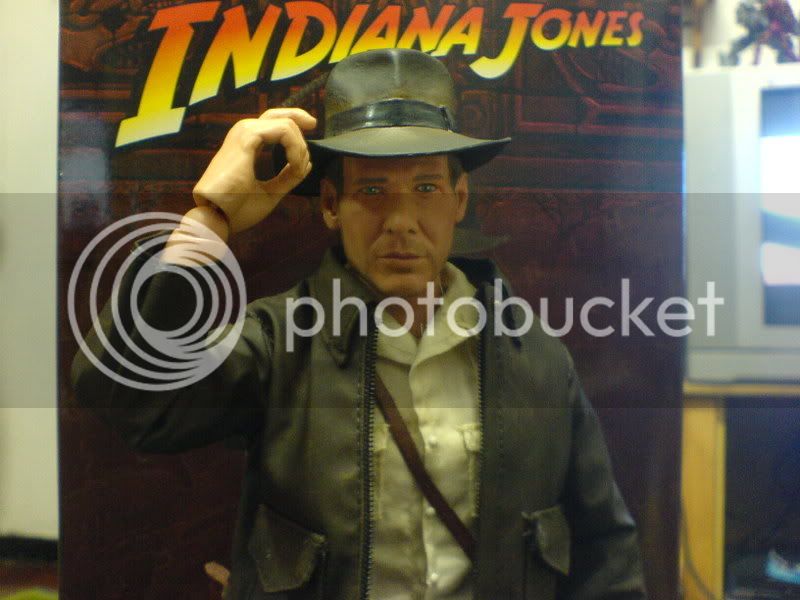
Does anybody else think that the Hat-less head looks better than the Hatted-one??
You are using an out of date browser. It may not display this or other websites correctly.
You should upgrade or use an alternative browser.
You should upgrade or use an alternative browser.
Sideshow 1/6 ROTLA Indiana Jones Image Thread
- Thread starter MaulFan
- Start date

Help Support Collector Freaks Forum:
This site may earn a commission from merchant affiliate
links, including eBay, Amazon, and others.
Memnoch
Lt. Vulture
Does anybody else think that the Hat-less head looks better than the Hatted-one??
It's the same sculpt.
Interesting that SS's new hands each have wrist posts instead of just the hands like HT does. That is nice in case one breaks your not snafu'd.
Ya, I wish HT did this with their new Batmans, would make things much better.
Like you said, it's nice to have spares so if one breaks, theoretically you can get the joint pin out of the hand and swap, not sure, since it pivots I assume you can, if it was permanent in the hand I'd think you couldn't articulate within the wrist.
noisetrigger
Super Freak
Despite Indy being opened for pre-order since March I did not even pre-order because I wasn't impressed with the proto pics. Fast forward a few days ago and in a 'woah' Neo moment, I was impressed enough for these initial pics from HK to at least warrant a second look at Indy.
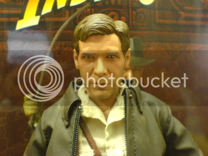
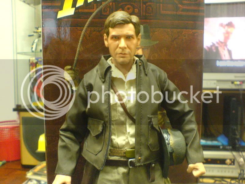
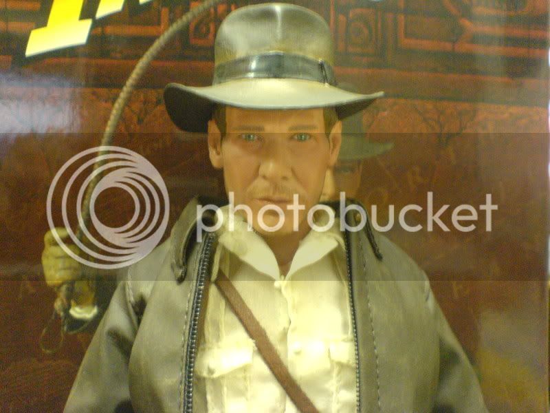
My local dealer got Indy in today and after checking out Indy in person, I came to the conclusion that it is indeed the BEST INDY SCULPT OUT THERE SO FAR. This is right up there with the fantastic looking Sir Alec Guinness sculpt.
Harrison Ford has a weirdly harder than usual face to sculpt and so far, no releases out there that actually captures Harrison Ford (yes, even the Cinemaquette looks nothing like Ford to me, don't even get me started on those Han Solo sculpt, PF looks really promising though).
Well ladies and gentle-men, I am glad to announce that our search is over. This Indy is HARRISON FORD. Pics just doesn't do it justice and as you can see in my pics (soory for bad quality it's night, will take better ones tomorrow), it's Harrison Ford miniaturized.
It looks even better in person and the expression is really a Harrison Ford trademark, the smirk that's kinda there and not there.Trevor really got this sculpt nailed and even Yulli from HT will have trouble topping this.
Only weakness here is really the paint job. With HT setting new standards in paint job with they recent releases, Indy feels a little dated here. It's standard sideshow fair (doll dots, shiny coat, no skin tone effect) and it's sad that they haven't been improving their painting methods. This paint is Star Wars quality folks which was impressive back then but really dated now.
A HT quality repaint will no doubt make this most lifelike.
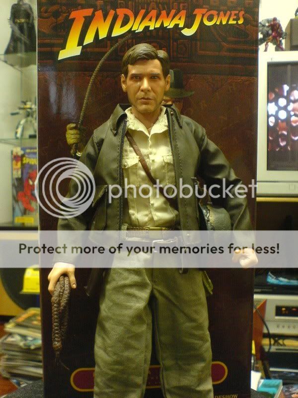
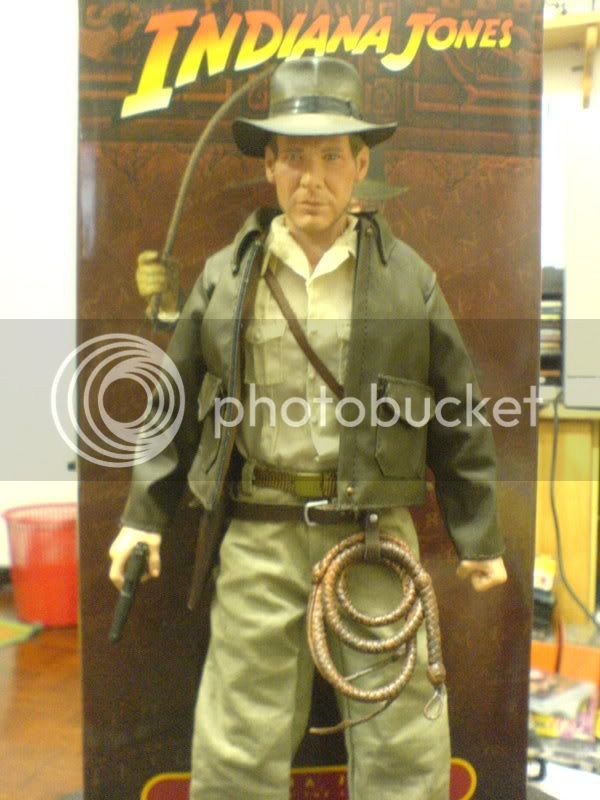
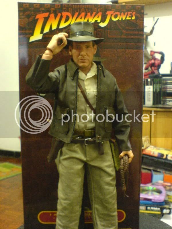
The clothing tailoring got nothing on HT. Material feels cheap (which weirdly fits Indy personality though) and I need to do a lot of trimming because of the large amount of extra thread ends. The jacket is the only thing done right to me. The boots are not the removable type and not very friendly for dynamic posing without a stand size it's very hard.
So how did the new Prometheus body perform? Disappointingly, SS took one step forward and two steps back with this body. Proportionally, it's very similiar to the TT (shoulders a little to narrow for Indy though, I will get to that point later) and articulation wise, it has more range than a TT (not as much as Medi) but what's the point of all these articulation is it's LOOSE??? The hands are fine and solid but the legs, they can barely hold any pose without Indy tipping over. His neck joint is also not as tight as I would prefer but at least still holds a pose.
Overall, it's a big improvement over the Buck but still not quite on the same level as HT TT or Medi 301. The issues that kept it from reaching the same level as those bodies are really minor and hopefully future releases will not have this problem. This is after all their first release with the new body.
Ok, just now I was mentioning how I wished the Prometheus has wider shoulders because Indy looks a little on the thin side. A few factors contributed to this problem. The main being SS age old problem of oversize head. Yes, Indy got quite a big noggin, not quite ROTJ Luke big but still big. I was checking out Raiders of the Lost Ark again just now and while Harrison Ford has a bit of a big head, this sculpt is still a little to big.
Because of the head, the clothing all looked oversize. With his jacket on, Indy looks fine (shoulders still too narrow though) but without his jacket he looks like he is wearing daddy's shirt and pants. With a TT body swap (wider shoulders), Indy should look more balance I reckon.
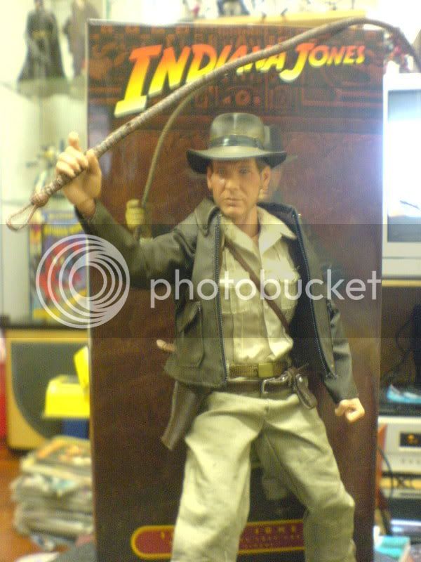
As for accessories, this is where SS got even HT beat. We get two sets of gloved hands and two sets of bare hands (sadly no open palm and this limits certain poses), a revolver (rotating barrel), a handgun with removable clip, a coiled whip, an uncoiled whip, the bag of sand, the Golden Idol, his sling pouch, his hat, the standard stand with a cool "Indiana Jones" printed on it, and two headsculpts, one with the hat on and one without. Both have the same expressions.
Despite a few hits and misses, this is the definitive Indiana Jones 12 inch figure out there and for the price, it's a lot of value for so little money. Enjoy the crappy pics for now and I will try to answer any questions that any of you might have. Cheers.


Last edited:
pjam
Here on the Perimeter
Thank you, Sir! 

Because this is the photo thread (pics from XL toys forum https://www.xltoysforum.com/viewtopic.php?t=5265):


Sorry if they are allready posted
Does anybody else think that the Hat-less head looks better than the Hatted-one??
Probably because the hat brim changes the way light falls on the face where the hatless head has a clear path and can have better lighting fall on it.
King Darkness
Super Freak
- Joined
- Jan 19, 2006
- Messages
- 44,456
- Reaction score
- 210
Does anybody else think that the Hat-less head looks better than the Hatted-one??
Its been said it is the same sculpt, but for some odd reason I can not explain, I too think the hatless Indy looks better

Mad Old Lu
Super Freak
Because this is the photo thread (pics from XL toys forum https://www.xltoysforum.com/viewtopic.php?t=5265):


Sorry if they are allready posted
Note in the second picture the AMSEL poster is upside down. It must be part of the accessories tray and they must have flipped it when putting the tray back.
Incidentally, I never liked that version of the poster. It was first used in the re-release in 1982. I have always thought the first poster (also by Amsel) captured the feel of the movie better and that the second poster made Indy way too happy! Weee! It's a free-wheelin' fun-lovin' adventure for the whole family! Look how much fun Indy's having waving his whip around! Yipee! I know they were trying to capitalize on what a "fun" ride Indy was, but the movie was fun because of the exciting stunts and story, where you felt real thrills because of all the close escapes from dangerous situations, not because it was a light-hearted romp through Cairo!
King Darkness
Super Freak
- Joined
- Jan 19, 2006
- Messages
- 44,456
- Reaction score
- 210


Pix are a bit fuzzy, but I think these best represent what he will look like in hand.
So how did the new Prometheus body perform? Disappointingly, SS took one step forward and two steps back with this body. Proportionally, it's very similiar to the TT (shoulders a little to narrow for Indy though, I will get to that point later) and articulation wise, it has more range than a TT (not as much as Medi) but what's the point of all these articulation is it's LOOSE??? The hands are fine and solid but the legs, they can barely hold any pose without Indy tipping over. His neck joint is also not as tight as I would prefer but at least still holds a pose.
Overall, it's a big improvement over the Buck but still not quite on the same level as HT TT or Medi 301. The issues that kept it from reaching the same level as those bodies are really minor and hopefully future releases will not have this problem. This is after all their first release with the new body.
Sounds like strike 3 in the new body department. I really hope these shortcomings are just because it's the first figure on the body and production tweaks need to get worked out, otherwise, I hate saying it, but I'd almost rather keep the Buck. Maybe I'm just spoiled by HT and Medi, but those bodies are nice and firm in the joints and I've never had a pose I wanted to do where it couldn't support the weight of a weapon or other accessory like SSC bodies tend to.
EVILFACE
Insufferable S.O.B.
Sucks about the Pro body. SS should have just modified a HT TT body like they did for the armor figures. But at least the parts swap over for those that wanna do that.
Its been said it is the same sculpt, but for some odd reason I can not explain, I too think the hatless Indy looks better
It has EVERYTHING to do with the doll dot. Indy wearing a hat where his eyes should be shaded and yet we still see that frakkin ugly useless white dot in his eye.

Its been said it is the same sculpt, but for some odd reason I can not explain, I too think the hatless Indy looks better
I should've clarified, the paint apps on the hat-less one look better...
and bad news regarding the body, this last batch of pictures make it look pretty bad... suffering a little from the Medi Indy syndrome...
noisetrigger
Super Freak
Are some of my pics showing up weird to you guys cause two of the pics are showing right side up for me. Can't seem to fix it.
pjam
Here on the Perimeter
Really lovin' these shots. Best yet...


Mad Old Lu
Super Freak
Yes, these last few pics really make the sculpt look great.
Captain Britain
Super Freak
- Joined
- Jan 26, 2008
- Messages
- 3,596
- Reaction score
- 6
Wait... aren't you one of those who has defended the $150 Medicom figure???
I've defended it in the sense that I don't think its as bad as some people have said...I still think its way overpriced and the body's awful, although at least you get a lot of different accessories from all the movies; the head sculpt looks like Ford to me; and the paint job looks good to me too (those last too being the most important to me). The clothes aren't great and the belt's awful, but at least the clothes hang quite well.
But you definitely couldn't call me a big fan of the Medicom Indy, although I like Henry Snr.
noisetrigger
Super Freak
The hand is slightly big (not ROTJ Luke big though) but mostly exaggerated by me shooting to close to the figure.Why does that hand look so huge?? Hope it's the camera angle.

drbrad1975
Super Freak
Thanks Trigger for the pictures....those are the best pictures I have seen yet. But your pictures show how narrow his shoulders are but the overall figure definitely looks the best in these pics. The narrowness of the shoulders makes his head look too big in my opinion. Which HT True-Type would look best with that figure? The asian color or the white one? Would a regular HT body work? The regular HT is just so much easier to find.
Similar threads
- Replies
- 687
- Views
- 54K
- Replies
- 4
- Views
- 1K
- Replies
- 47
- Views
- 7K
- Replies
- 10
- Views
- 8K
- Replies
- 28
- Views
- 2K


