Premium Format Sideshow Friday the 13th Jason Voorhees: Legend of Crystal Lake Premium Format

Collector Freaks Forum

Help Support Collector Freaks Forum:

This site may earn a commission from merchant affiliate links, including eBay, Amazon, and others.
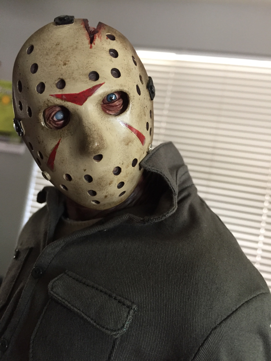
Great example of good light and a proper camera shot. Nice. And even though for the money I shouldn't have to do this...I will be properly blood splattering this monstrosity. [emoji106]


Sent from my iPhone using Tapatalk
That's a great plan. Splatter that blood to get rid of the "dots". It should look much better.
 
b89246929560a3563ca5d8d1084ae194.jpg
Jason is such a b@d@ss, he can piss out a spear gun!
 
I took some photos with my real camera, not phone, in bad light so here they are...
 

Attachments

  • PJV10.jpg
    PJV10.jpg
    192.6 KB
  • PJV9.jpg
    PJV9.jpg
    192.8 KB
  • PJV8.jpg
    PJV8.jpg
    220.2 KB
  • PJV7.jpg
    PJV7.jpg
    224.4 KB
  • PJV6.jpg
    PJV6.jpg
    249.4 KB
  • PJV5.jpg
    PJV5.jpg
    197.5 KB
  • PJV4.jpg
    PJV4.jpg
    179.2 KB
  • PJV3.jpg
    PJV3.jpg
    290.9 KB
  • PJV2.jpg
    PJV2.jpg
    262.2 KB
  • PJV1.jpg
    PJV1.jpg
    141.2 KB
  • PJV16.jpg
    PJV16.jpg
    215.2 KB
  • PJV15.jpg
    PJV15.jpg
    273.8 KB
  • PJV14.jpg
    PJV14.jpg
    198.1 KB
  • PJV13.jpg
    PJV13.jpg
    331.2 KB
  • PJV12.jpg
    PJV12.jpg
    254.4 KB
  • PJV11.jpg
    PJV11.jpg
    216.2 KB
New one wins for me easily... Just a scarier more intimidating looking piece.

Having said that, I did own the old one and just never cared for it. Sold it twice actually.

Agreed. I think this is a case where artistic liberties trumps screen accuracy. The older PF does resemble Brooker from part III more--even down to the coloring of the hockey mask, but you can't beat the detail on the new one. Also, the weapons are far better on the new one and the bases don't even compare.


Sent from my iPad using Tapatalk
 
Thanks for solving my pic issue Patriot666. here's mine.. not in natural light like I wanted but you get the idea. I added a bit more blood to his left leg than I wanted to but nothing I can do about it now so oh well. I'm happy with it.

ed7c3b115050b5fd7725b6b250897639.jpg


5e7328311410f036acc10ea9b3a952bb.jpg


3d42921112c77e3b1fae41e77fca7f4a.jpg


952c8a37d8ba710d4cef472182303a16.jpg


3c3ba78022434c3343458ec8d8d7ace0.jpg


ad643ebd7202f91801e7b291a51ea6a9.jpg


cd5477053aa86726ea0be63d3e2922bf.jpg


882f1e193dadb184cf86fd998a1df284.jpg


742da4356a445e4568ed39102d167f53.jpg


d61aa78be660b16868eca758a30d4840.jpg


c36c28a924dda219446f77152fae7795.jpg


Sent from my Z813 using Tapatalk
 
I don`t have that old PF, but by looking at those pictures with them both, I can see SS have used the same thickness with the pants as the shirt. On the new PF that is. The old one looks just way better with the material used on the pants. I dig the new PF though, but just sayin. Would like SS to not go cheap on that matter.
 
With the back of the shirt pulled back this looks pretty amazing. I think the only improvements could be better blood splatter and a mask repaint.
 
With the back of the shirt pulled back this looks pretty amazing. I think the only improvements could be better blood splatter and a mask repaint.
I agree, it gives him the illusion of being bulkier. I am loving the look. Can't wait until tomorrow.

Sent from my SM-G935V using Tapatalk
 
Back
Top