You are using an out of date browser. It may not display this or other websites correctly.
You should upgrade or use an alternative browser.
You should upgrade or use an alternative browser.
Sideshow Superman Man Of Steel Premium Format
- Thread starter RagingBull
- Start date

Help Support Collector Freaks Forum:
This site may earn a commission from merchant affiliate
links, including eBay, Amazon, and others.
Damn that is one helluva camera. Those are the best pics I've seen yet.
amazing pics Emzi!
- Joined
- Apr 9, 2007
- Messages
- 5,700
- Reaction score
- 5,819
Damn that is one helluva camera. Those are the best pics I've seen yet.
You're bringing out my competitive instincts...
Really great shots man!

$14.99
DC Comics, 12-Inch Superman Action Figure, Collectible Kids Toys for Boys and Girls
Bopster USA Inc
- Joined
- Apr 9, 2007
- Messages
- 5,700
- Reaction score
- 5,819
You know I can't stop myself...


just a *little* help from my bridge cue!


just a *little* help from my bridge cue!
- Joined
- Apr 9, 2007
- Messages
- 5,700
- Reaction score
- 5,819


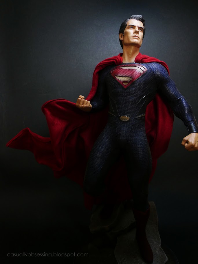
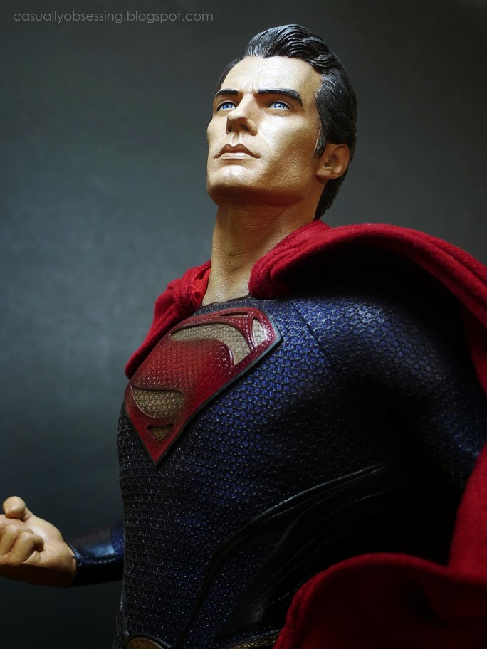
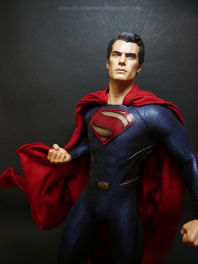
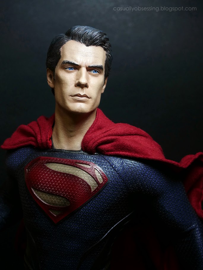
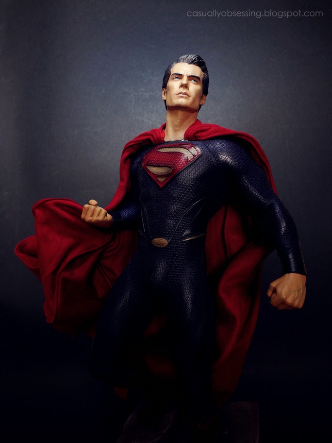
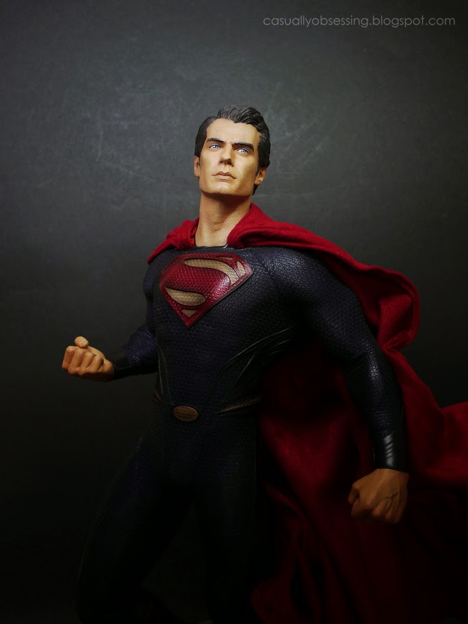
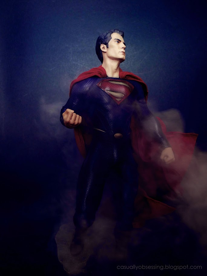
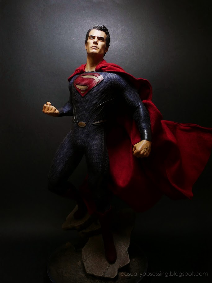
These are of course quite similar. It's amazing what a slight tilt of the lamp can do to the lighting and the tints the camera pics up... not sure which I like best.
Last edited:
Mr. Green
Super Freak
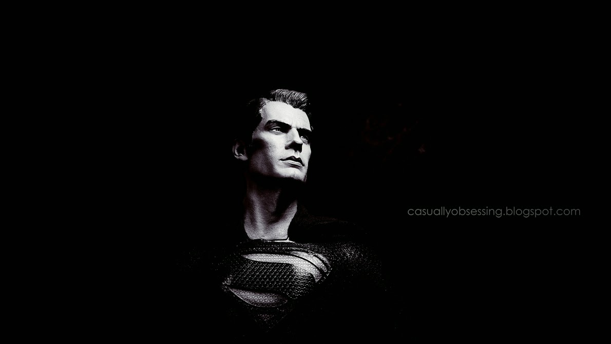
why does he look dusty or something? like he got grey hair and suit look old instead of glossy.
they should've make the symbol and boot solid red instead of making every part of the uniform mesh-like
they should've make the symbol and boot solid red instead of making every part of the uniform mesh-like
- Joined
- Apr 9, 2007
- Messages
- 5,700
- Reaction score
- 5,819

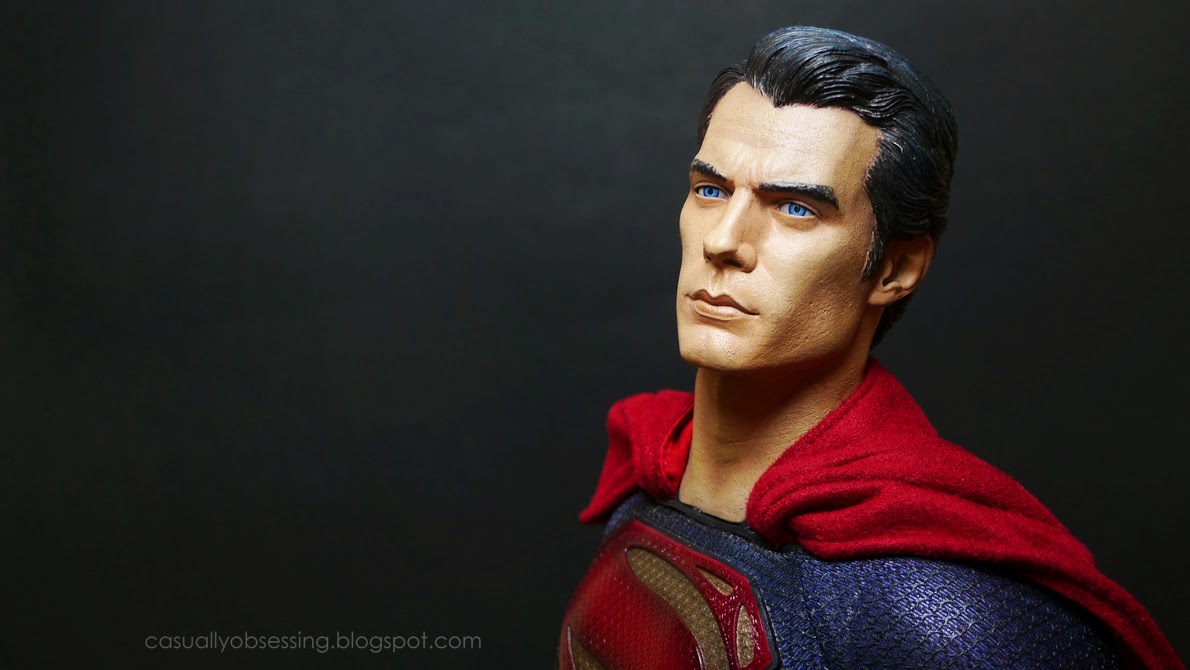
Just a little reflection from the lamp light in a darkened room. If you look at the shots of the prototype from SDCC 2013 you'll see the same effect from the harsh florescent lighting. I'm not using a diffuser here, just my trusty desk lamp...

As for the design of the suit, I guess you'll have to take that up with Zack Snyder
 .
.
Last edited:
mattski
Freaked Out
Just a little reflection from the lamp light in a darkened room. If you look at the shots of the prototype from SDCC 2013 you'll see the same effect from the harsh florescent lighting. I'm not using a diffuser here, just my trusty desk lamp...
Great photo QuiGonFishing, thank's for sharing it us
- Joined
- Apr 9, 2007
- Messages
- 5,700
- Reaction score
- 5,819
Thanks Matt!
As you can tell, my approach is strictly make-shift. Black blanket barely concealing the couch behind it, balancing my table lamp on a U-Haul shipping box and a pool cue holding up the cape! I guess creativity is really borne from necessity... Cheers!
As you can tell, my approach is strictly make-shift. Black blanket barely concealing the couch behind it, balancing my table lamp on a U-Haul shipping box and a pool cue holding up the cape! I guess creativity is really borne from necessity... Cheers!
Pretty resourceful to get the shot Quigon. 
I like it man. Gives a pretty good representation of how the suit's colors look like in person.
I like it man. Gives a pretty good representation of how the suit's colors look like in person.
GeneralZodLives
Super Freak
New pics are great! I still love looking at this statue.
awesome pics QuiGon!  keeping this thread alive!
 keeping this thread alive!
Awesome pic QuiGone! 
That shot looks just like the proto from the con.

That shot looks just like the proto from the con.
- Joined
- Apr 9, 2007
- Messages
- 5,700
- Reaction score
- 5,819
Thanks guys! I appreciate the comments very much!
Marker, I may be able to pull off a descent shot now and then, but I can't get to the Proto level of awesome. That paint job is just way too good.
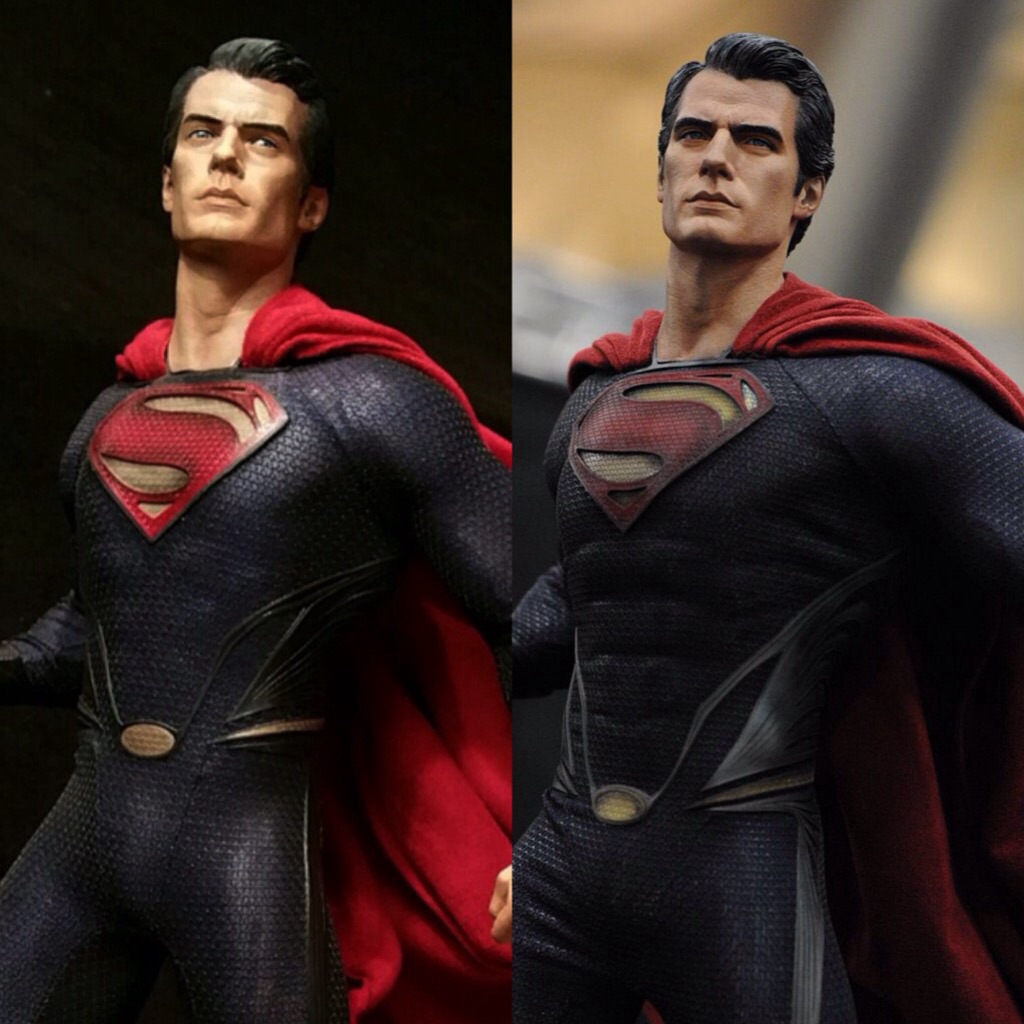
But the point of all of this is, the sculpt is there, folks. I think the issue is that the SSC in house artisans used a lot of detailed shading and care in their work to highlight the detail in Trevor's sculpt on the Proto. You can get somewhere near that effect if you take a lot of care in the lighting, because the topography is there even if the factory paint job is a little flat...
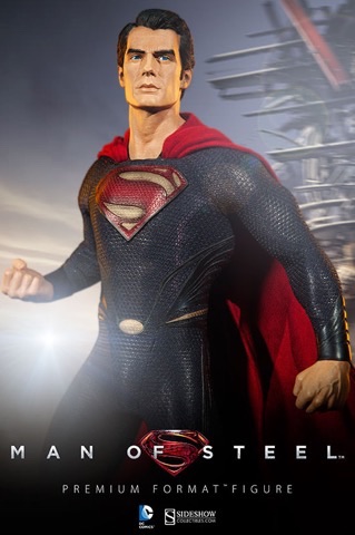
Oh, and the other point is that the SSC staff photographers should be flogged:

Last edited:
Sculpt is definitely there.
- Joined
- Apr 9, 2007
- Messages
- 5,700
- Reaction score
- 5,819
Nice lighting or no, Factory paint apps < Proto paint art:

Similar threads
- Replies
- 0
- Views
- 165
- Replies
- 0
- Views
- 187
- Replies
- 0
- Views
- 401
- Replies
- 23
- Views
- 3K


