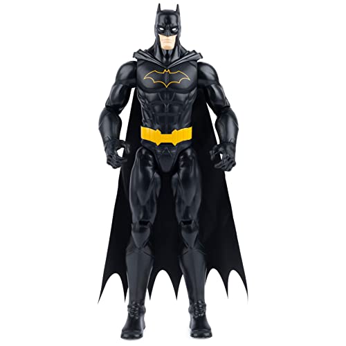
Well to each his own, I have this on preorder and I don’t regret it; nevertheless, I do see some flaws. Mainly, his waist is just to tiny. The utility belt is very bulky and his thighs are large so it almost looks like the top half of his body above his utility belt does not belong on the bottom half. Also a few times it sort of looked like he was wearing a scarf, like the fabric was sticking out a little to much from the back of his neck and it wasn’t perfectly in unison with the back of his head.
I really do like how you can cover his whole body with the cape tho...like he is disappearing into the shadows. I think the figure in hand will be a lot more appealing once you are able to pose him the way you want and experiment with the way you want his cape to sit; which I think will make a lot of difference for each individual.
It isn’t easy to take a Batman that is completely comic centered and translate it into a more real life, practical, piece. It almost looks silly and it should. Which is why the cinematic Batman usually has a straight black and leather look to his suit.
Overall; it’s not perfect but It is a super nice generalized comic version.
Sent from my iPhone using Tapatalk


