- Joined
- Oct 1, 2014
- Messages
- 6,293
- Reaction score
- 1,491
Welcome to the Anatomy of a pose, a place for newcomers and veterans alike to share their tips, tricks, and techniques to making their figures come to life.
Only together can we fight boring shelves full of straight armed mannequins!
In here I'd like to see all of you post pictures and discuss the whys, hows, and logic behind your pose. What's your secret to those shots that 110% sell the fact that these are the most realistic figures on the market? Post that figure that's been giving you difficulty and get suggestions on what to tweak!
Inspired by a great discussion in the QMX Trek thread with very sound commentary, I felt the need to finally bring a thread to life that I'd thought about for a good while.
Typically things stay the way I pose them once I've opened them up. That being said I'll usually tweak that over a few weeks until it's perfect.
Major reposes occur when I goof and ruin the one I had when futzing or moving a figure. Once you break that perfect balance point, it's all over. It'll never be the same. You HAVE to start from scratch to ensure a stable pose that looks good and avoids toppling.
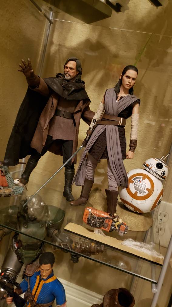
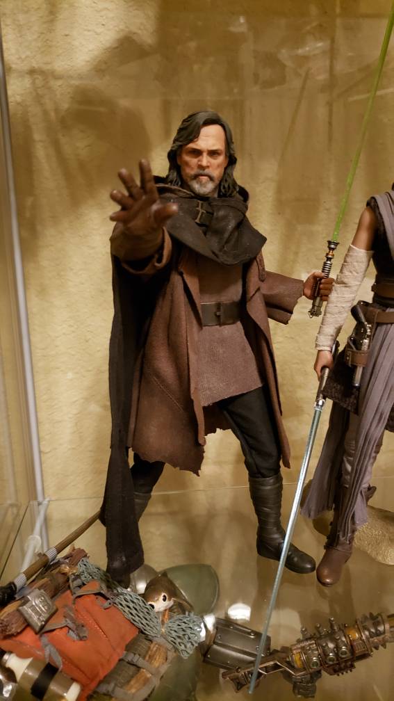
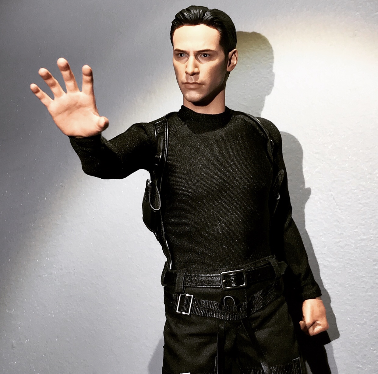
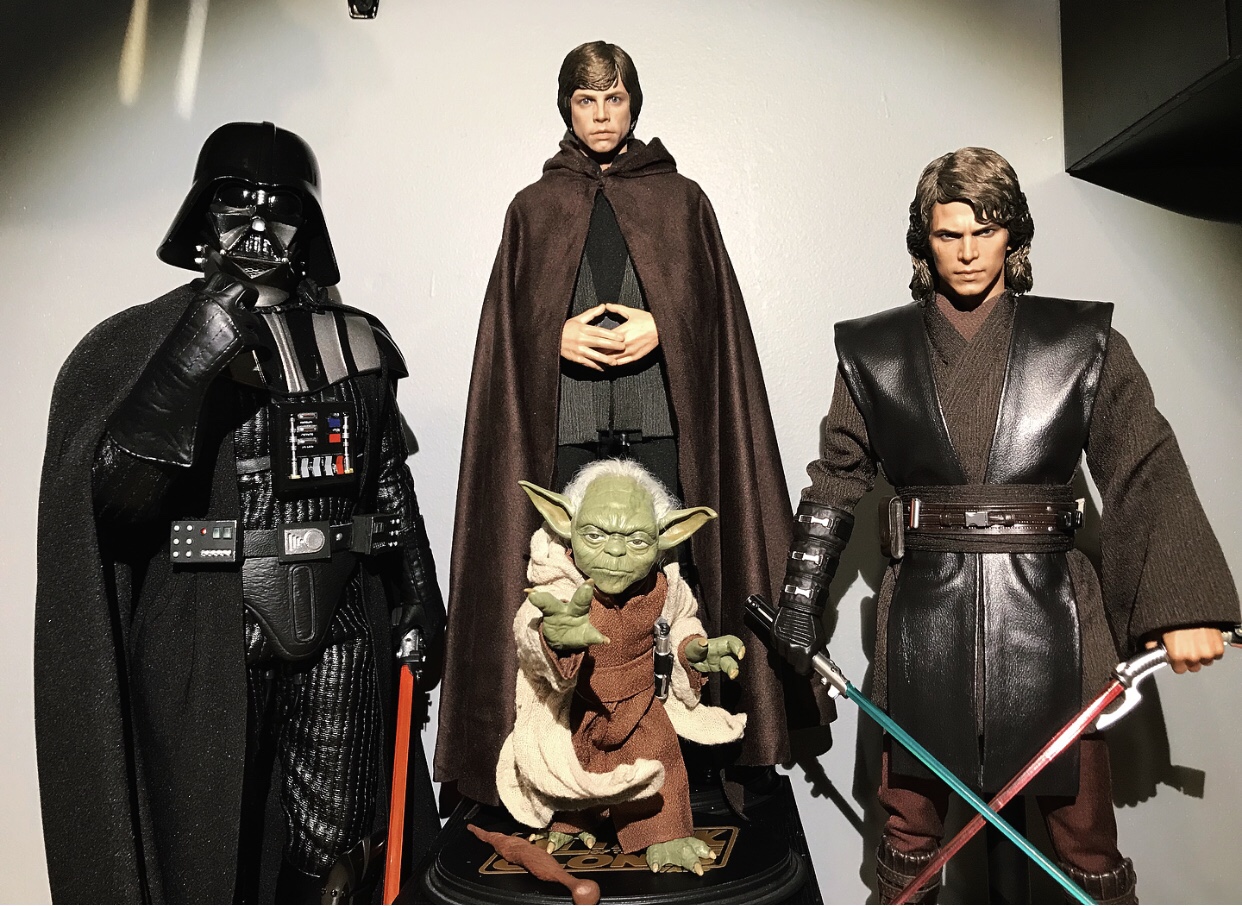
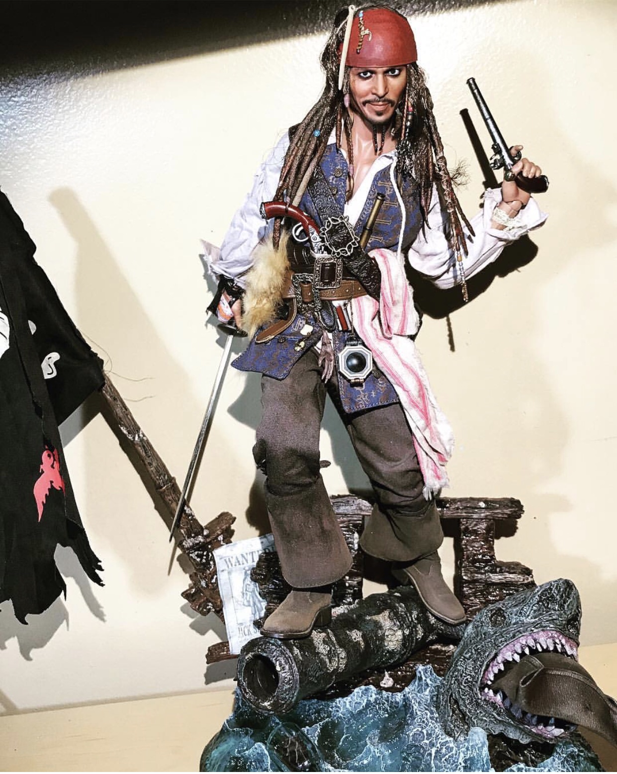
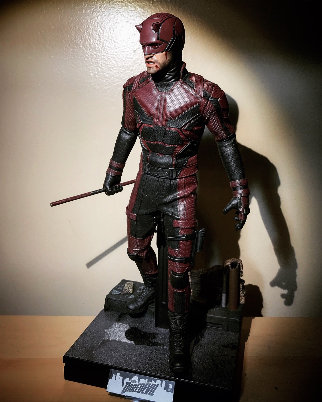
That being said, posing is the most underappreciated art in this hobby. I don't understand how so many people can buy a $200, or even a $20 figure, and just place it on a shelf, arms outstretched. These things look like little humans, why make them appear to be a doll? You've already paid the entry price for the realism, no reason to stop when displaying the figure.
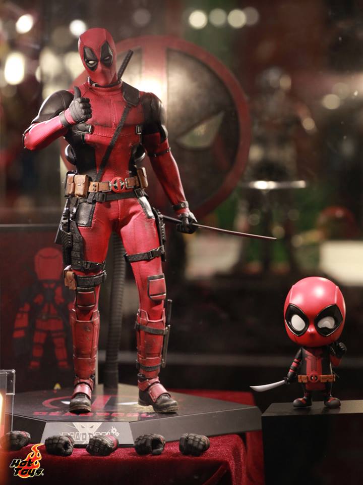
And I'm not knocking museum poses. Proper museum poses capture the nuance and attitude of a character in a reserved state. You don't have to be executing high kicks to "properly pose". Case in point: Hot Toys Deadpool.
Every pose should tell a story. It should answer the question that comes to mind, or prompt one. Your audience (that includes you) should look at a figure and think:
"Tony's armor is damaged, so he popped his visor and is aiming down his foe"
"What's Tyrion contemplating? Whores? Power? Money?"
"What base did Barney Ross just clear?"
"Wolverine looks tense, standing at the ready; he's about to go berserk, isn't he?"
"Oh look, The Doctor just arrived, and he's making a show of it."
"But you haven't tried MY product. Now. Say. My. Name."
Never should the audience solely say "that's a cool figure" and move on to something else. The cool factor should simply be the introduction to further investigation. EVERYONE knows when they were successful: someone gets stuck at your display cabinet and starts to grin, eyes glued to each piece, zipping back and forth to satiate another glance. You've all had this happen before when showing your collection to a guest. You know when you pull it off.
It's like having a proper musical arrangement fill your movie trailer, not some cheap two-bit cross promotion with a rapper. The former sells an idea. The latter makes for a forgettable, generic "action movie 32" preview.
Movie companies do this too. Look at character shot posters and apply this same concept. Which ones catch your attention?
Compare this:

To this:

It's a big difference here, but I think it conveys the point. Poster 1 delivers "Oh, that's the girl from the new Star Wars movie". Poster 2 however offers exposition, thought. There's character to it. It makes me ask WHY as opposed to just stirring film recognition. Even if you took out the background of Poster 2, there is still an aura of wonder around the attitude of Rey, not just an image.
Those are my general thoughts. For now. More to come, hopefully from some of the experts on here!
Only together can we fight boring shelves full of straight armed mannequins!
In here I'd like to see all of you post pictures and discuss the whys, hows, and logic behind your pose. What's your secret to those shots that 110% sell the fact that these are the most realistic figures on the market? Post that figure that's been giving you difficulty and get suggestions on what to tweak!
Inspired by a great discussion in the QMX Trek thread with very sound commentary, I felt the need to finally bring a thread to life that I'd thought about for a good while.
Typically things stay the way I pose them once I've opened them up. That being said I'll usually tweak that over a few weeks until it's perfect.
Major reposes occur when I goof and ruin the one I had when futzing or moving a figure. Once you break that perfect balance point, it's all over. It'll never be the same. You HAVE to start from scratch to ensure a stable pose that looks good and avoids toppling.
That being said, posing is the most underappreciated art in this hobby. I don't understand how so many people can buy a $200, or even a $20 figure, and just place it on a shelf, arms outstretched. These things look like little humans, why make them appear to be a doll? You've already paid the entry price for the realism, no reason to stop when displaying the figure.
And I'm not knocking museum poses. Proper museum poses capture the nuance and attitude of a character in a reserved state. You don't have to be executing high kicks to "properly pose". Case in point: Hot Toys Deadpool.

Every pose should tell a story. It should answer the question that comes to mind, or prompt one. Your audience (that includes you) should look at a figure and think:
"Tony's armor is damaged, so he popped his visor and is aiming down his foe"
"What's Tyrion contemplating? Whores? Power? Money?"
"What base did Barney Ross just clear?"
"Wolverine looks tense, standing at the ready; he's about to go berserk, isn't he?"
"Oh look, The Doctor just arrived, and he's making a show of it."
"But you haven't tried MY product. Now. Say. My. Name."
Never should the audience solely say "that's a cool figure" and move on to something else. The cool factor should simply be the introduction to further investigation. EVERYONE knows when they were successful: someone gets stuck at your display cabinet and starts to grin, eyes glued to each piece, zipping back and forth to satiate another glance. You've all had this happen before when showing your collection to a guest. You know when you pull it off.
It's like having a proper musical arrangement fill your movie trailer, not some cheap two-bit cross promotion with a rapper. The former sells an idea. The latter makes for a forgettable, generic "action movie 32" preview.
Movie companies do this too. Look at character shot posters and apply this same concept. Which ones catch your attention?
Compare this:

To this:

It's a big difference here, but I think it conveys the point. Poster 1 delivers "Oh, that's the girl from the new Star Wars movie". Poster 2 however offers exposition, thought. There's character to it. It makes me ask WHY as opposed to just stirring film recognition. Even if you took out the background of Poster 2, there is still an aura of wonder around the attitude of Rey, not just an image.
Those are my general thoughts. For now. More to come, hopefully from some of the experts on here!


