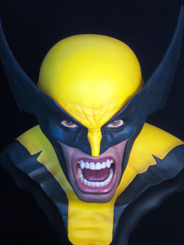
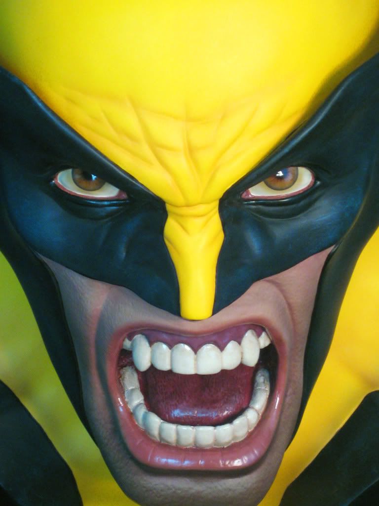
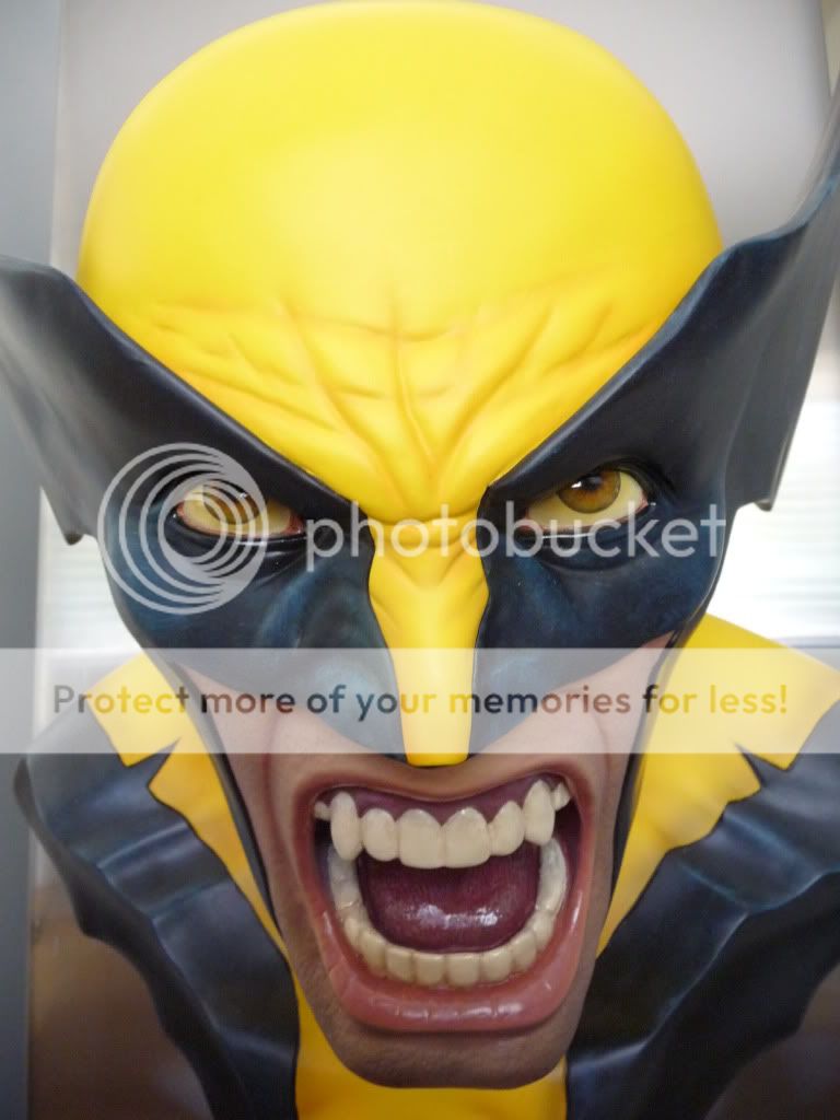
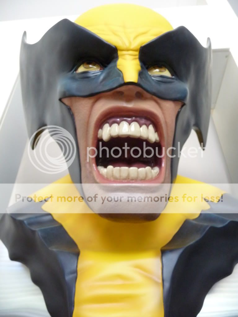
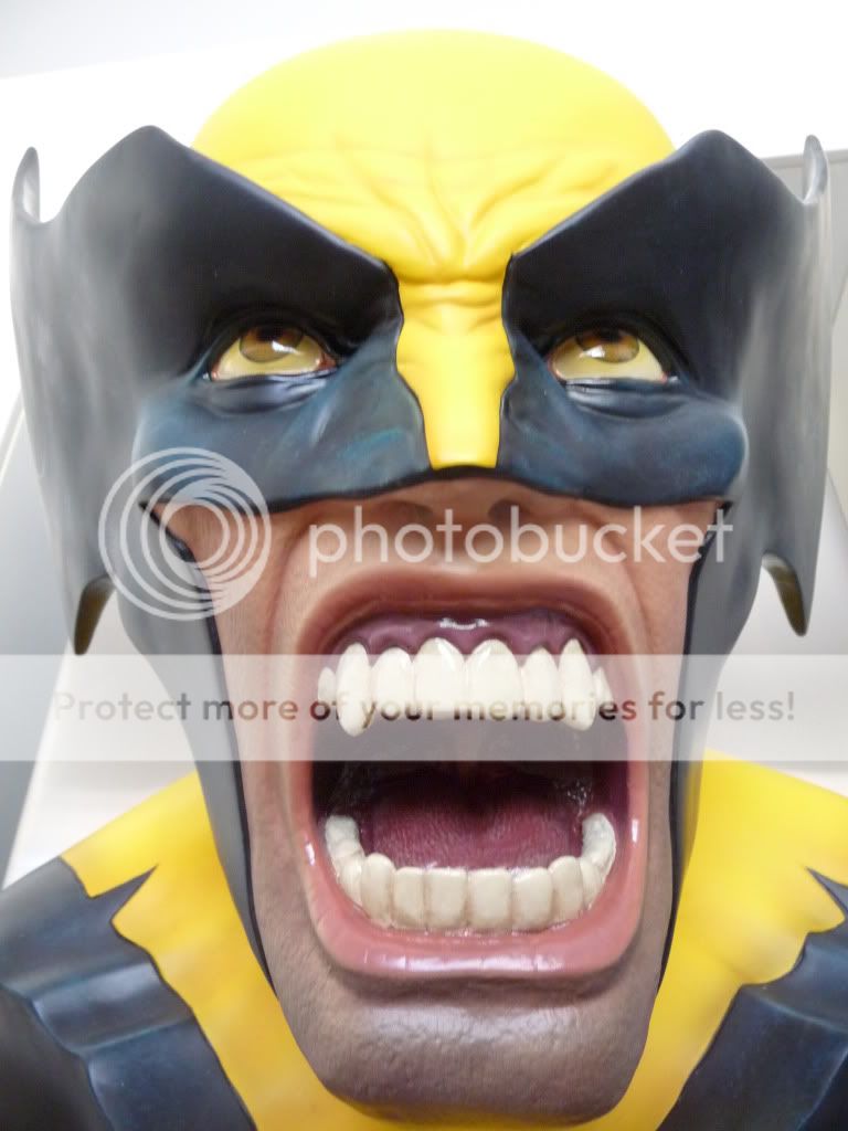
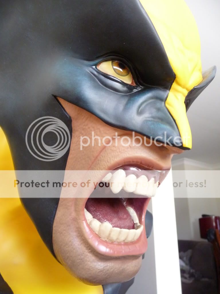
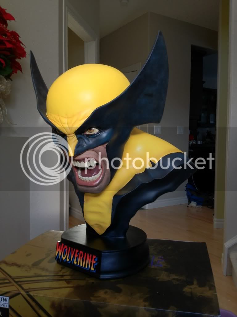
Wolverine: Berserker Rage 1:1

Collector Freaks Forum

Help Support Collector Freaks Forum:

This site may earn a commission from merchant affiliate links, including eBay, Amazon, and others.
:goodpost: Agreed, the Ironman 1:1 bust looks so much better without the non-removable nameplate at the bottom. I don't mind the nameplate if they at least make it removable.

It doesn't hurt the pieces and it keeps up with the continuity. I like consistency among my pieces.
 
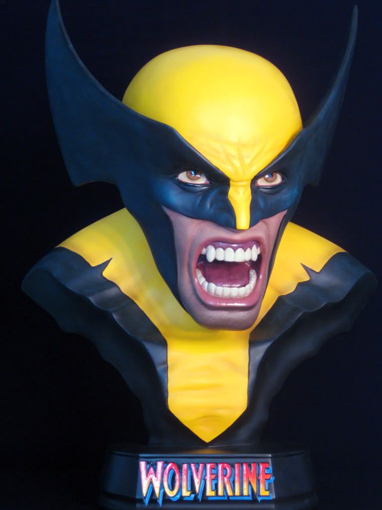
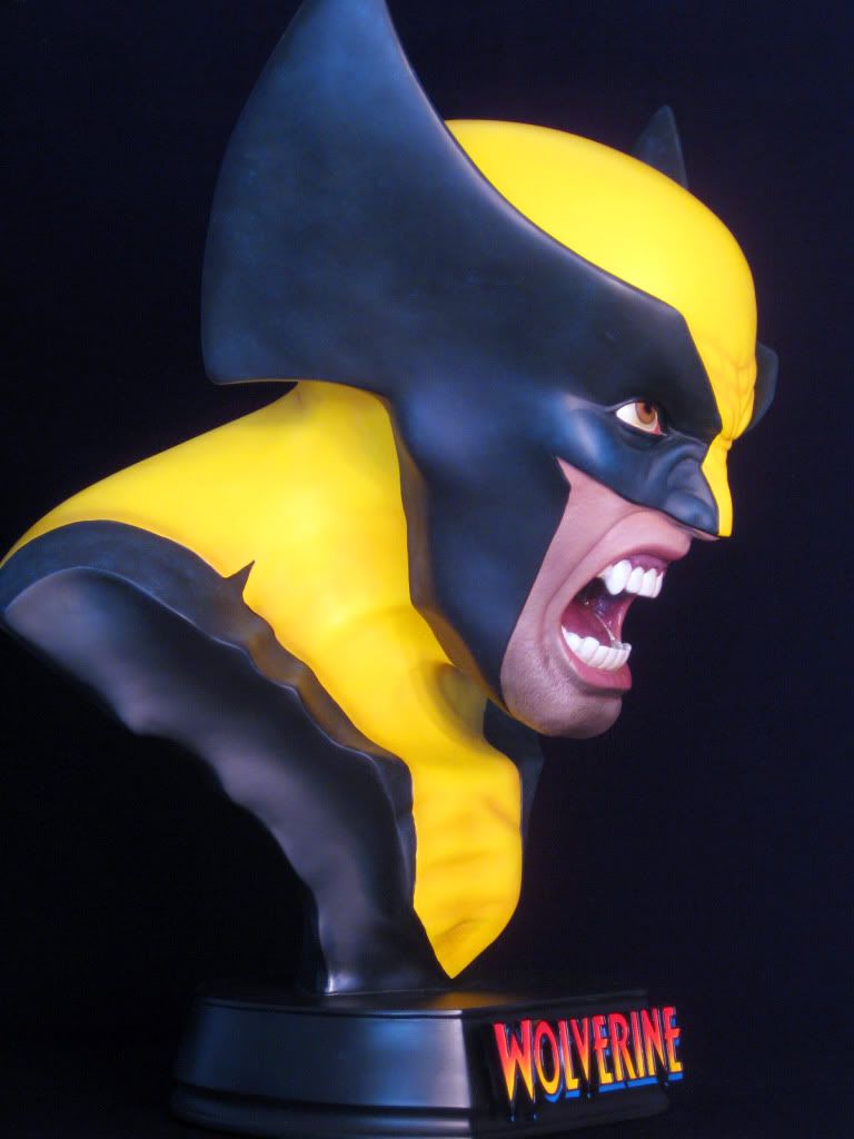
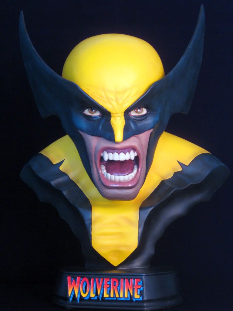
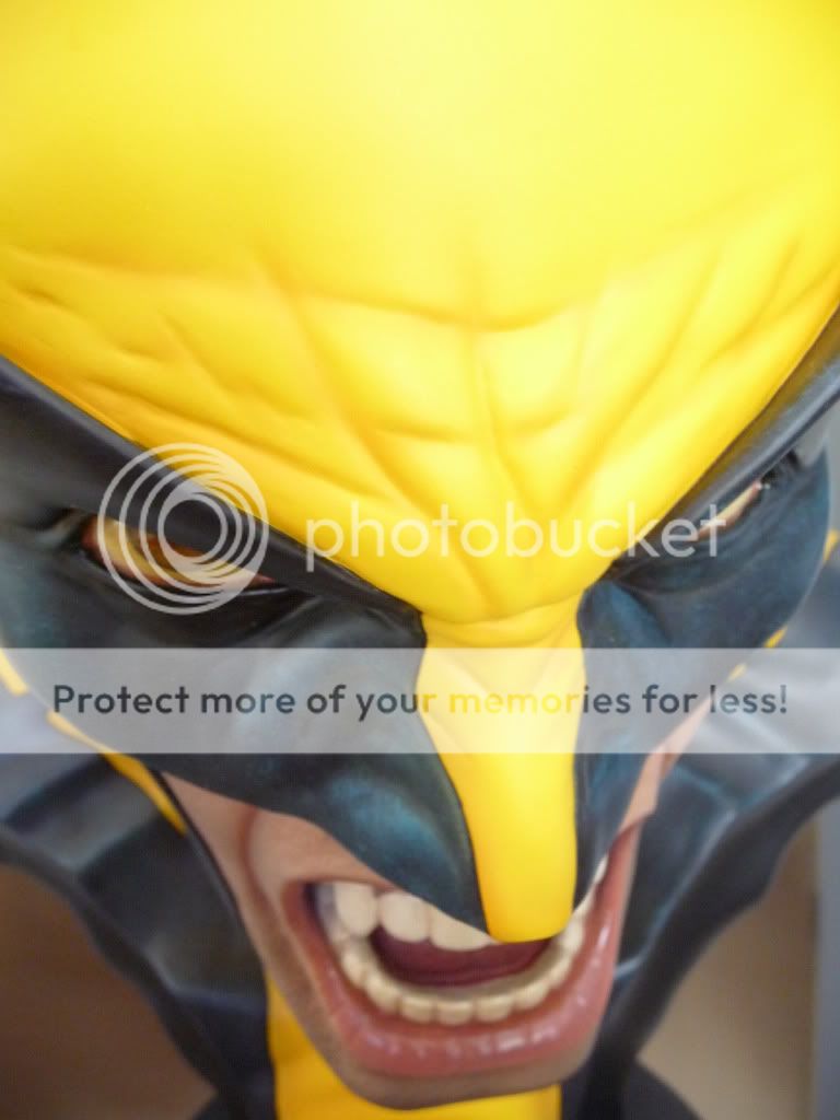
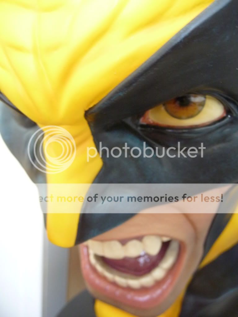
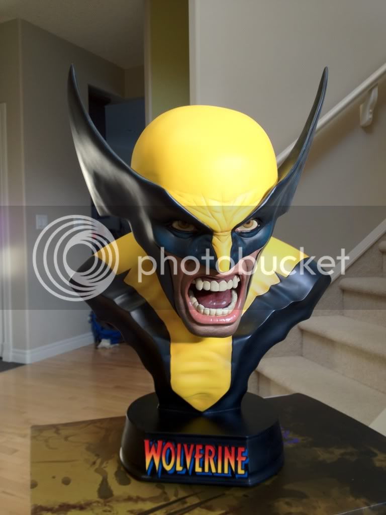
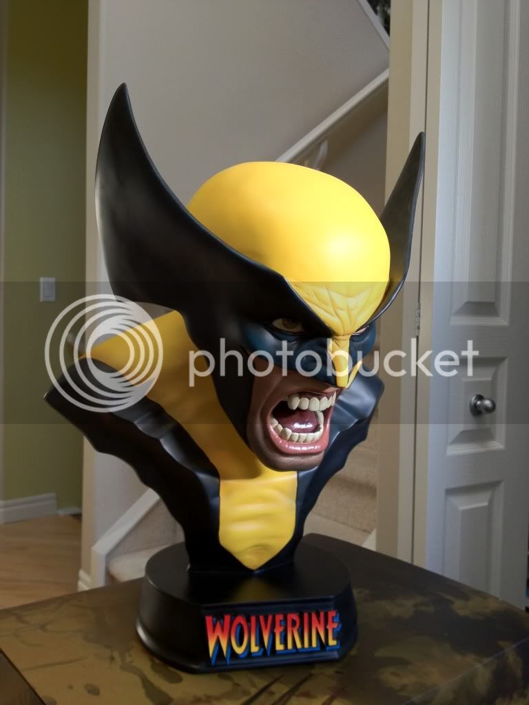
Thought I would add some more recent photos of this awesome bust! The 1:1's cost more money, but they are some of the highest quality pieces that Sideshow produces nowadays. Wolverine and Thor are both focal points in my collection and I'm eagerly awaiting to add the upcoming Captain America 1:1 to my collection.

IMG_0966.jpg


IMG_0967.jpg


IMG_0968.jpg


IMG_0969.jpg


IMG_0970.jpg


IMG_0971.jpg
 
Thought I would add some more recent photos of this awesome bust! The 1:1's cost more money, but they are some of the highest quality pieces that Sideshow produces nowadays. Wolverine and Thor are both focal points in my collection and I'm eagerly awaiting to add the upcoming Captain America 1:1 to my collection.


IMG_0968.jpg


IMG_0969.jpg


IMG_0970.jpg


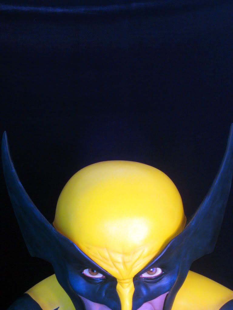
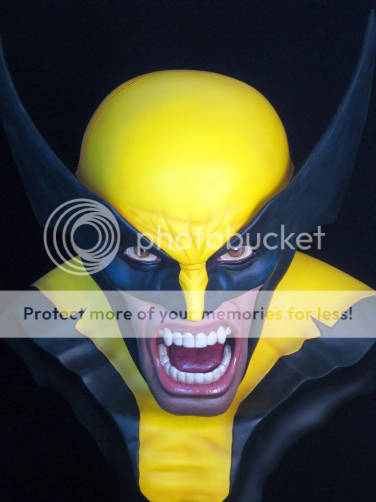
I like this bust but the top half of the head is off centre and too non symmetrical for my liking. I thought it might just be mine but this one seems just as bad. It isn't too noticeable from side on but front on I find it distractingly obvious that the skull looks warped to the right hand side.
Great pics but Mister :clap
 
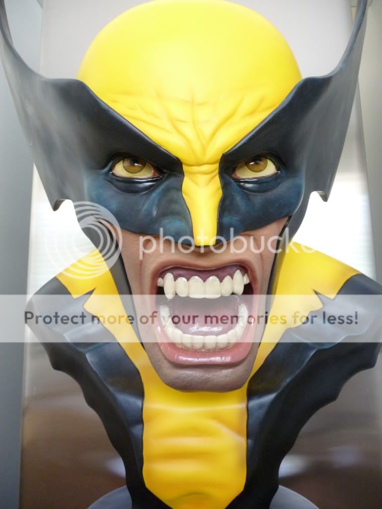
The only thing I see is that hes got his head slightly turned ...otherwise I think I would have to get out some calibration tools and instruments to notice or prove what your noticing...Looks great to me
 
The only thing I see is that hes got his head slightly turned ...otherwise I think I would have to get out some calibration tools and instruments to notice or prove what your noticing...Looks great to me

he's looking down & to his left. the mouth is right above the N in wolverine

Sorry if I was vague in trying to describe what I thought was off on the top corner of the head :) I put a red line in the part that throws me - when I look at it front on that area seems too far over to the side and higher on the same side aswell.

IMG_0970.jpg
 
NUMBA! 71 IN DA HOUSE.
I'm impressed with this piece, im so glad i picked this one up. They did a pretty good job with the sculpt. The mouth had me worried with some other peoples shots, But now that ive seen this in person and taken my own shots with my crappy phone i can say the mouth is in pretty good scale.
Heres some pics from my iphone. enjoy.

wolvie1.jpg


wolvie2.jpg


wolvie3.jpg
 
Last edited:
Back
Top