Eli26
Super Freak
yep, profile looks much better than straight on.
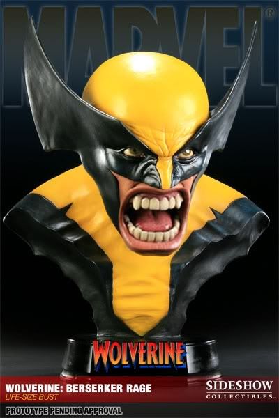
It looks awesome straight on and with the eyes as is.

yep, profile looks much better than straight on.
the "big mouth" version is all i see now when i look at this piece lol


the "big mouth" version is all i see now when i look at this piece lol
Hmm...looks terrible to me. It has the big teeth syndrom that Sideshow has on it's busts. Congrats to those who like it though.


you know, the more i look at it, the more i see "odd" on it. The eyes, they look much better white, because, maybe I am wrong, but when colored it, they look like almost wide-eyed surprise/agitated look, not anywhere near berserker rage. They should be more squinted (not VERY squinted though). The brow should be more furrowed down. And those head/wing things on the side of his head make no sense. Unless this is more of a recent design change - were those wings more of an area for his hair to sort of flow? I mean, I could very well be wrong but that was always how I saw it. And thusly they should be closer to his head and further back. aiya.


 ...no.
you know, the more i look at it, the more i see "odd" on it. The eyes, they look much better white, because, maybe I am wrong, but when colored it, they look like almost wide-eyed surprise/agitated look, not anywhere near berserker rage. They should be more squinted (not VERY squinted though). The brow should be more furrowed down. And those head/wing things on the side of his head make no sense. Unless this is more of a recent design change - were those wings more of an area for his hair to sort of flow? I mean, I could very well be wrong but that was always how I saw it. And thusly they should be closer to his head and further back. aiya.
Enter your email address to join: