Centurion
Super Freak
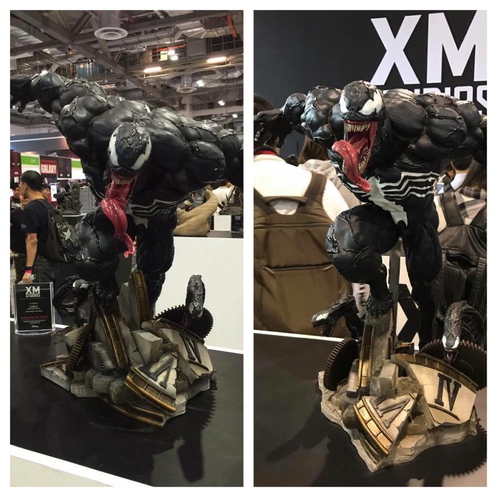
Wow! Portrait with the tongue out for the win.

Wow! Portrait with the tongue out for the win.

Best I could do . The original statue was leaning forward more and had more of a leaning side angle.

Sent from my iPhone using Tapatalk
I think this makes the difference quite pronounced. Personally I prefer the leaning pose because it offers more presence and dynamism to the statue. The one on the right feels quite dead; yes he's posing there with his tongue out looking menacing and all, but that's the thing. He's posing there, there's no movement, no lunge like what the concept art led us to expect of the statue. Disappointed, I will wait till I get this on hand before passing any judgement, but I was hoping for this one to be my XM grail. Doesn't look like it's gonna happen anymore. If anything, I've still got the bust on po too.


I think this makes the difference quite pronounced. Personally I prefer the leaning pose because it offers more presence and dynamism to the statue. The one on the right feels quite dead; yes he's posing there with his tongue out looking menacing and all, but that's the thing. He's posing there, there's no movement, no lunge like what the concept art led us to expect of the statue. Disappointed, I will wait till I get this on hand before passing any judgement, but I was hoping for this one to be my XM grail. Doesn't look like it's gonna happen anymore. If anything, I've still got the bust on po too.


The new pose shows more of the statue off, that leaning pose would require you to put him on a high self in order to see him properly... And to be honest that leaning pose brings back nightmares of SS statues that have leaned in the past because that's what it would look like

From radd titan, video showing all 3 heads:
https://youtu.be/SfzUGk8askA
The more I look at the new improvement the more I love it.
Would be really cool for someone to make a custom coh holder for those extra portraits. Shame to put them away in the box and not have them constantly showing.
Enter your email address to join: