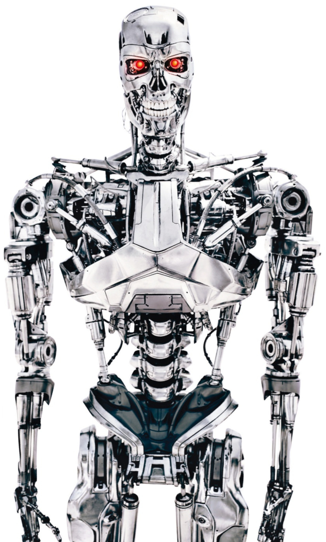
Re: 1/6 Hot Toys - Terminator Genisys: Endoskeleton Collectible Figure
(BTW a nice picture of T1 skeleton proportions for those who can see the difference with T2), but i get what you mean.
Thanks.
In my opinion the main difference between all endos is this:
The shoulders on the T2, T3 & Salvation endos going by reference pics and all the figures out there (-apart from the HT endo figure-) would not fit inside Arnold's body. The shoulders are too wide. A simple way to tell is if you make an L between the skull and the collarbone, most T2 endo's the length from the collarbone to the end of the shoulder is around the same length as the lower horizontal line of the L between the skull and collarbone itself.
https://www.youtube.com/watch?v=iUFXXB08RZk
This is too wide. In T1 and in Genisys you can see that the lower horizontal line of the L is less between the end of the collarbone and the end of the shoulder than it is between the skull and the end of the collarbone. That would fit inside Arnold's body. T3 (shown below) was I believe the same endo as T2:
But the biggest mistake, (in my opinion) from T2 & T3 onwards was this:
The artists forgot what makes the endo so frightening. It is the fact that (IMO) it alludes to a real skeleton, which is (I suppose genetically) frightening to humans. Take the spinal vertebrae. In salvation they tried to create an endo which looked bulked up and beefy. The spine at the pelvic bone started out narrow and got wider as it moved into the chest (the opposite of a real human skeleton). They did this to give it a V shape waist, reminiscent of a football player or muscular body builders, but completely lost the primal fear factor that a genuine human skeleton brings. They added shoulder pads and filling on the inside of the humerus to again simulate the overall bulkiness of a muscular man, completely losing the point Jim Cameron tried to make by using actual human skeletal proportions.

The same with T: Genisys, while the shoulder with is correct again, the spine, etc. (while better than before) still deviates from the intention of Cameron. Also the "bodywork" plates, etc. are too smooth, "Apple" designed like . if that makes sense. Not "raw" and "insidey" enough.
Then again the whole movie (to me) was like a teenage kids film, with all the sexual angst and the overt pressure to make jokes about the nakedness of Reese as if catering to a 12 year old audience, but that's another matter entirely.


