1/6 SSC ESB/ROTJ Darth Vader Modification Thread

Collector Freaks Forum

Help Support Collector Freaks Forum:

This site may earn a commission from merchant affiliate links, including eBay, Amazon, and others.
This is what the reveal head looks like put together on the helmet.. I hate how it doesn't look right because the OCD in me wants to use this as a Vader to pull apart to show to friends the reveal sculpt on the shelve.. -__-

Sideshow dropped the ball there IMO.
 
zv6g5u.jpg


Wish there was a way to make that ****in dome work.
 
2my19ix.jpg


Mod of my vader. Took quite a bit off! Looks better now, maybe even a bit tóó angled but I like the look! He's not looking up.

Is that what the SSC V2 looks like with no cape or is that on a different body? This pic looks really strange.
 
Is that what the SSC V2 looks like with no cape or is that on a different body? This pic looks really strange.

Experimenting with the angle of the helmet. That's the V2 vader with only a helmet mod. Not glued yet just trial.

Also, I made the reveal head work! With a lowered dome if you reposition the head inside a bit. Will buy tiny magnets to make mine fully reveal-able to show off to people coming to visit! :rock
 
I agree with TaliBane, Vader looks weird in that shot, ez. Really skinny for some reason, and the upper arms seem really long. Perhaps it's a bit of lense distortion.


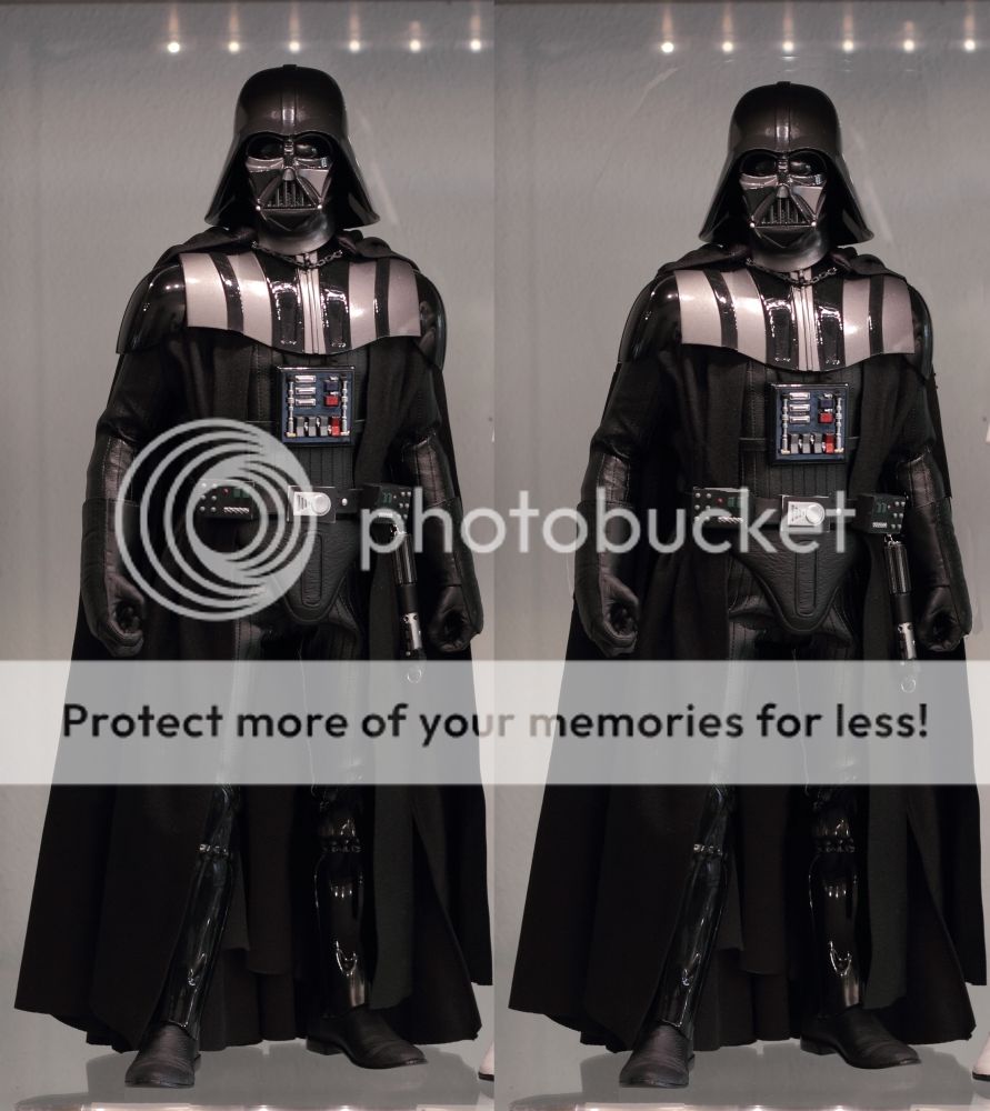
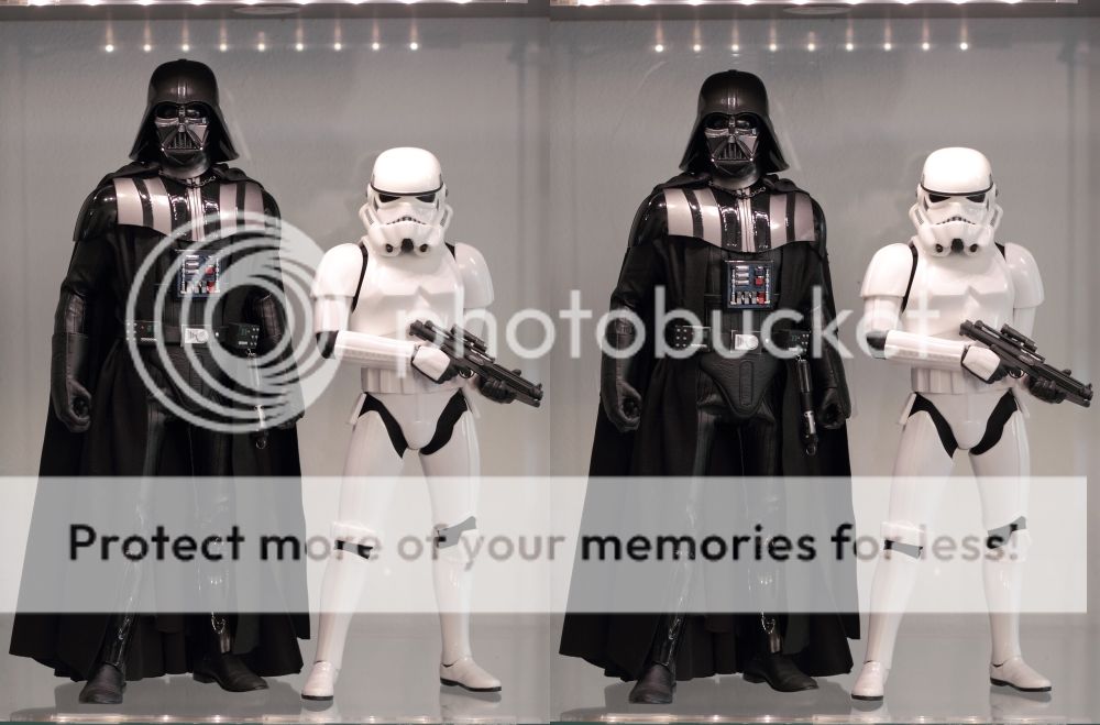
I did some photo editing to see what Vader would look like shorter. What I did was bring the shoulder bells in more, shorten the forearms (bring the gloves in higher), shorten the torso, and shorten the upper legs. Everything else is untouched.

IMG_1339_3_heightcomparison_small2.jpg


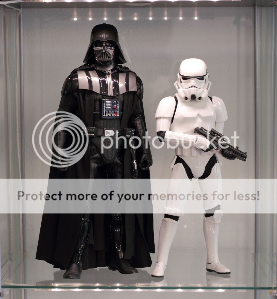
Height comparison with Stormtrooper:

IMG_1339_3_heightcomparison_small.jpg


I think the proportions still look good, especially the arms look better IMO. Any comments, suggestions?
 
I think he could stand to be a little shorter still. The torso shortening will bring the crappy suit into play unfortunately.
 
How to make the reveal head your standard head:

1. Remove the headsculpt and lower it a bit, allowing the dome to be lowered with it. Place it at a slight angle so the ears don't interfere with the mask anymore. (he's put inside the helmet at an angle stockwise, so one ear makes it not so well fitted.)
winfuw.jpg

2yklsma.jpg

2. Put a good clay inside the dome, I used miliput superfine. Press the now fit mask part against it inside the dome, making a nice mold of the top of the helmet, so you can rest it easily, and remove it easily.
fjkhoy.jpg

3. Enjoy your reveal-able Vader figure.
2zp40tg.jpg
 
Lowered the neck on Vader as well.

Lowered the headsculpt inside to make the reveal head work better as well as lower the neckjoint. Comparison of the original reveal head vs modded:

il9jeh.jpg


Pic of Vader without mask.

synwwi.jpg


This is what I cut out of the neckpost, then glued the thing back together:

2isv33t.jpg


Money-shot:

2ywbn2t.jpg


Satisfied now. :)
 
Did he say time has caught up with Vader and his look is "dated"? Static, plodding and "a space version of Frankenstein.":lol

Great review though and hadn't heard about the scale issue with the lightsaber. That body does indeed look pretty weird in certain poses, with his arm bent, his forearms look way too long and the arms are super skinny.
 
I'll have to check out Clipperking's review soon - I generally agree with him most times on the important stuff.

That said - it's SSC Vayda 2.0. - I'm interested in seeing if he's as unforgiving as I am with that POS figure. :lol
 
Actually got one of his highest scores. :D But either way, move on Vintij. Jesus, how many times do you need to say the say thing about it. :gah:
 
:gah:


I'd say Clipper's take on it is pretty close to my own (he might even be a bit more forgiving). I'd agree it's sort of an ambiguous figure. I like it a lot but would be OK selling it, too. You'll have a good laugh at the height comparisons he did. :lol
 
Back
Top