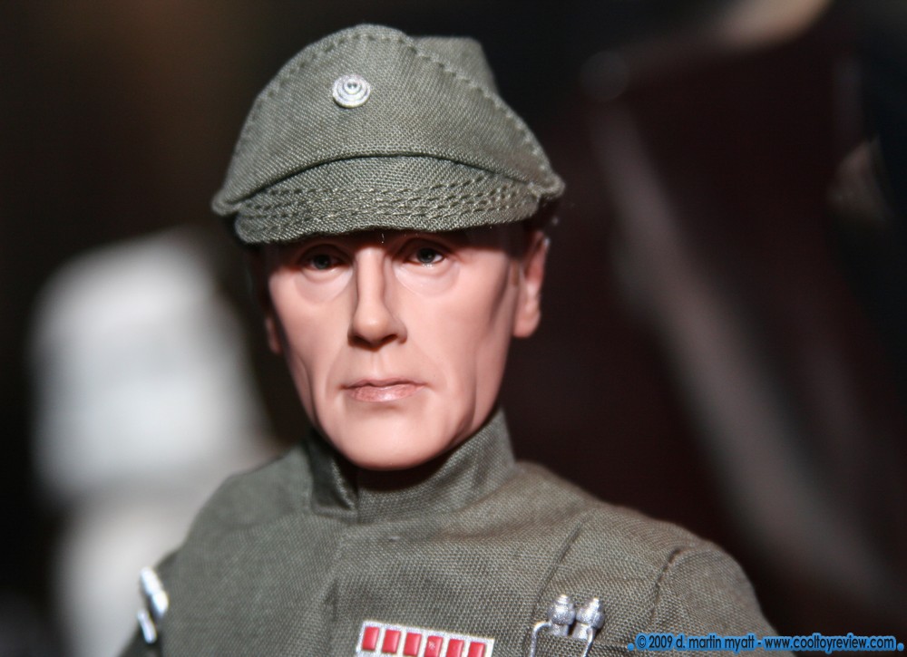
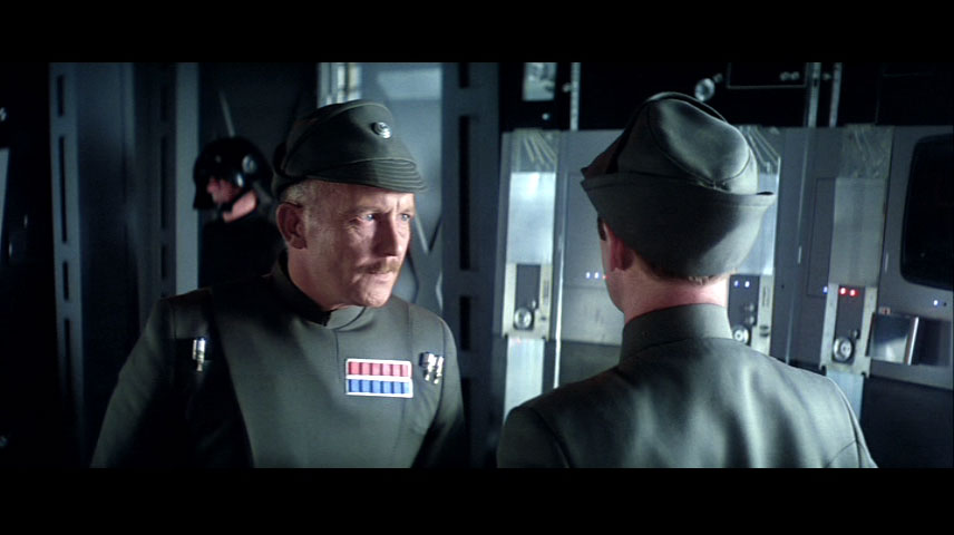
Green. And the SS Proto looked the same as Pradji, black. Right?
No the proto looked closer to grey on the olve drab scale. Nowhere near black.


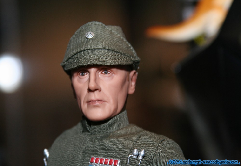
Green. And the SS Proto looked the same as Pradji, black. Right?
No the proto looked closer to grey on the olve drab scale. Nowhere near black.

Looking again, the paint work looks great too.
This figures sculpt and paint is horrible..hell DML and DID pump out better a better job then that.
Looks nothing like the character at all IMO, the sculpts way too smooth.
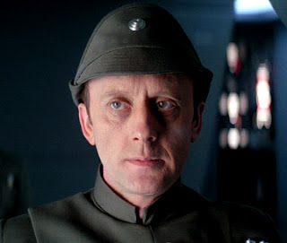
He does look better than the proto picture, but in that particular shot, he looks ALOT like the merovingian from the Matrix trilogy. It's got ALOt of potential, but this particular shot is not very flattering.He looks better but still not all that recognizable.
He does look better than the proto picture, but in that particular shot, he looks ALOT like the merovingian from the Matrix trilogy. It's got ALOt of potential, but this particular shot is not very flattering.


He looks better but still not all that recognizable.
It is a bad shot for highlight the sculpt, it's only useful for seeing the uniform color and clean paint lines, but the lighting on the face is almost all the same middle tone, no highlights, no strong shadows, almot as bad as flash photography in terms of showing off forms in the face.


Sean, didn't Andy quit making Sideshow sculpts a long time ago?
Respect one another's right to disagree...
Thanks.

Thanks DarthNeil.