allosaur176
Freaked Out
- Joined
- Nov 22, 2013
- Messages
- 225
- Reaction score
- 1

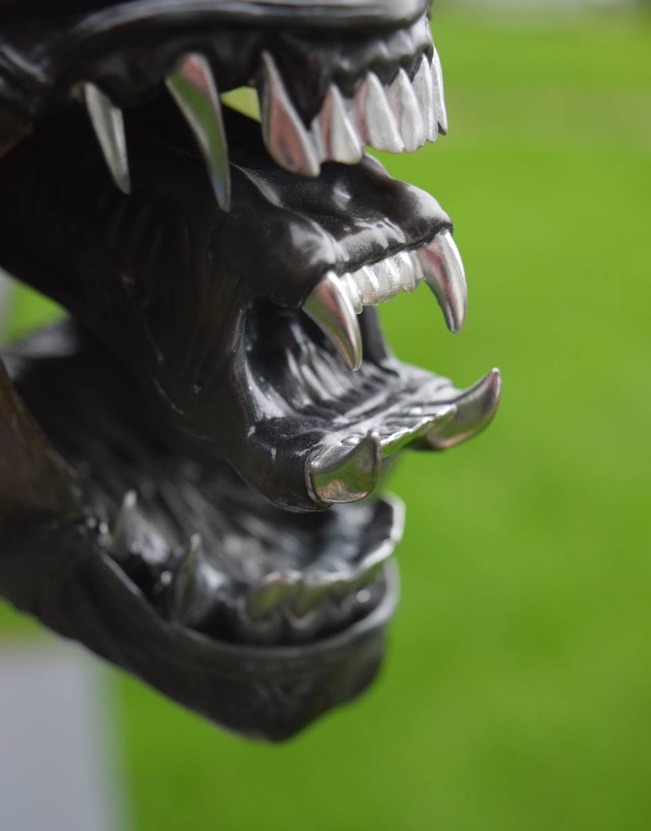
Posted on the CoolProps FB page . . .
Clearly it's a Lafka-esque rendering of the struggle of modern day women is male society under the governing zeitgeist of neonatal postpatrarchical....words....Yeah - sorry Bro' - what is this showing us?
(* I'm getting older - I needz context*)
.
Yeah - sorry Bro' - what is this showing us?
(* I'm getting older - I needz context*)
.


It's a teaser of the chrome teeth.


Dude....is that the 1/3 in the background?!
Sent from my SGH-M919V using Tapatalk
I don't know if this may shape your opinion, but the original dome was fairly transparent. On set it had a tendency to fog up. This was ultimately the reason James Cameron did away with them in Aliens.Even if lighting is not the best to display this piece, I think it looks great! Thanks for posting the pictures! I was waiting for themare the teeth chromed in that bust? What do you think? i think I would prefer a dome less transparent than that
, but as I said! May be is because of the lighting conditions there...
Even if lighting is not the best to display this piece, I think it looks great! Thanks for posting the pictures! I was waiting for themare the teeth chromed in that bust? What do you think? i think I would prefer a dome less transparent than that
, but as I said! May be is because of the lighting conditions there...
This.The dome started off clear, had varying degrees of transparency for various reasons (even filled with maggots at one point in a failed experiment, they died) and was ultimately tinted black for the end scenes. So this is entirely accurate, but personal preference obviously comes in to play. You could have a bit of tint added to it easily enough. I quite like being able to see that menacing skull beneath.
Cameron ditched the domes because they were too fragile.
Enter your email address to join: