Jack00
Super Freak
- Joined
- Aug 17, 2012
- Messages
- 275
- Reaction score
- 1
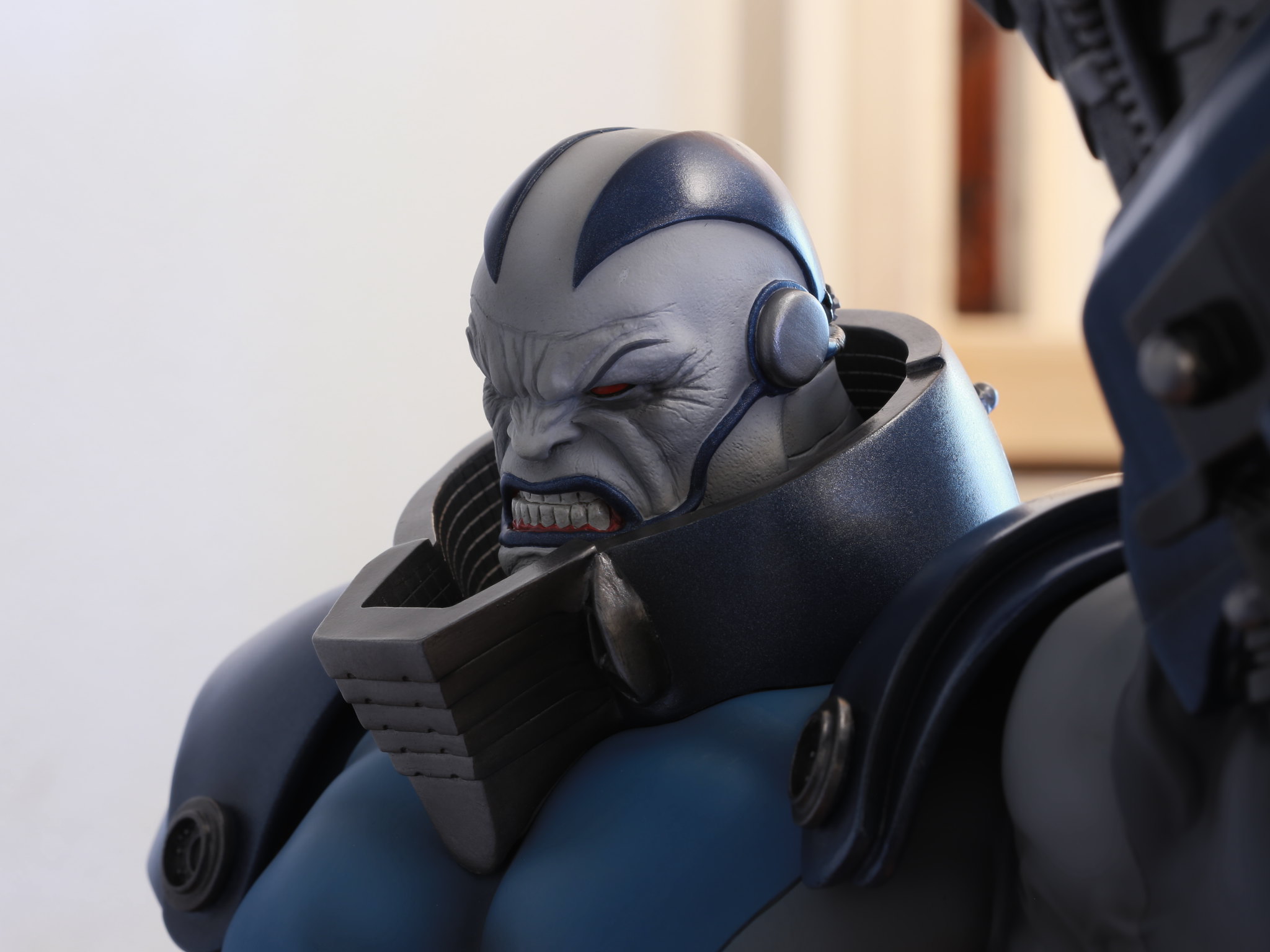
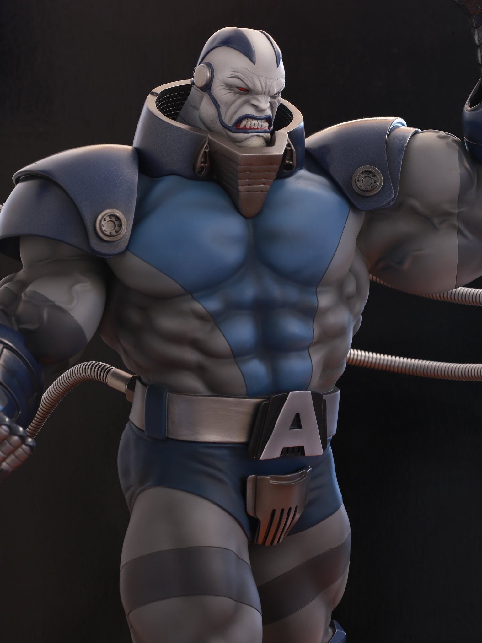
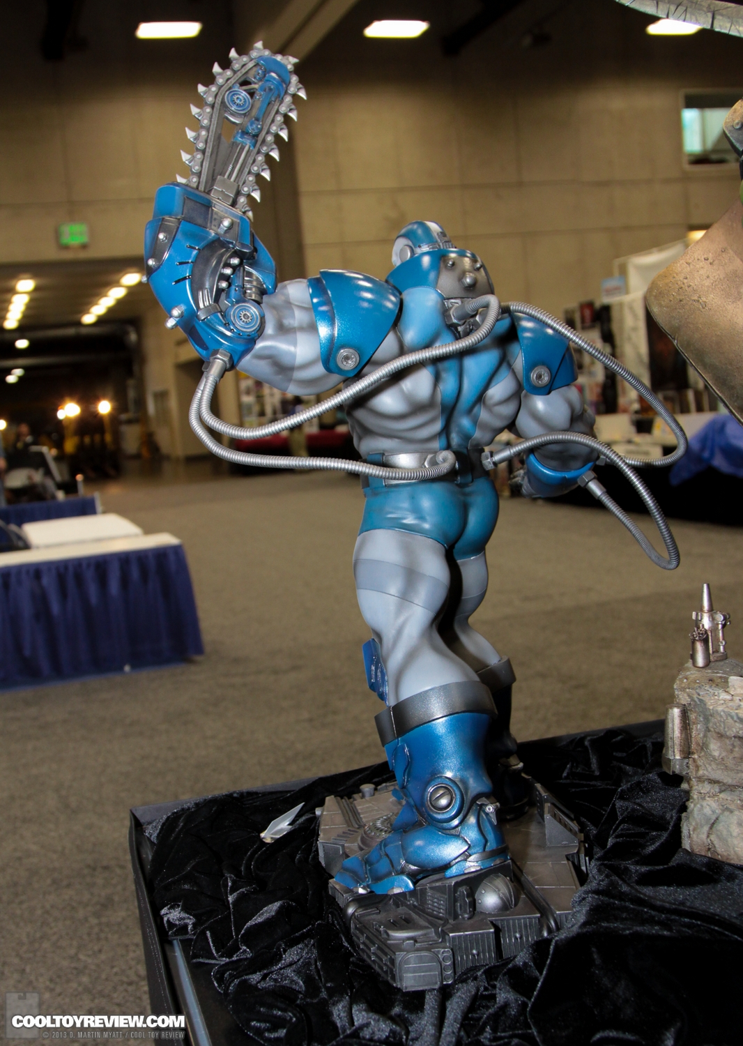
It could also be because Olivetti's art, the one they used as inspiration is a more toned down look in terms of colours palette. I personally prefer it. Yes a brighter color would've made it pop more, but this makes him look grittier and darker like he should
Sent from the **** Pit of the Millenium Falcon
This. In the Dark angel saga from x-force the color palette is toned down quite a bit and this is a more accurate representation of Oli's Apocs.
With that said, vibrant blue would of made him great too.


 Phone!