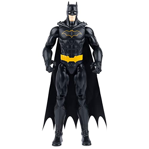
Got an email from SSC saying that they did not change anything except the ears are longer now. Nothing about the symbol has changed. They still let me cancel and move my NRD... Just not feeling it after the SSC pics. Hope it comes out great for those who are keeping their orders.. Perhaps in hand will change my views.
You are using an out of date browser. It may not display this or other websites correctly.
You should upgrade or use an alternative browser.
You should upgrade or use an alternative browser.
Premium Format Batman Modern Age Premium Format
- Thread starter Rulk
- Start date

Help Support Collector Freaks Forum:
This site may earn a commission from merchant affiliate
links, including eBay, Amazon, and others.
krzykoopa
Super Freak
Got an email from SSC saying that they did not change anything except the ears are longer now. Nothing about the symbol has changed. They still let me cancel and move my NRD... Just not feeling it after the SSC pics. Hope it comes out great for those who are keeping their orders.. Perhaps in hand will change my views.
I want to cancel mine as well how did you word it so they let you move your NRD? if you don't mind me asking
Grumpy Bear
Super Freak
Got an email from SSC saying that they did not change anything except the ears are longer now. Nothing about the symbol has changed.
Maybe they must watch the own pictures. I want this piece so bad, but the logo is new.

venawn
Super Freak
In the left pic the logo look like sticker err don't like it at all I hope they fix itMaybe they must watch the own pictures. I want this piece so bad, but the logo is new.

It's not even finalized yet
Grumpy Bear
Super Freak
It's not even finalized yet
I know, but in the past it was the same situation with the Black PF. First great embossed logo and then the change.
Yea, better wait and see what else gets screwed up right?It's not even finalized yet

Looks like the same things done to the original:
- flattened the logo from what was originally shown
- made it wider
- the worst part to me, lowered its position on his chest.
I guess for the same reasons as the original, so the cape doesn't cover any of the logo? But if the logo touches the bottom of his chest, it's too low. I guess making it bigger was supposed to offset the fact it was lowered a bit?
Also confirmed on the other thread is the "orange" shading over the yellow on the logo is taken out. That's why aside from natural shading on the SDCC piece, the logo no longer goes from dark outer to lighter center like the proto.
- flattened the logo from what was originally shown
- made it wider
- the worst part to me, lowered its position on his chest.
I guess for the same reasons as the original, so the cape doesn't cover any of the logo? But if the logo touches the bottom of his chest, it's too low. I guess making it bigger was supposed to offset the fact it was lowered a bit?
Maybe they must watch the own pictures. I want this piece so bad, but the logo is new.

Also confirmed on the other thread is the "orange" shading over the yellow on the logo is taken out. That's why aside from natural shading on the SDCC piece, the logo no longer goes from dark outer to lighter center like the proto.
It's not even finalized yet
That's part of the problem. Things do change from proto to final, true of any product in any industry, but no industry matches the frequency of "it's not even finalized yet" like the statue world.
In most cases for other industries before an item is available for sale or preorder you see changes in design/features but by the time you get to the sale/pre order period you've already seen what's intended to be the final product, but it's like the statue world doesn't even care, the PO just goes up, a line about "pending approval" or "prototype shown" or "subject to change" is shown as a cop out, and when changes are made, complaints happen...and one can complain about people complaining all one wants, they're valid complaints, as a person usually likes what they PO'd and committed to, only for that to change, obviously they feel let down and need to vent.
Funny thing is, the changes many forum members ask for are the changes that get ignored, while the things nobody wants to change are usually what gets altered.
I know that's just the way this, but that's also why these situations continue to be problems for collectors. Companies need to wait for POs until they have what they know to be final...and yeah, things can still change after that, but these types of issues would happen less often.
PS, this isn't a complaint, it's an observation and commentary
Pork Chop Express
I never drive faster than I can see...
That's part of the problem. Things do change from proto to final, true of any product in any industry, but no industry matches the frequency of "it's not even finalized yet" like the statue world.
I'd assume this has something to do with production issues/fixes that are addressed once work begins, all while trying to stick to the budget. A proto or two is one thing but 2k adds up. At today's prices better to be close enough 100% on board or pass.
I'm still undecided about the logo. In some pics it looks ok, but others it doesn't look that great. It doesn't help the fact that the suit wasn't futzed properly to have the logo look even and maybe pulled up higher on his chest. That part doesn't really bother me as I can easily adjust that, but I also don't know if I like how much bigger they made it. I really loved the PO logo and was hoping this piece would have that same quality being raised and having the faded yellow.
One positive thing about the pictures from SDCC though is the color blue he looks now. I like the color better than the color shown in the PO pics.
One positive thing about the pictures from SDCC though is the color blue he looks now. I like the color better than the color shown in the PO pics.
Actually this pic makes it look good aside from the logo not being futzed properly.
I'm still keeping my order in the end so I'll just see it in hand.
I want to cancel mine as well how did you word it so they let you move your NRD? if you don't mind me asking
Sorry about the late reply. Basically I just politely voiced my concerns and asked if my NRD could be transferred to another item that I have on order.
krzykoopa
Super Freak
Sorry about the late reply. Basically I just politely voiced my concerns and asked if my NRD could be transferred to another item that I have on order.
Thank you for replying

I've decided I'm still keeping my order. I still think the entire piece will end up being the best comic Batman in 1/4 scale out there.
Tbolt
Super Freak
I've decided I'm still keeping my order. I still think the entire piece will end up being the best comic Batman in 1/4 scale out there.
Same ^^^
But I hope that in hand the logo can be futzed/is not as stretched.
I hope it turns out great for everyone... If in hand pics look good then perhaps I go hunting for him again 
afattori
Super Freak
I have never thought about canceling my preorder. This represents my 70's childhood batman. I can not wait to get him. This will be one of my favorite pieces in my collection unless 66 batmobile still comes out.
Spidey976
Super Freak
Would there be interest in a custom looking straight forward head for thie one??
Similar threads
- Replies
- 23
- Views
- 3K
- Replies
- 0
- Views
- 195
- Replies
- 0
- Views
- 186
- Replies
- 0
- Views
- 349


