BurningRage
Super Freak
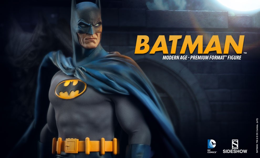
Ugh, it's almost like he's wearing a t-shirt sized bat logo now. Belt wasn't an issue for me but this I don't like at all.
I have the t-shirt to match this.

Ugh, it's almost like he's wearing a t-shirt sized bat logo now. Belt wasn't an issue for me but this I don't like at all.
I have the t-shirt to match this.
I don't know why there's complaints about the belt, that's the way it was in the comics
It's too obvious that the big head and long neck are caused by fish eye effect when the camera gets too close to the object. I wonder why you people can't see it?I was thinking about ordering this (depending on finances) but now I don't plan to. The neck is too elongated and the bat symbol is bad.
At the very least, the 'metal' parts of the belt - the buckle and the canisters - could have been painted brass/gold.
This was the deal breaker? the bat-logo on the chest?
Interesting place to draw the line in the sand.
This was the deal breaker? the bat-logo on the chest?
Interesting place to draw the line in the sand.


such a shame.. really wanted this to go with a Robin piece or Nightwing

I think they were sticking to the comics on this one and his belt was bright yellow if they had done "brass and gold" it wouldn't be that belt.
Seems to have shading in the blue here, yet the belt is still bright yellow.By that logic, the blue should be one solid color without any subtle shading worked into it.
