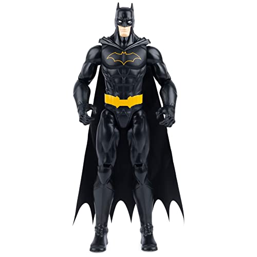
I could tell SSC's photo is probably a little off in terms of color levels etc. in comparison to the prototype. I tried to adjust them to a closer match based on the apple and the green's in the helmet and armor. The balance tones down the blue a bit, which seemed to be too high on the original photo. Perhaps this might be closer to how they would compare, which seems more like the movie screen shot suit colors I saw earlier? It's not quite so bad without the overly done blue overtones.

Edited next to prototype:


Edited next to prototype:

Last edited:


