Carnage Comiquette

Collector Freaks Forum

Help Support Collector Freaks Forum:

This site may earn a commission from merchant affiliate links, including eBay, Amazon, and others.
It's obvious that Sideshow is taking liberties with the Olivetti work that these pieces are based on. I dislike the way he draws the faces of Venom and Carnage and I don't think the pieces would be as popular if they didn't give the symbiotes the more classic look that we know and love.

I'm ususally all for exclusives but this art isn't worth the extra money and effort of picking the piece up at UPS. I'm going with the regulars from an online retailers for these pieces.

No offense to you guys that want the exclusive, though. I understand where you're coming from. :peace
 
That's what I am saying. You really didn't need Olivetti but good for him for collecting a paycheck here.

I would be interested to see how the brown claws look painted. Inthe dio you can see a hint of purple as the symbiote is morphing into a giant claw.
 
When you attach a current cover artist to a line of Marvel products it's going to make money.
 
When you attach a current cover artist to a line of Marvel products it's going to make money.


You'd think it would but it doesn't always. Alex Ross' name was tied to numerous lines of statues and busts and most of them bombed big time, expecially the statues based on Earth X and Kingdom Come.

Ultimately, I would think it comes down to how nice the statues look. The attached artist's name may be a perk but if the pieces look subpar, it doesn't matter who's name is on it.

Neal Adams and Frank Frazetta, to name other artists whose names were also attached to pieces as a selling point, were hit and miss as well. Again, it depends on what the final product looks like. I don't think a name is enough anymore. For some, no name is good enough to even preorder anymore as they need to see a product first with their own eyes before even ordering.
 
Alex Ross is so different from most artists. I love his style but he is not to everyones taste. But I get what your saying not everyone will like Ariel's style either.
 
It's obvious that Sideshow is taking liberties with the Olivetti work that these pieces are based on. I dislike the way he draws the faces of Venom and Carnage and I don't think the pieces would be as popular if they didn't give the symbiotes the more classic look that we know and love.

I'm ususally all for exclusives but this art isn't worth the extra money and effort of picking the piece up at UPS. I'm going with the regulars from an online retailers for these pieces.

No offense to you guys that want the exclusive, though. I understand where you're coming from. :peace
I like you.:inlove
 
The artist that is best known for Spider-Man is easily Mark Bagley who drew him through the 90s and has the best known looks for Venom and Carnage yet no one really takes his designs into consideration for statues. That always surprised me.
 
I agree that he gave Carnage his look. Bagley has been one of those consistent guys that doesn't get much credit.

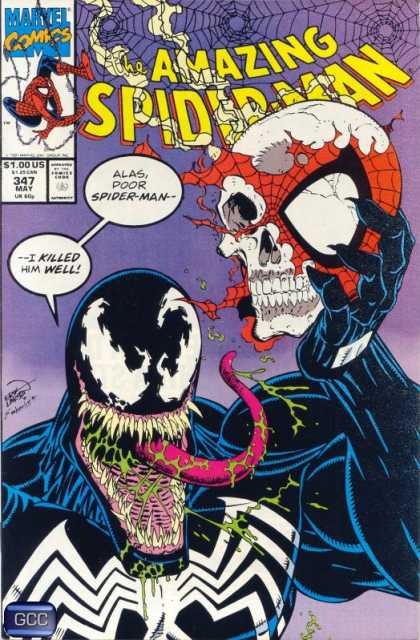
Venom on the other hand is defined by artist Erik Larsen. He took the McFarlane look and gave it the tongue and crazy teeth.
 
Disagree completely.

McFarlane's:

battle80.jpg


Larsen's:

347-1.jpg


Bagley's:

40_venomlethalprotector1nm.jpg


AmazingSpider-Man362.jpg


I would bet a good amount of money that its Bagley's Venom that people recognize and relate to the most. While Larsen may have gave him the tongue look, even though McFarlane toward the end of the run drew him with a tongue as well, I said best known and I would say that Bagley's Venom is best known and arguably most loved.
 
I dont keep up to date with artists of the comics, but when I think of Venom it is the Bagley's version.
 
Yes, Bagley Venom is the best of all. I've always preferred the sleek, clean look of Bagley's Venom over the more recent cottage cheese, hulking, gigantic tongue Venom.

If they made a comiquette of his work, I'd buy the exclusive version no doubt.
 
I respectfully disagree of course.

Sharp straight non-crazy teeth? very little crazy tongue? I don't think that's what most fans associate with Venom. They like the Aliens monster aspect.

The Venom bust is mostly Larsen with some Sam Keith in there. The diorama is Larsen. The new comiquette is Larsen. If you look up some interior pages of that Larsen story in Amzing #345 through #347 you see what I am talking about. Bagley's style is more smooth/clean than what most associate with Venom.

Larsen's Venom:

AmazingSpider-Man346.jpg


Again, see some interior pages to better judge. Coincidentally, Amazing #345 was my first serious monthly comic when I first started reading/collecting comics all the way to the early #400's so that gives you an idea of where I am coming from.
 
Last edited:
No kidding man. The only expensive ones were mostly the chromium/die cut/foil covers. Lord knows there were plenty of those back then. Valiant comics loved that crap too. :lol
 
Erik Larse was never consistant in his drawing of Venom. Check this out from Spider-Man 332. Straight teeth, smaller tongue.

300px-AmazingSpider-Man332.jpg


Larsen was quoted in saying that McFarlane always talked about how he envisioned Venom's "skin" to be constantly moving, very alien over Eddie Brock so Larsen liked to incorporate that idea in many of his drawings, more so towards the end. Bagley mentioned that Venom was supposed to confusable with the Black Suited Spider-Man from a distance only bigger and more muscular (again from McFarlane's descriptions) and that in his interpretations an alien suit would be sleek, look like the fabric of Spidey's suit until Brock made it move.

Bendis in the Ultimate universe wanted a Venom that was closer to McFarlane's original description with a moving skin, a piece that was unstable which Bagley did:

0.340126001192574142image_big_large.jpg


The thing is that fans didn't really like it, it was considered one of Bagley/Bendis' first missteps in that title.

to each his own though, I wouldn't mind over time getting a Venom done in Bagley, Larsen, McFarlane and even Finch to go with the Olivetti piece.
 
Olivetti draws a bad ass venom too.Even if the print could have use a better background.
 
I cringe every time I see anything Ultimate Universe. I always saw it as an epic waste of talent.

Mike, I think that issue of Larsen you quoted was during the transition period when he took over McFarlane in Amazing. It makes sense that it would still look like McFarlane's take a bit. The later issues #345-347 is where the character was visually defined to what I think most people associate with Venom today.
 
Back
Top