You are using an out of date browser. It may not display this or other websites correctly.
You should upgrade or use an alternative browser.
You should upgrade or use an alternative browser.
Cinemaquette life size genisys endoskeleton
- Thread starter paris
- Start date

Help Support Collector Freaks Forum:
This site may earn a commission from merchant affiliate
links, including eBay, Amazon, and others.
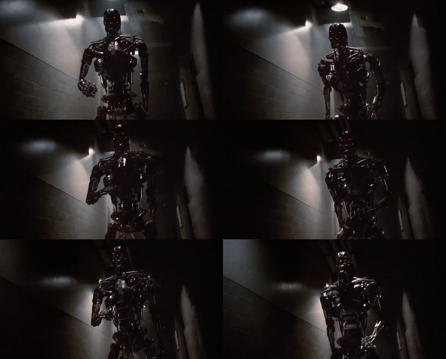
Someone please just make a 1:1 Endo like this. No over sized plasma rifles, not awkward poses or complicated bases just simple, menacing, classic endo.
Maybe you are lost, this is a thread for the GENISYS endo.
FDS
Freaked Out
- Joined
- Jul 24, 2010
- Messages
- 234
- Reaction score
- 57
Maybe you are lost, this is a thread for the GENISYS endo.
I think they know, its just that they wish it was the other Endo, with that pose!!! Hell yea
FDS
Freaked Out
- Joined
- Jul 24, 2010
- Messages
- 234
- Reaction score
- 57
Someone please just make a 1:1 Endo like this. No over sized plasma rifles, not awkward poses or complicated bases just simple, menacing, classic endo.
View attachment 442283
Im with you on that one!
If you can't appreciate this version too its your loss.I think they know, its just that they wish it was the other Endo, with that pose!!! Hell yea
If you can't appreciate this version too its your loss.
Well since you appreciate it SO much BUY it! It will be your gain! amazing.

$36.79
$39.99
McFarlane Toys - DC Multiverse The Flash Movie - The Flash 12" Scale Statue
Amazon.com

$33.35
Marvel 60th Anniversary Captain America DS-086 D-Stage Previews Exclusive Statue
Green Bargain
Maybe you are lost, this is a thread for the GENISYS endo.
Sure is and the pose sucks. Deal with it.
Sure is and the pose sucks. Deal with it.
Pose is fine, and I AM getting one, so you Fing deal with it.
jkno
Stormtrooper
Nice Endo, but I don't have the slightest interest in the Genisys stuff.
Pose is fine, and I AM getting one, so you Fing deal with it.
Sensitive much?
 Who cares if someone doesn't like it.
 I'd much prefer a t1/t2 endoskeleton though. Better design and films.
I'd much prefer a t1/t2 endoskeleton though. Better design and films.
Better films no doubt, but design is very debatable. If you less into science/engineering and moreso T1/T2 nostalgia I can understand why you don't like the new one. I can appreciate them both and I already have the original SS T2 so I am good.
I epically hate the T:G endoskull, narrow long face with creepy long teeth, and dislike the chest part.
Kinda like those new limbs design and some intricate details.
Let's see whether T6 will be using another new design or continue with T:G one, or just go back to the original design.
Kinda like those new limbs design and some intricate details.
Let's see whether T6 will be using another new design or continue with T:G one, or just go back to the original design.
Better films no doubt, but design is very debatable. If you less into science/engineering and moreso T1/T2 nostalgia I can understand why you don't like the new one. I can appreciate them both and I already have the original SS T2 so I am good.
I actually don't mind the new design at all, I just prefer the old one. The endoskull on the Genisys design is what bothers me the most. As dark mummy said it looks like they stretched the skull vertically. The horse teeth look stupid too.
I actually don't mind the new design at all, I just prefer the old one. The endoskull on the Genisys design is what bothers me the most. As dark mummy said it looks like they stretched the skull vertically. The horse teeth look stupid too.
Teeth are actually fairly large without bone/gums. This design just shows them exposed more, or they aren't final as their bust and V1 endo weren't quite as large. It's better than the V1 teeth either way...

Yeah I like the way the skull on their 1/2 bust looks, the teeth look better on that too. Overall they just look too exaggerated, it makes it a lot loss menacing when he looks like he's got a big cheesy smile the whole time.
Teeth are actually fairly large without bone/gums. This design just shows them exposed more, or they aren't final as their bust and V1 endo weren't quite as large. It's better than the V1 teeth either way...
Narrow face and long teeth...
This is the real endoskull.

The teeth are quite long on a real human skull, but we're talking about the endoskul and T1 set a rule of it.
No need to argue about any 'realism', cuz otherwise why an endoskull has eyeballs? Eyeballs are soft tissue which don't exist in a skeleton.
Oh, there are "tooth rules" in T1 that must be followed forever? Didn't know that.
"eyeballs" are not actually there, those are just optical sensors. They need to move like real eyes when tissue grows over, so those obviously need to be included in the skull even though they look similar to "eyes".
"eyeballs" are not actually there, those are just optical sensors. They need to move like real eyes when tissue grows over, so those obviously need to be included in the skull even though they look similar to "eyes".
Similar threads
- Replies
- 0
- Views
- 1K
- Replies
- 0
- Views
- 772
- Replies
- 0
- Views
- 945
- Replies
- 254
- Views
- 18K


