Looking back through the thread it seems that lots of people really dislike the TNBA designs; I found that interesting because I tend to like them. I came across this convenient set of pics, so let me comment on each character in BTAS form versus TNBA, to get some (more) discussion going:
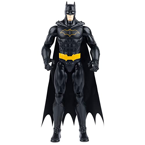
Batman: I prefer the redesign. It's sleeker and more badass, especially with the cape covering the shoulders.
Robin: I prefer the redesign. I like Robin as a little kid better than in his late teens, and the costume really pops without the green.
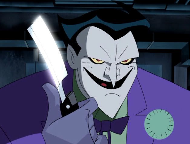
Joker: I prefer the original. The new one's eyes and lack of lips looked a little too strange.
Two-Face: I prefer the original, just because the redesign makes him look a bit too "pretty".
Riddler: neither design works very well in my opinion; the original is boring and the redesign makes him look goofy.
Penguin: Redesign all the way. The original was the Tim Burton version, which has not aged well.
Catwoman: I prefer the original; in the redesign she looks a bit too small and creepy. But the redesign is a pretty cool take on a more villainous looking Selina.
Ivy: I prefer the redesign. I like how she looks creepy and diseased, yet still beautiful.
Harley: They're both equally fine.
Freeze: I prefer the redesign. The original looks like a generic silver age bad guy; the redesign is powerful, scary and sad.
Mad Hatter: I prefer the redesign. The smaller version looks like he stepped right out of a twisted version of Wonderland.
Clayface: I like them both equally.
Scarecrow: The redesign wins, obviously. Is there really anyone who disagrees?
Ventriloquist: I prefer the original; Scarface looks scarier in the original.
Croc: I guess I'd have to pick the redesign, as it looks more like what I'd imagine a crocodile-man should look like, but I'm not a fan of the character.
Bane: I prefer the redesign. The original with the luchador mask looks fat and comical. The redesign is a scary bastard.
Batgirl: I prefer the redesign. I like the pixie-ish, girly look.
So, tallying it up, out of 17 characters I think 3 of them are equally effective (or ineffective) with both designs, I prefer the redesign in 10 cases, and I prefer the original in 4 cases. I suppose I'm in the minority though, alas.


 ......................................................................