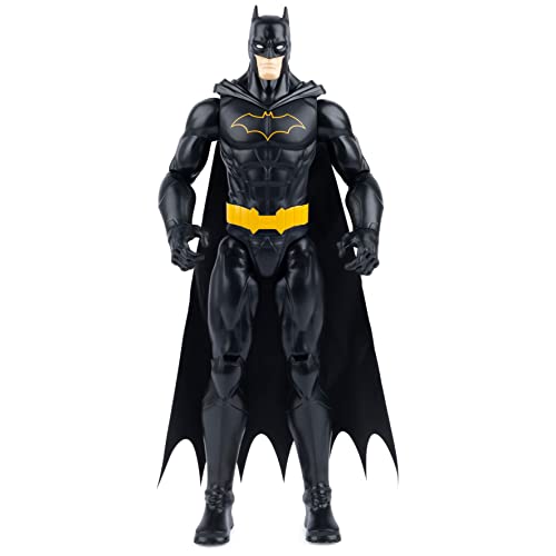
Here's the issue about going dark grey, or any in between color. While it would be find to do so, what will happen is all the products with white and black backgrounds will show the whole image square. This would create an even more cluttered look. As it is now, all black background images blend in, and all white background images are at least consistent with a white square. The opposite was true on the current/old site. All white images blend in, and all black images show the black square. Make sense?
You will be the best judge of it. I can't imagine it will hamper anyone's usage of the site, or "lose you custom".
Despite people saying they don't like the black background, it looks fine and i am sure it will all fit together when customers are searching.


