blinguskahn
Super Freak
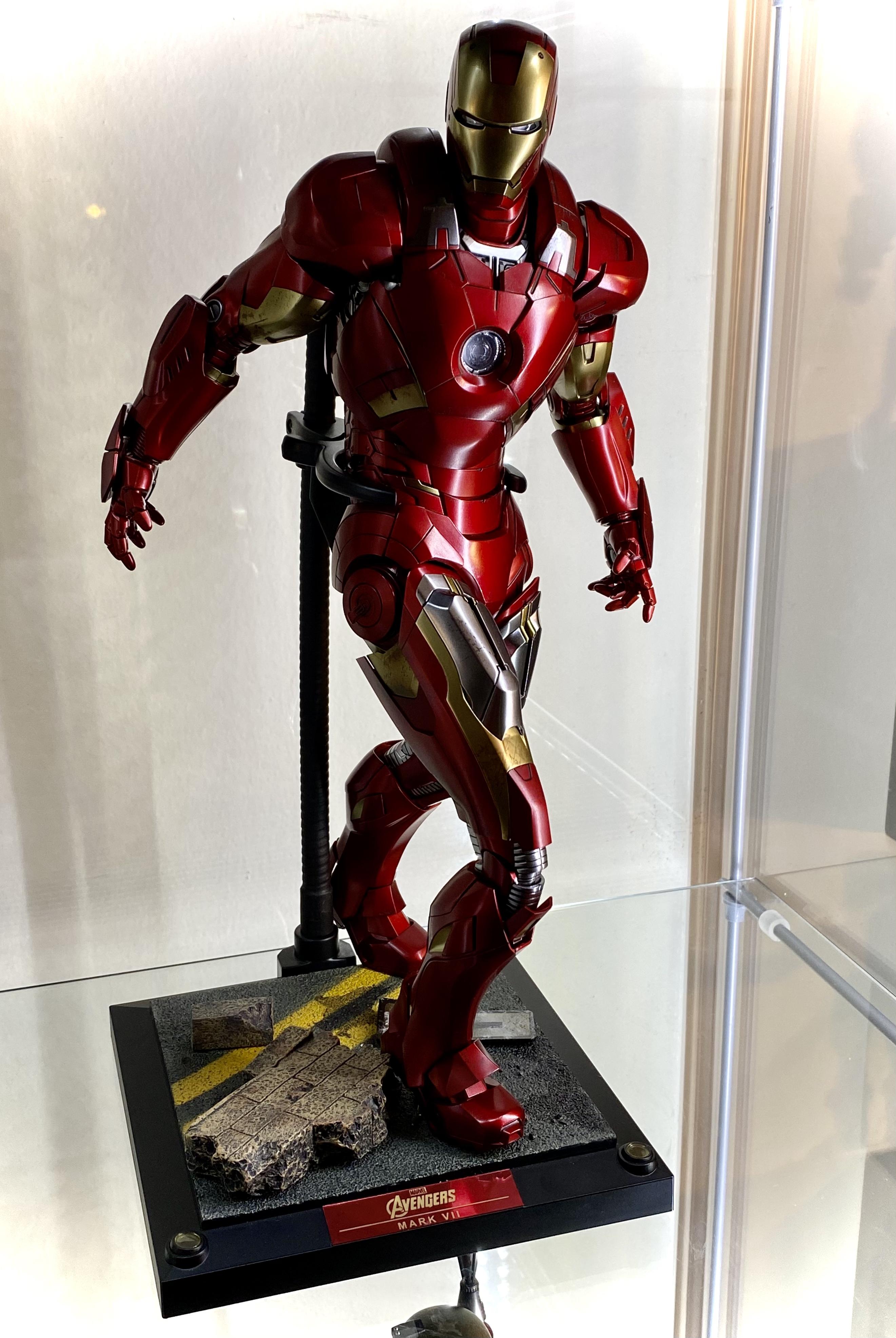
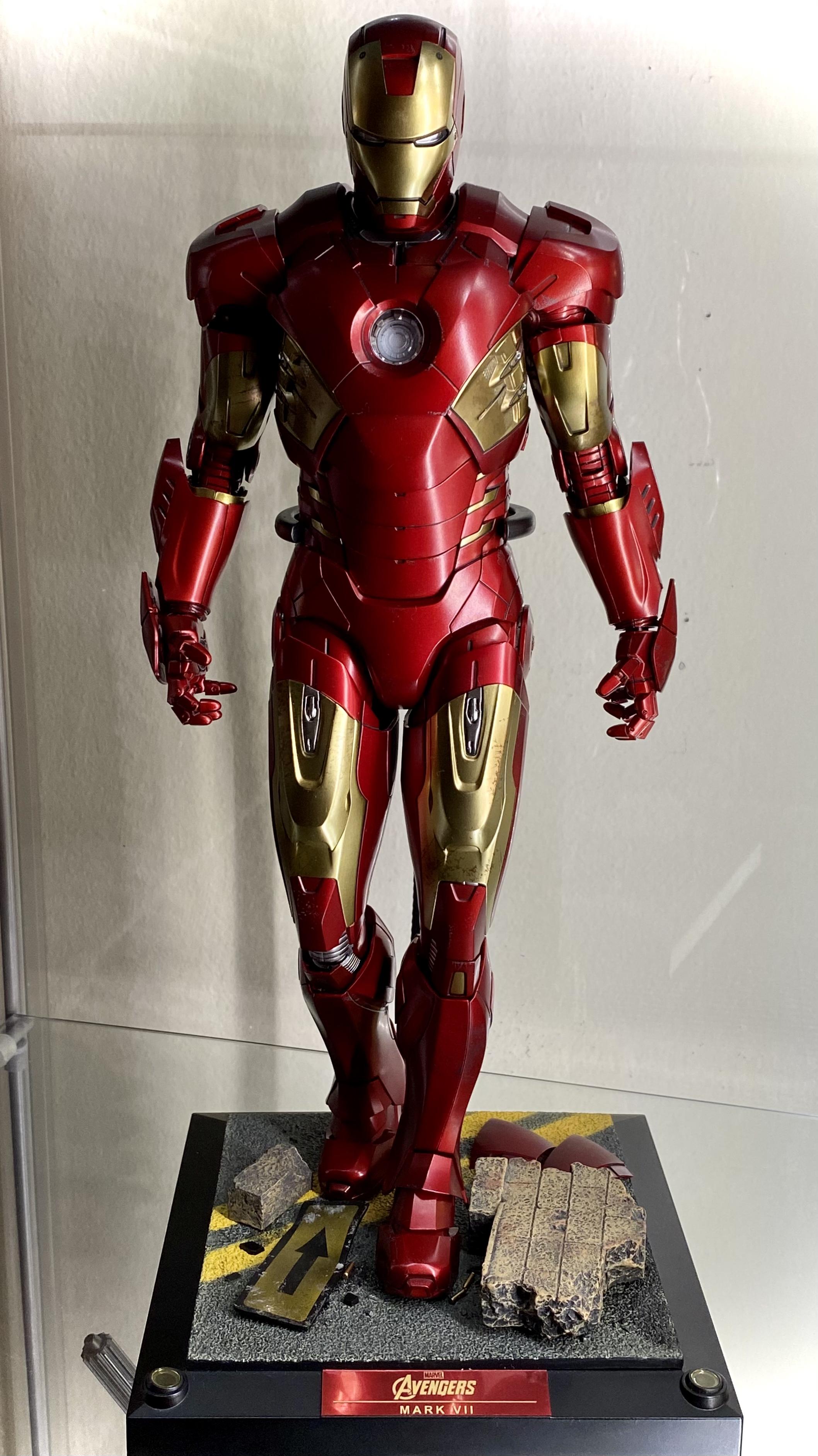
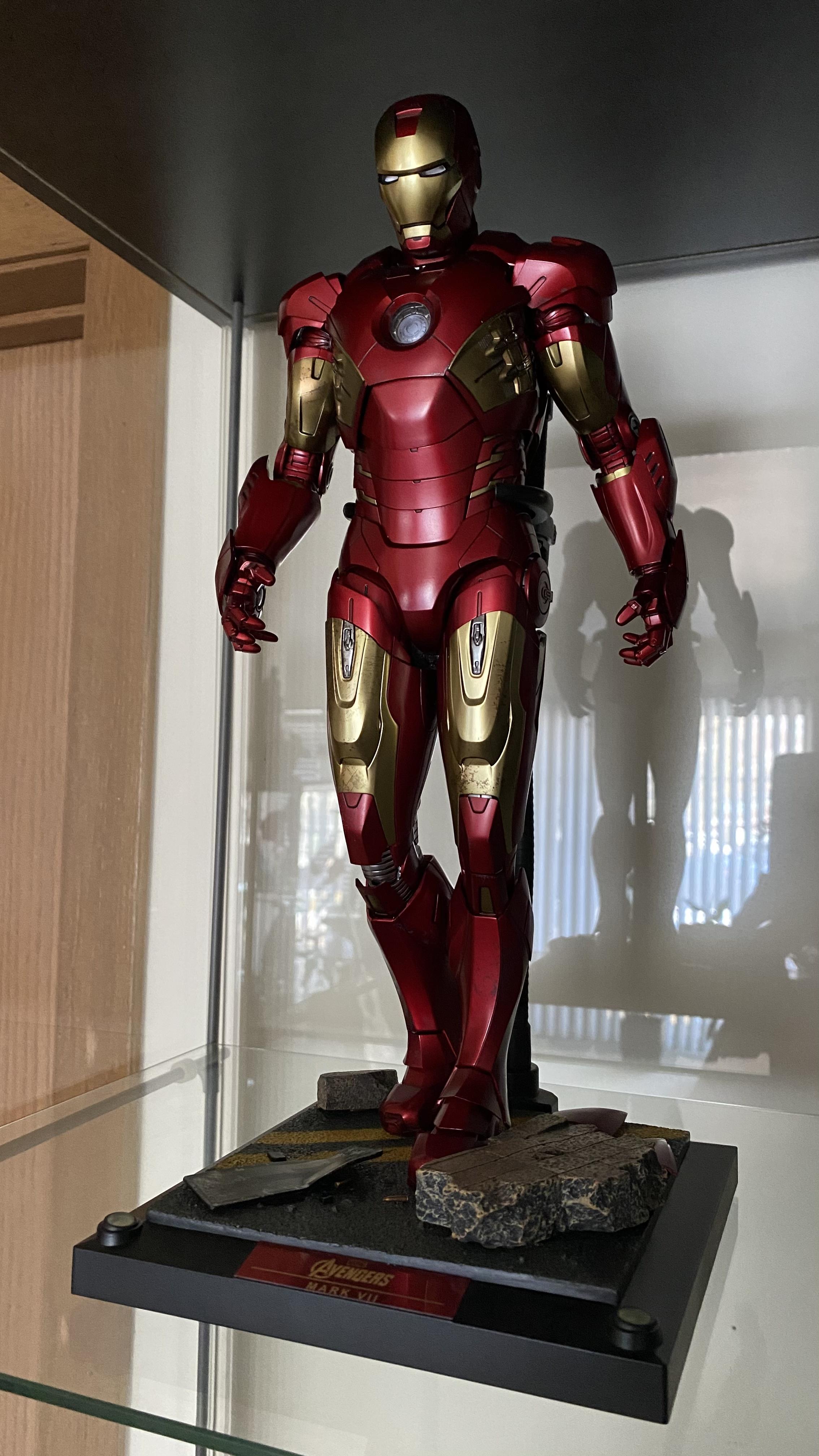
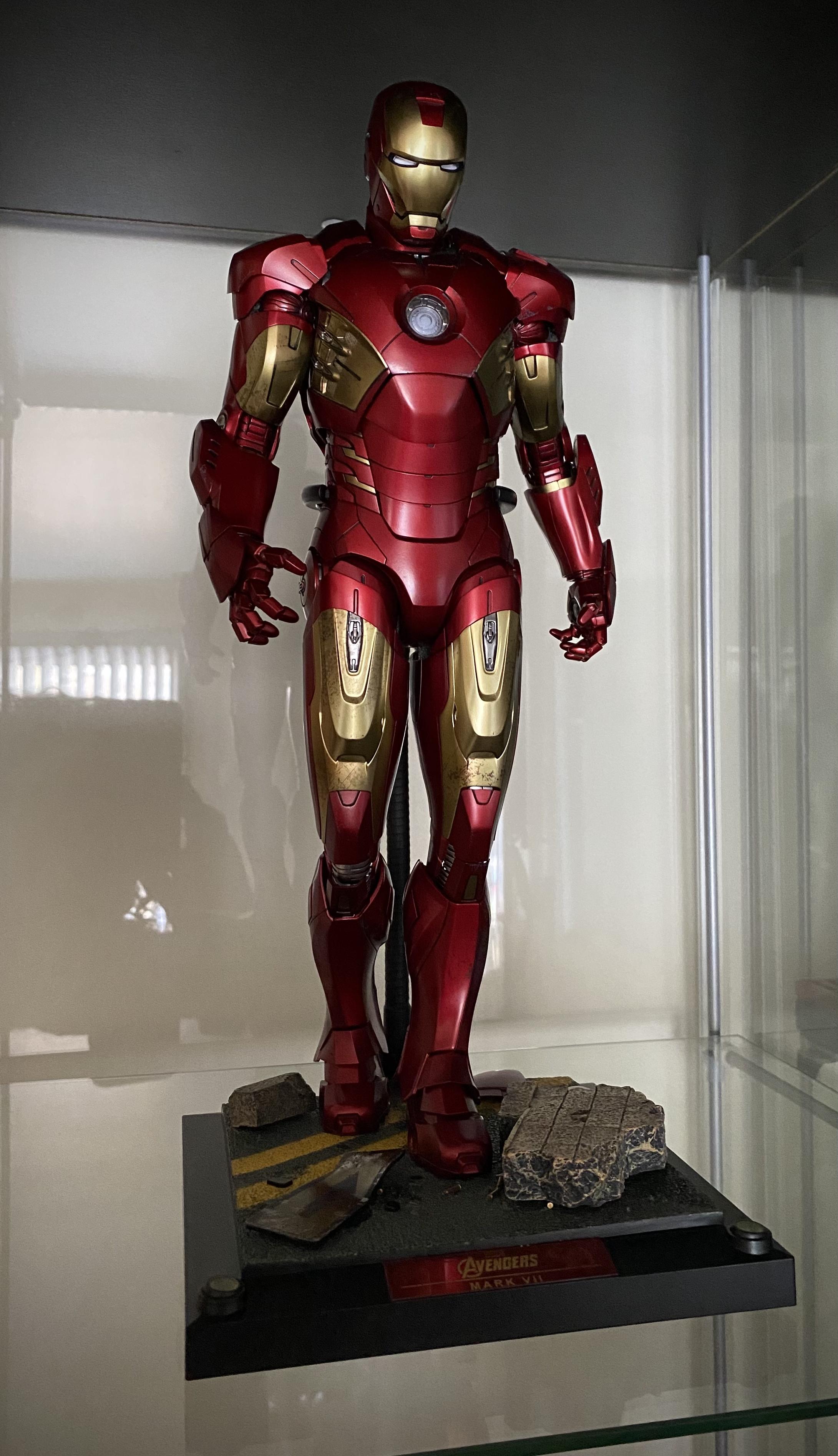
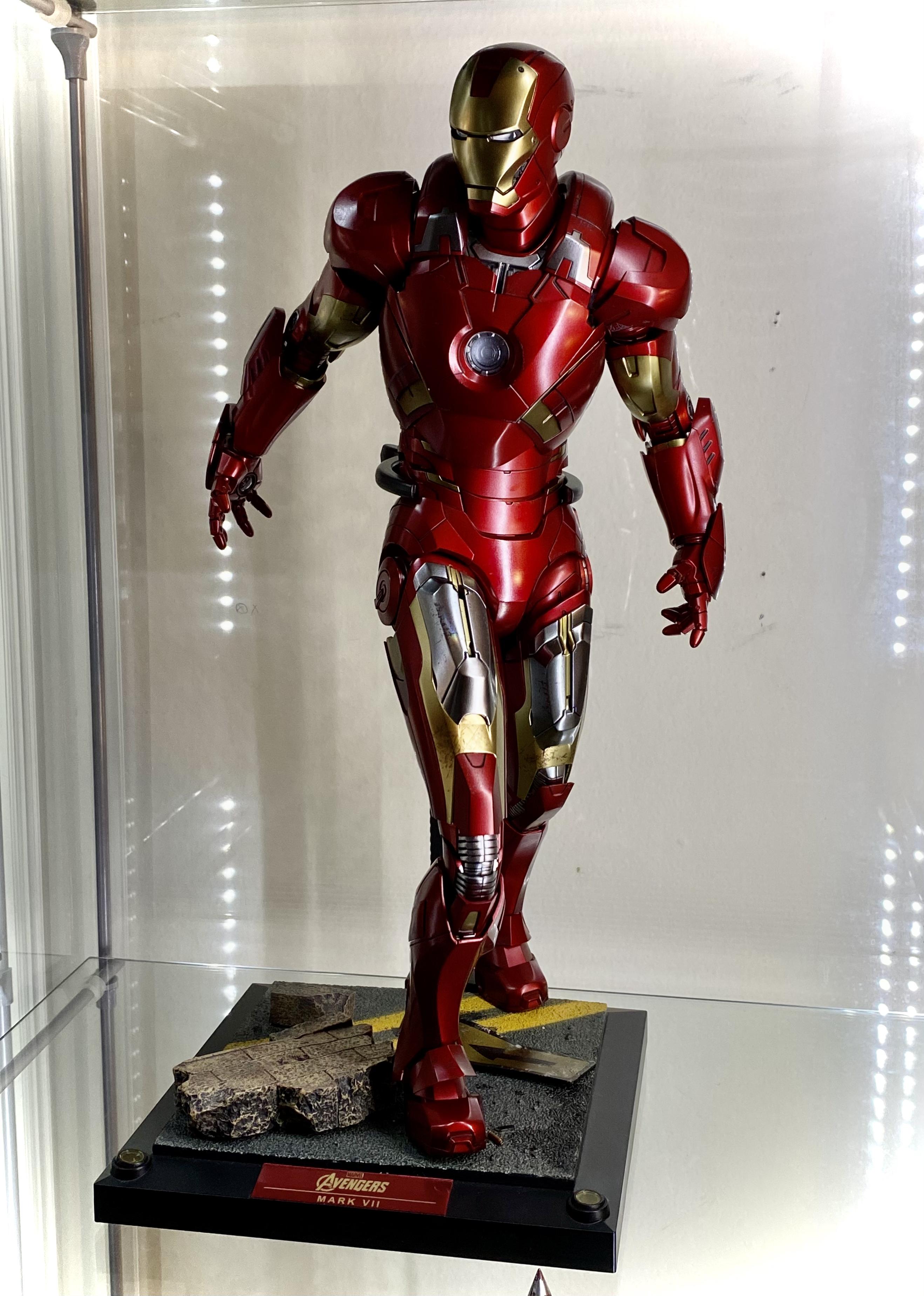
I really go back and forth on those two. The colour blocking and industrial look do work exceptionally well on the 47. The 46 is one of my favourites but the design can get a little busy at certain angles.
I know that this will sound counter intuitive but it is my opinion and this forum along with plenty of FB groups hurt the first production-production numbers with the knee-jerk, negative reactions before ever seeing it in person. I feel that the silver sections actually make the design less “busy” looking. The regular Mk. XLVI is the busiest looking, less busy is the Concept Mk. XLVI and the Mk. XLVII is the least busy looking out of the 3 paint schemes. If I had to guess why it looks that way to me is the fact that the regular 46 has so much red but still all those lines. Unlike the extra gold in the concept 46 or the silvers and gunmetal in the 47, the lines that are breaking up the same color red do just that, most look like they are just breaking up what might have looked streamlined instead. I am sorry for all these needless words to say what my initial response to your post was; YOU’RE RIGHT!
2 armors on my wishlist (realistic unlike the comic Godkiller, Superior IM or Model Prime, then again we did get Punisher WM) would both probably be under the Concept Art moniker with my 2nd choice being a Concept Mk. L that did for color a mix of the Concept 46’s pallet and 47’s torso silver and gunmetal. It is not a concept I have seen in any of the official books per se but it would obviously be a repaint. Unfortunately aside from the books not showing anything close to my color choices there?s that pesky problem with with the stock of the Mk. L seemingly being never ending

But my ultimate first choice right now (again realistic) would be completely dependent on the demand for Rescue initially, now, when it ships and after; yeah would need a major alignment of stars. Oh I remember the feelings of shock, need, anger, surprise and more so well when I received my Art of EG book reaching the Rescue section and there she was. I mean at this point my emotions were utterly discombobulated going though stuff like Captain Iron Strange (no joke), armors for all Avengers (kinda cool, kinda stupid), IP 2.0 with WM colors (so hardcore, in a good way) the elusive WM Mk. V (yes, the IP 2.0 is not the WM Mk. V) and even Thanos in a full on dress (not a kilt, not even a long kilt and not even a long skirt, it was a full on DRESS-yikes but also… YIKES). So I am nearing the end of the book being mortified, flabbergasted, extremely entertained, wildly excited and even some off the wall real laugh out loud (in the healthy funny sense) and there she is on page 296, one single picture of Rescue painted in the classic gold, silver and hot rod red Iron Man colors! It is so impressive and while not nearly identical, it had enough similarities to the Marvel Comics one-shot issue where Pepper willingly has the surgery to implant the chest RT so she could resume being a Superheroine! I believe that issue was way before To y became Superior IM and everyone, including Pepper/Rescue tried to stop him. IIRC, the single issue is very simple and self contained; no huge storyline and nothing crazy but some cool realizations about Pepper’s personality and of course some great armor shots besides the cover. So yeah, I want this to happen:


 Yeah the 45 is great! It was my first die-cast IM, and I was blown away by it. I think it still holds up pretty well as far as figures go. It's also my favorite of the 'organic' Iron Man armors, as I even now prefer it to the 50 and 85. The XLVI/XLVII are a nice in-between of that industrial and streamlined look, in my opinion.


 no seriously it’s true!

