pjam
Here on the Perimeter
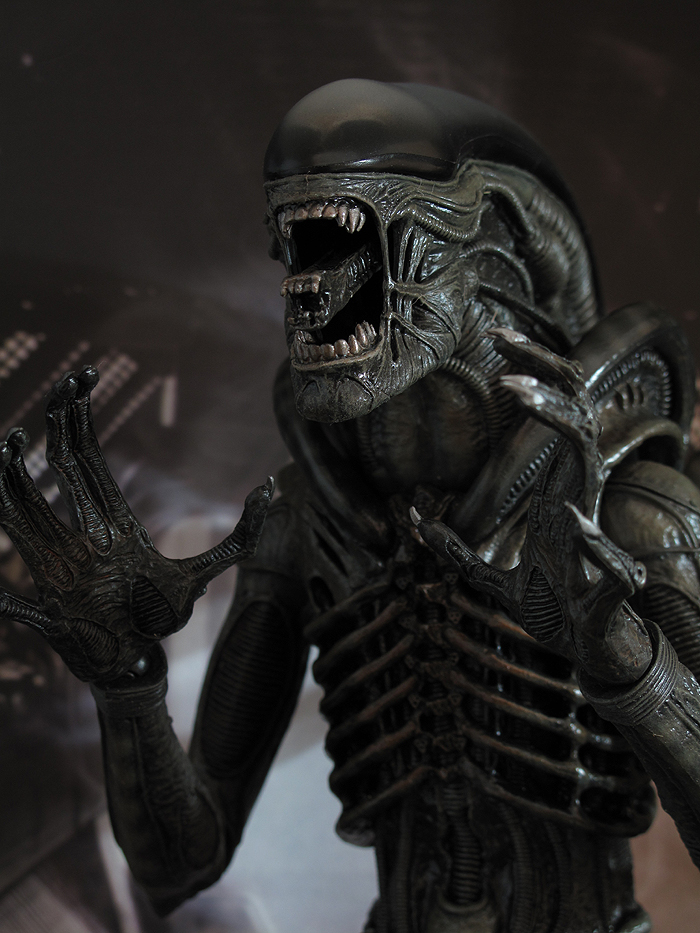
And what's with the BBQ stains in his teeth and chest? Has this chap been eating Babyback Ribs at Chili's?
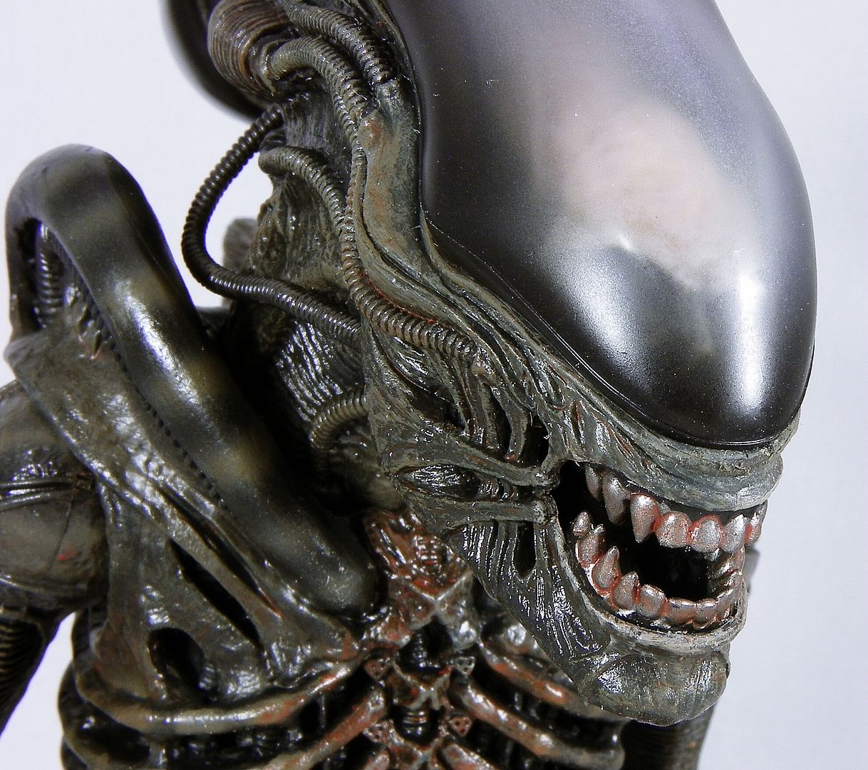
Looks more like Cap'n Dallas' Steakhouse to me.


And what's with the BBQ stains in his teeth and chest? Has this chap been eating Babyback Ribs at Chili's?


...And what's with the BBQ stains in his teeth and chest? Has this chap been eating Babyback Ribs at Chili's?[/IMG]
can you tell me ...is the dome hard or soft plastic and removable ?? I will need to fix some things
It's supposed to be a "rust" effect.
Giger had a bit of that on the original suit.
 Cuz that would look awesome.
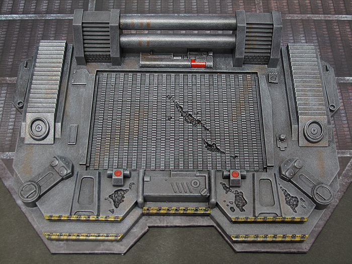
Sabres those are some fantastic pics you got there. Absolutely love the ones with the Nostromo dio in the background.
You should try and darken it up and take some pics to give it a more menacing look...at least I wish you would.Cuz that would look awesome.
Yes I know. But they overdid it. A lot.
Nice pics Sabres,
The rust effect is pretty minimal on mine, it tends to show up a lot more in bright lighting & on camera.
Overall the paint looks good - spanks the medi, that's for sure.
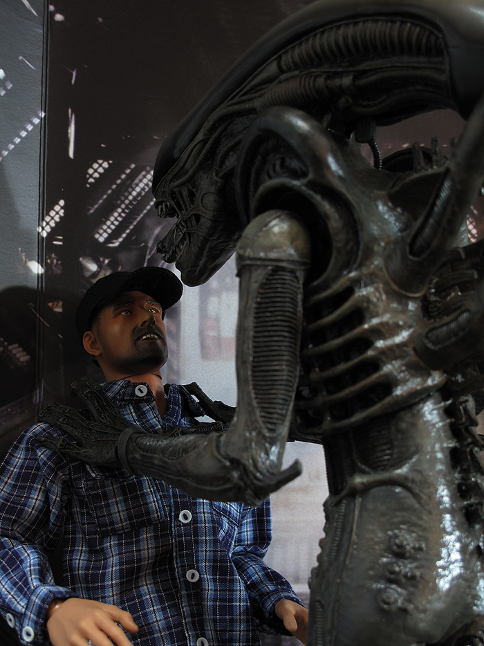
I love the irony of how Neca's BIGGER Chap owns it in this shot:
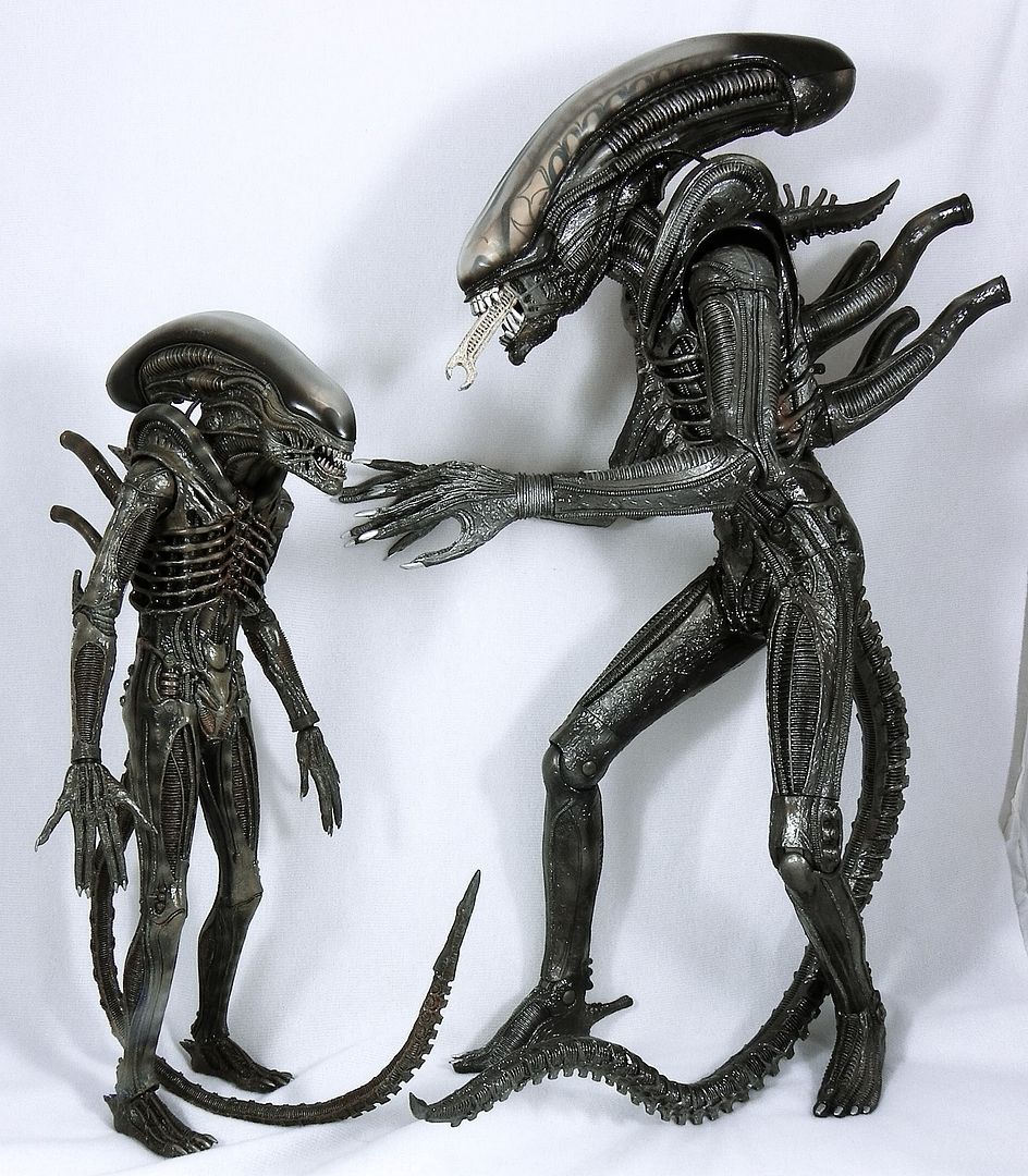
And what's with the BBQ stains in his teeth and chest? Has this chap been eating Babyback Ribs at Chili's?

Have these pics been posted? Guy on Toys Daily puts his Alien in some cool poses.
EDIT: Centrocal you beat me to it!
See the photos here: https://www.toysdaily.com/discuz/thread-115127-1-1.html He gives a pretty comprehensive rundown (it seems. You'd have to be able to read the text) with screenshots from the film.
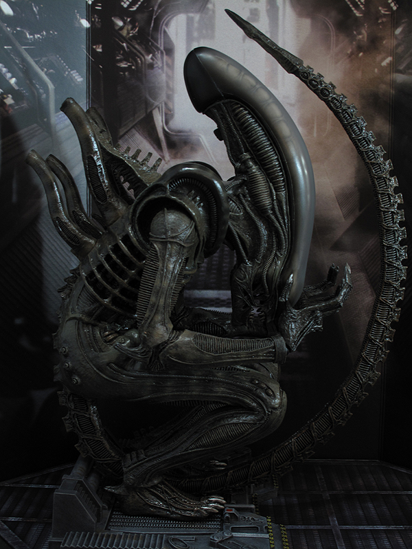
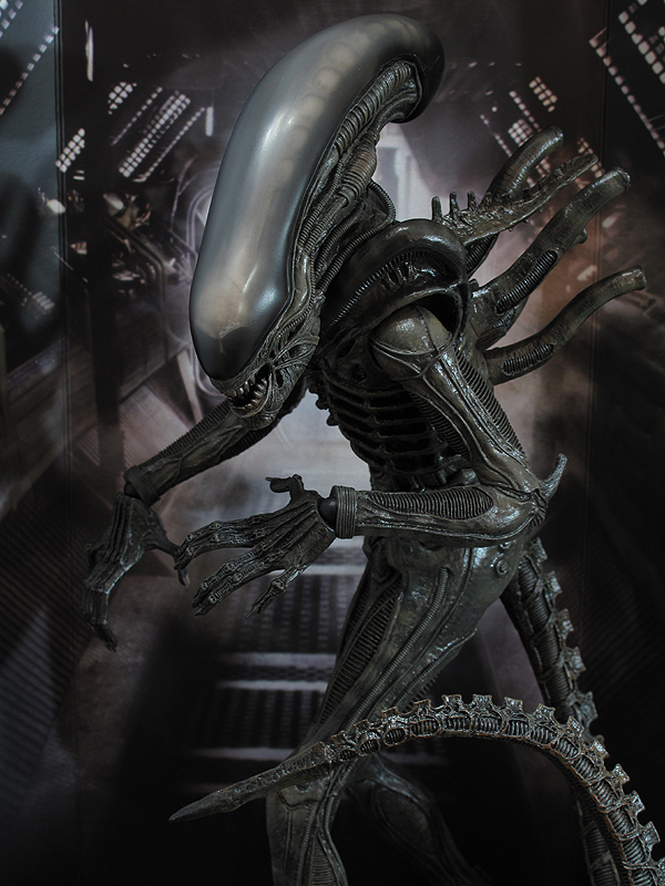
This one reminds me of the HT AVP Alien
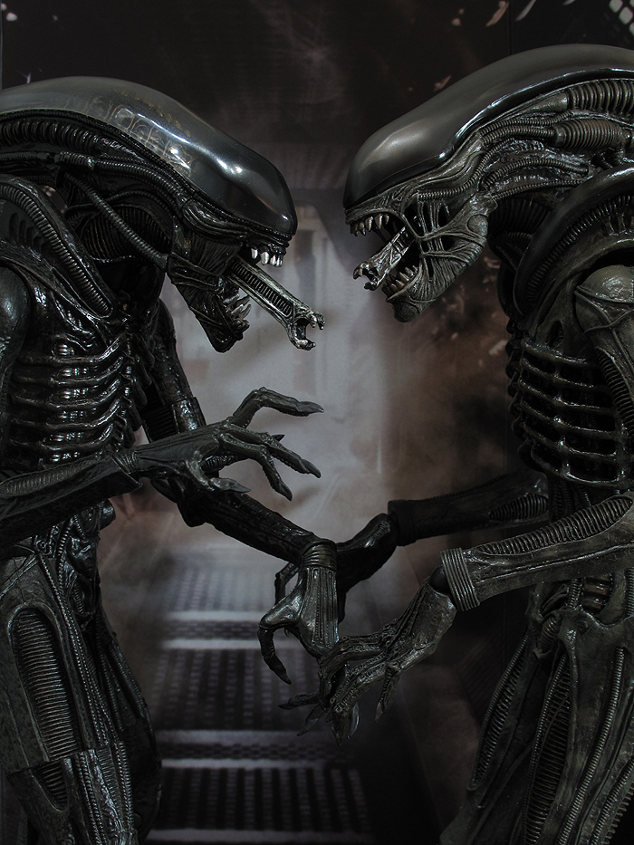
shot of the base
the neca is nowhere near as good as the ht....
I need to pose mine like the top pic when I get it. Has anyone tried to bend it that far yet?
Have to disagree...the NECA owns the Hot Toys version.
I know you are right in terms of 100% Xeno accuracy (well, in most areas) but I think in terms of the over all look, then to the non-obsessive fan the HT wins. The NECA's ugly pin joints, cut joints (that look odd if not lined up) and the cheap look of the plastic and paint app (esp the inner skull) coupled with its general ungainliness make it look like a budget figure, which in all fairness it is. So comme si comme ca!