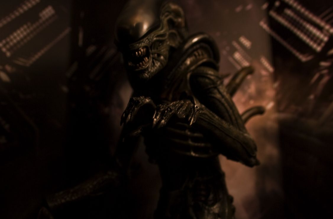
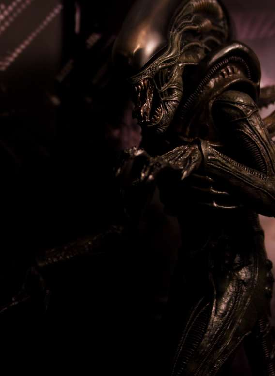
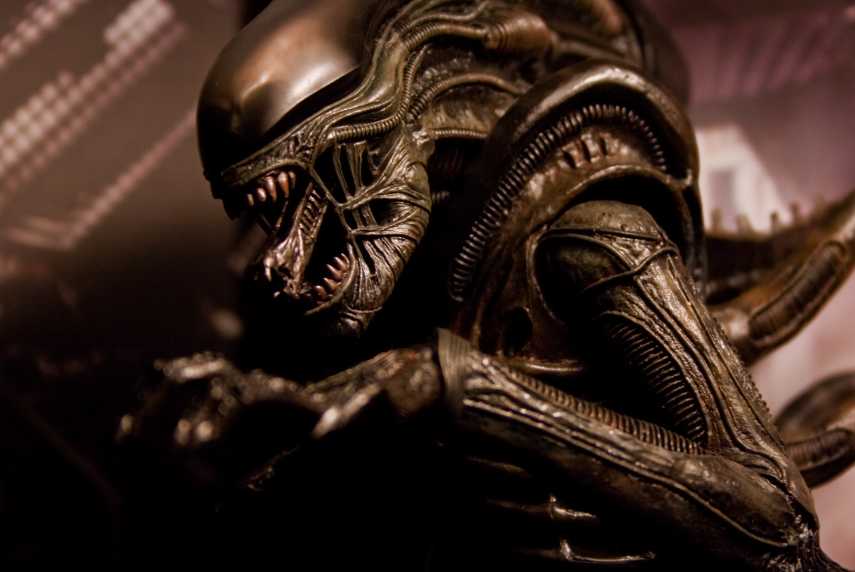
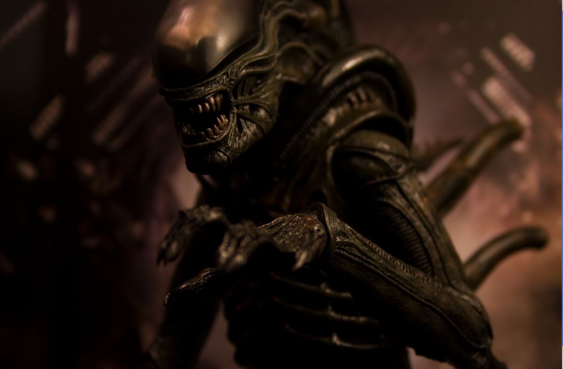
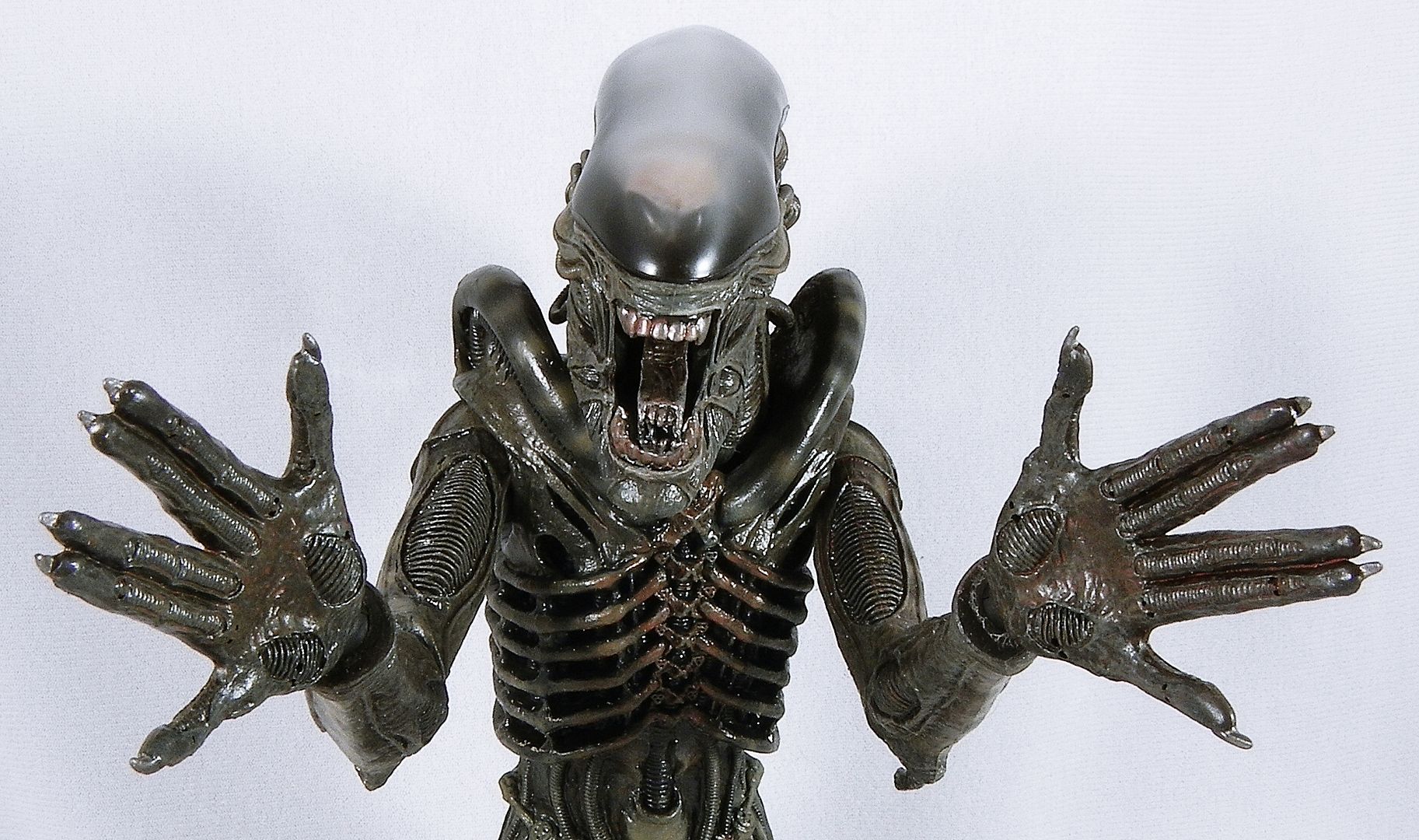
I'm not sure I quite understand the problem people have with the mouth in that last shot here. Is it because the mouth opens so wide, or is it because the upper teeth aren't as concave as the middle picture? If you close the mouth on that last shot..the only real difference I see is the concave upper teeth. And that could just be camera angle. That and the first and last digits on the hands needed to be more webbed.
Also, the gap between the edge of the dome and the mouth people were upset about seems dead on.
It's hard to know where to start really. Pretty much every proportion and detail is incorrect. The shape, colour and size of the teeth. The shape of the dome and its angle in relation to the face. The missing pipe running round the edge of the dome. The bevelled edge they have put on the dome. The colour, shape and sunken-cheeked appearance of the mouth tendon area. The colour and shape of the inner jaw. The massive, distended jaw itself...
But as I said, the details don't really matter. What matters is that it just doesn't give the overall impression of what we saw on screen. I'd rather a less detailed, more impressionistic take on the Alien, that overall resembled the screen version.
The Revoltech is a good example. At that size it can't have all the right details, but it still looks very close indeed to the screen version, through judicious use of the right proportions and a skilled sense of the way the Alien seemed to look overall, when you actually sit and watch the film.
Last edited:





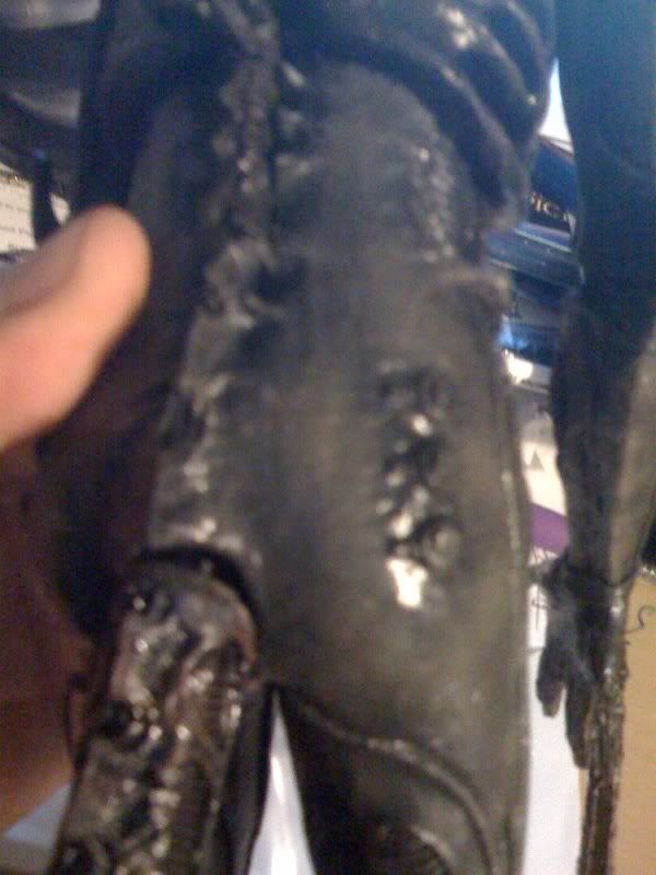
 The right hand/wrist piece is fine. I didn't want to touch anything else. As of right now I am guessing a replacement arm because I don't know how I can get that small plastic piece out of the arm.

 . I might wait till either HT or the online store where I purchased it from to respond to my email request. I know it might be a while. But I can wait.