Hot Toys - MMS DX 11 - TDK: The Joker 2.0 Collectible Figure specs and pics

Collector Freaks Forum

Help Support Collector Freaks Forum:

This site may earn a commission from merchant affiliate links, including eBay, Amazon, and others.
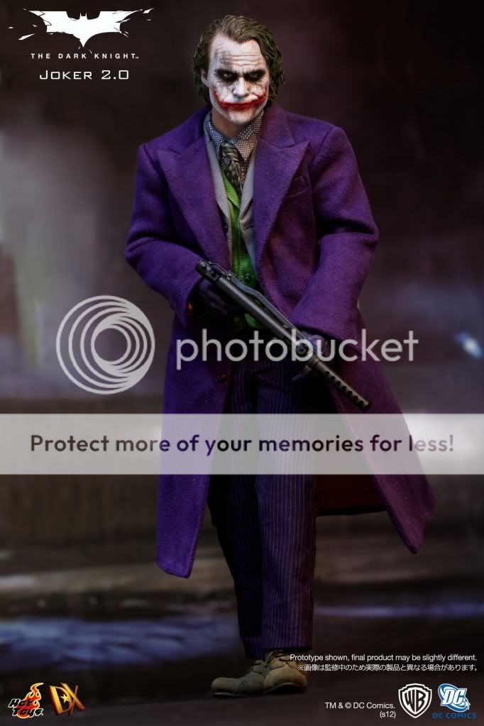
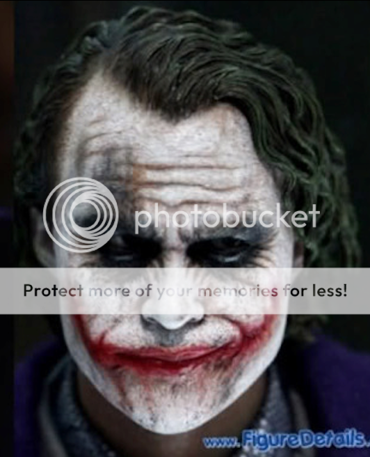
this is my favorite pic of the figure and its straight on.
and i think its my favorite joker sculpt i've ever seen.
521294_10150886130437344_2041872100_n.jpg
 
The chin in that pic looks almost identical to this chin imo. :dunno


135357283b3kk9drf32ivj.jpg

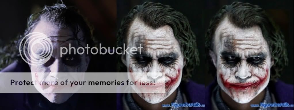
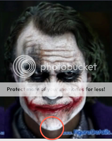
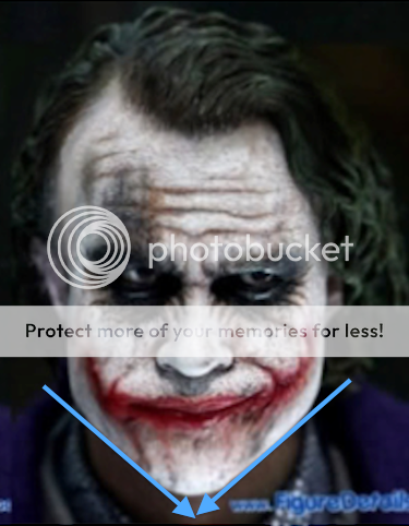
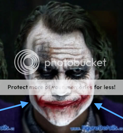
Maglor but you know the chin is too pointy, void showed pics already that proved that, but these ones here should show it to. However, the main problem is the face is shaped like a heart when it should have bulky cheeks like the photoshop ones here, well at least IMO.

I am not forcing you to believe me, I am just saying a lot of people on facebook do not like this sculpt and if Hot Toys made the changes, maybe these faults are what is wrong with it?

2ag2aex.jpg
 
There is something with the eyes when you look at him straight on, dont know what it is, but really...it is a awesome sculpt.

My other nit pic for this would be that his hair should be a little longer and more messy.

Other than that...He is perfect, IMO.

Probably the PERS thing, making the eyes look strange from front on.
 
Maglor but you know the chin is too pointy, void showed pics already that proved that, but these ones here should show it to. However, the main problem is the face is shaped like a heart when it should have bulky cheeks like the photoshop ones here, well at least IMO.

I am not forcing you to believe me, I am just saying a lot of people on facebook do not like this sculpt and if Hot Toys made the changes, maybe these faults are what is wrong with it?

2ag2aex.jpg

I like the comparison pics, but really? C'mon.
 
this is my favorite pic of the figure and its straight on.
and i think its my favorite joker sculpt i've ever seen.
521294_10150886130437344_2041872100_n.jpg

Ah I don't know maybe it is me. I doubt they will change it so I guess there is no point on going on about it.

I am just wondering if anyone else is seeing what I am seeing because people tell me they hate the sculpt and that the only reason they are buying it is because of the laughing sculpt.

I really see no likeness there though. :(
 
Not sure which is the photoshop. The one on the right has a really pointy chin.

The last one (right one) is the Photoshop and it does not have pointy chin but more square kinda. The one in the middle is not really pointy but it is pointer than it should be.

The space between the lower lip and the chin needs to be smaller, as shown in the photoshop, and the shape of the chin is adjusted - not sure if its right to call it rounder or squarer, it's just wrong and the PS is more correct.

- The hairline is also too pointy, sculpt has a V shape which is totally wrong, this has been adjusted
- The eyes have been adjusted
- The ear shape has been corrected
- Some adjustment to the scars

And the nose.
 
The space between the lower lip and the chin needs to be smaller, as shown in the photoshop, and the shape of the chin is adjusted - not sure if its right to call it rounder or squarer, it's just wrong and the PS is more correct.

- The hairline is also too pointy, sculpt has a V shape which is totally wrong, this has been adjusted
- The eyes have been adjusted
- The ear shape has been corrected
- Some adjustment to the scars

Wow you found more faults than me. In all fairness though, he is pulling a different expression and maybe by doing that he is lifting the chubby cheeks up a bit to show the jawline. :dunno Nevertheless, heaths jaw is square not round, hence why some people call this the duck sculpt.

I just remember the next day all these pics came out and I said did you see the Joker 2.0 pics and they go yeah its a horrible sculpt. I said what why? They could not give me a reason so I have been going over it to see what is wrong.
 
The last one (right one) is the Photoshop and it does not have pointy chin but more square kinda. The one in the middle is not really pointy but it is pointer than it should be.


Are you talking about the chin or the jaw?


This is a chin:

chin-1.png


The photoshop comes to a sharper point at the chin:

chin2.png


This is a jaw:

jaw.png


The original definitely has a less sharp chin:


original.png
 
Wow you found more faults than me. In all fairness though, he is pulling a different expression and maybe by doing that he is lifting the chubby cheeks up a bit to show the jawline. :dunno Nevertheless, heaths jaw is square not round, hence why some people call this the duck sculpt.

I just remember the next day all these pics came out and I said did you see the Joker 2.0 pics and they go yeah its a horrible sculpt. I said what why? They could not give me a reason so I have been going over it to see what is wrong.

It's not just me who found all these faults, that PS is made by Neo, and him and I discussed what we thought could be adjusted. So yeah, this is why I think the laughing sculpt is much better than this one. The main things wrong with that are hairline (same V) and ear shape.
 
It'd be most ideal if we could know exactly what referance material HT uses to base its sculpts on. Sometimes I think that all these picture comparisons we do on here could be unfair and unrealistic - perhaps the sculpt is dead-on to some other pic that they used where the lighting made his hairline look a certain way or his chin with a certain pointyness/roundness.
 
Back
Top