- Joined
- Jul 15, 2009
- Messages
- 1,497
- Reaction score
- 27
Just for fun :
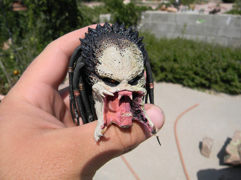
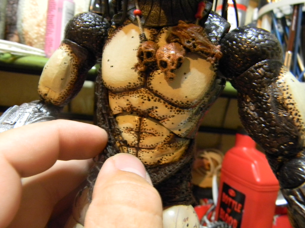
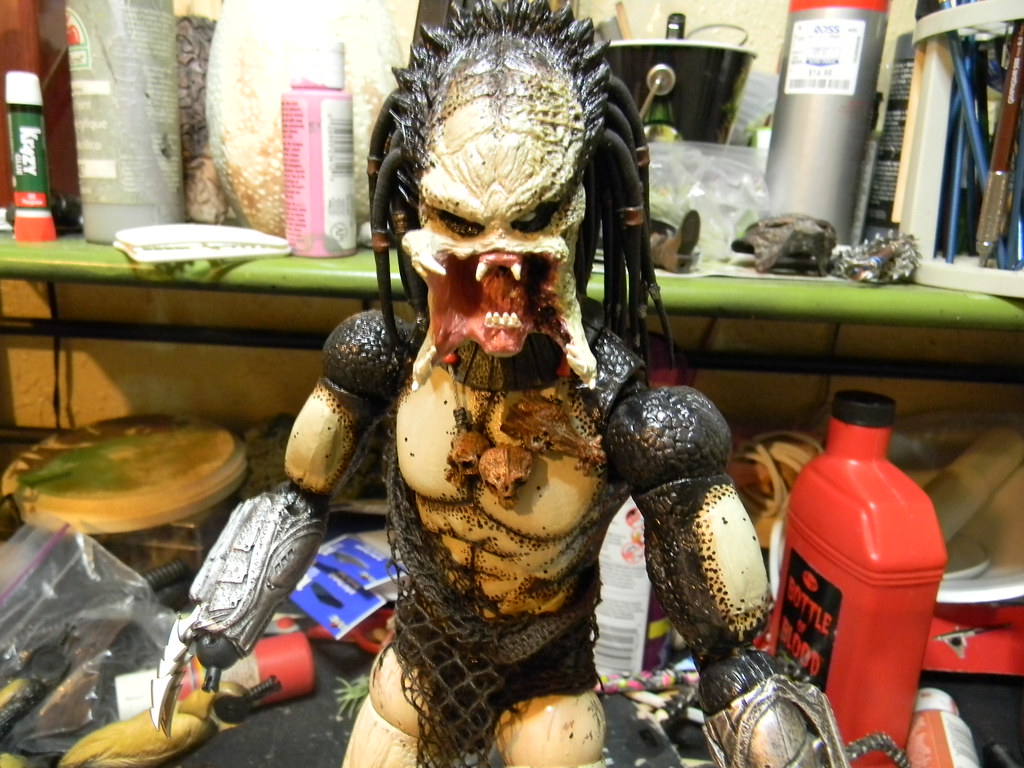
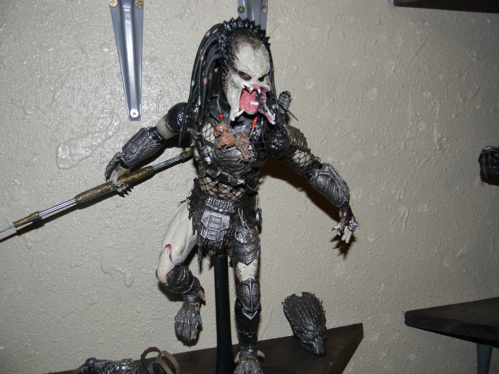
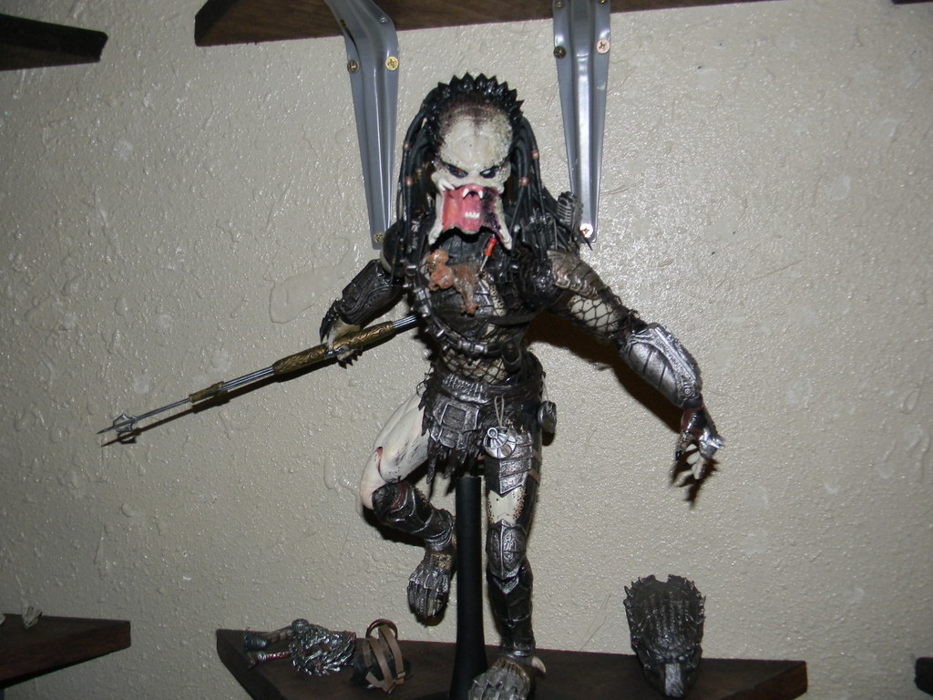
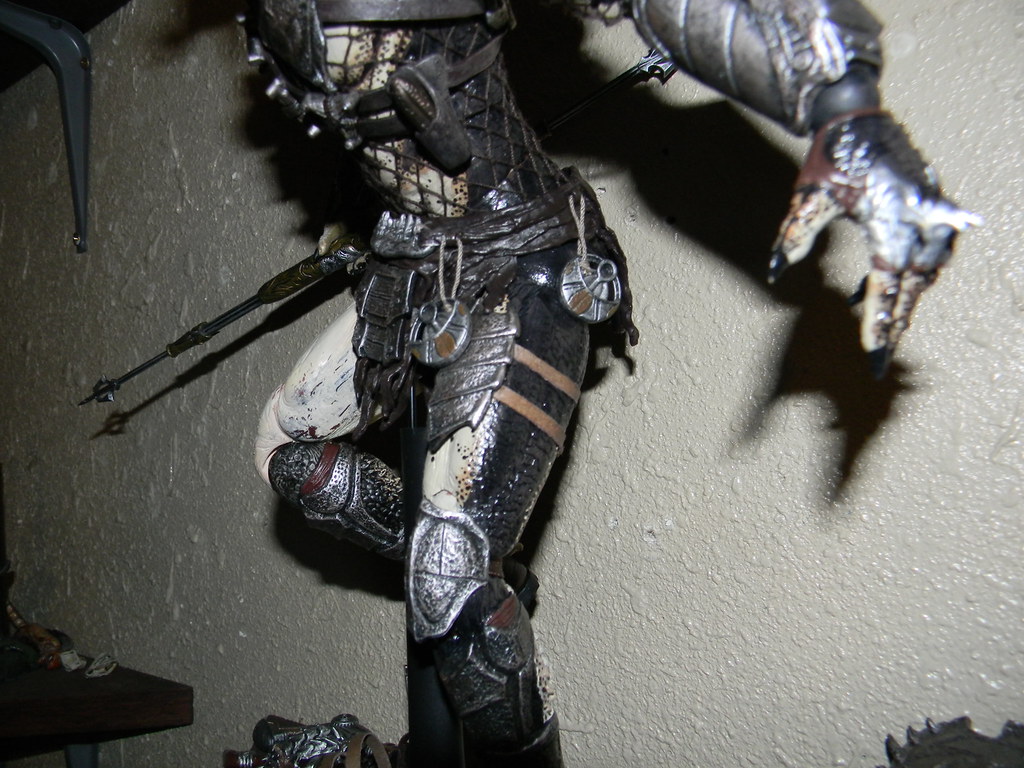
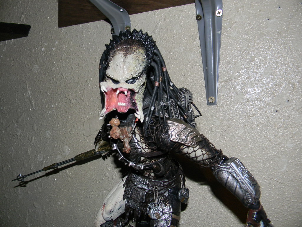
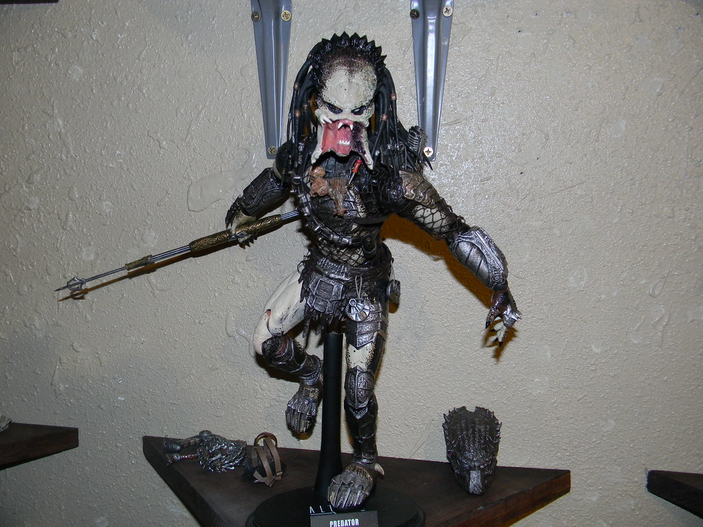
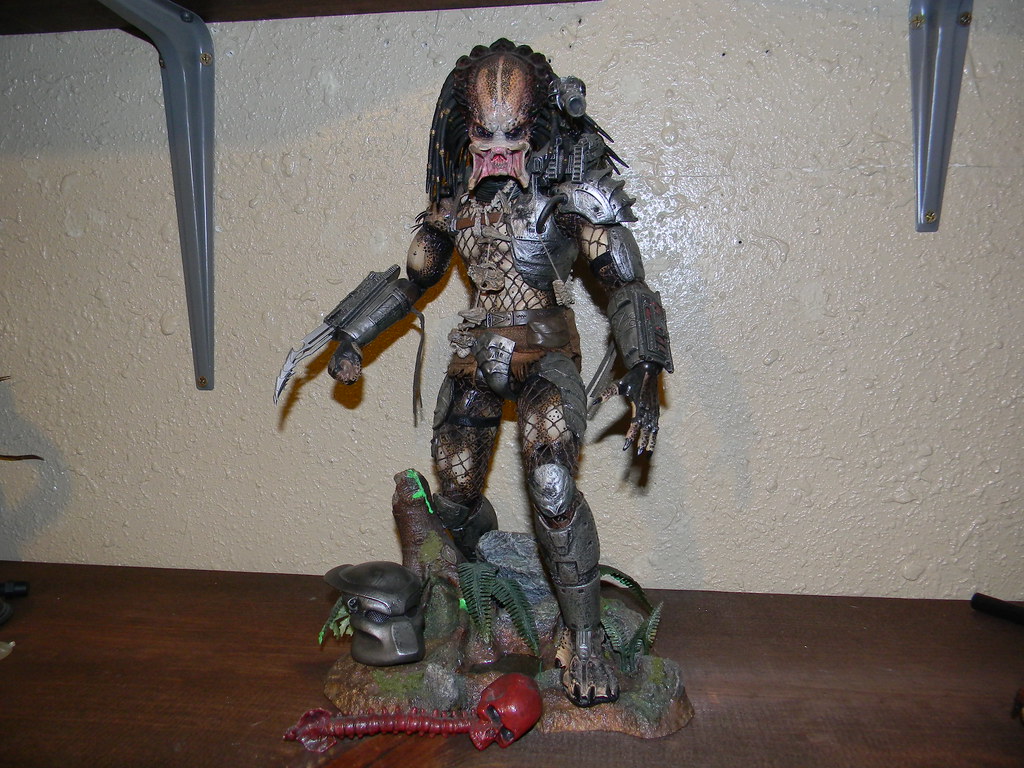
2006 Hot Toys Scar Predator body + 2011 Classic Predator head.
Imho it looks pretty damn good.


Works great for me
Somehow it works.
Last edited:

Just for fun :
2006 Hot Toys Scar Predator body + 2011 Classic Predator head.
Imho it looks pretty damn good.


Works great for me
I know other people have repainted bodies before. The actual painting doesn't worry me. I know I can do that. I just am unsure of disassembling the body and then once re-assembled keeping the paint from rubbing off on the joints.
Just for fun :
2006 Hot Toys Scar Predator body + 2011 Classic Predator head.
Imho it looks pretty damn good.


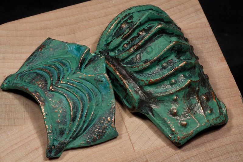
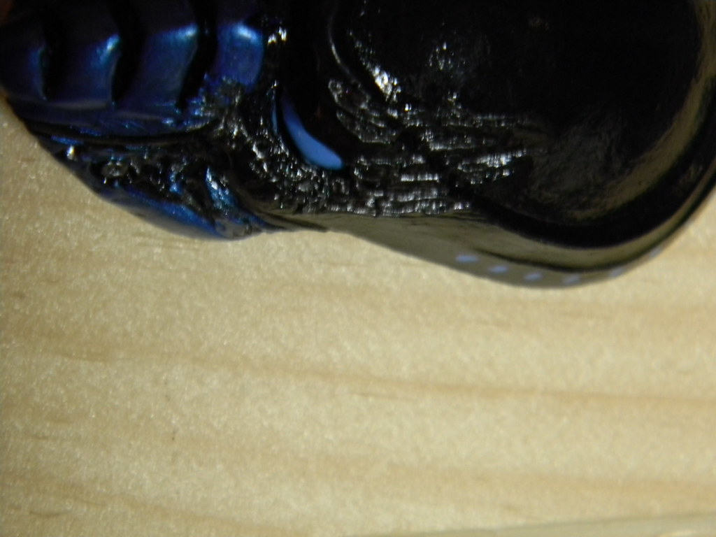
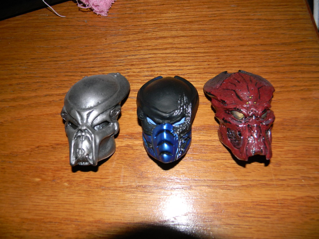
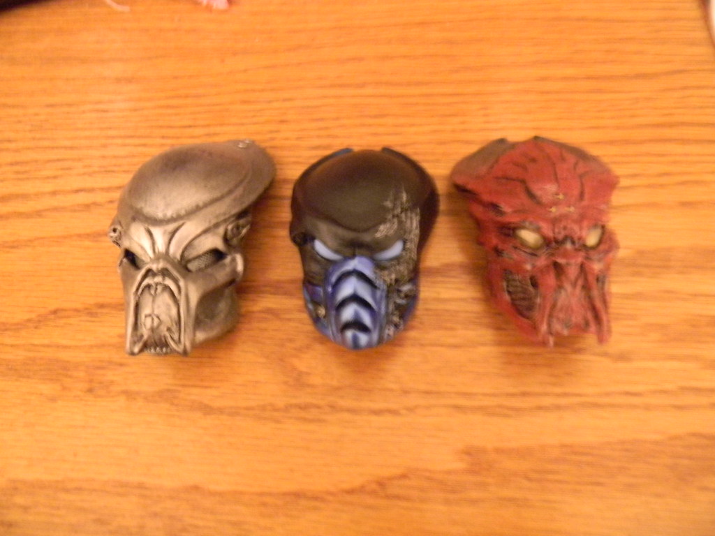
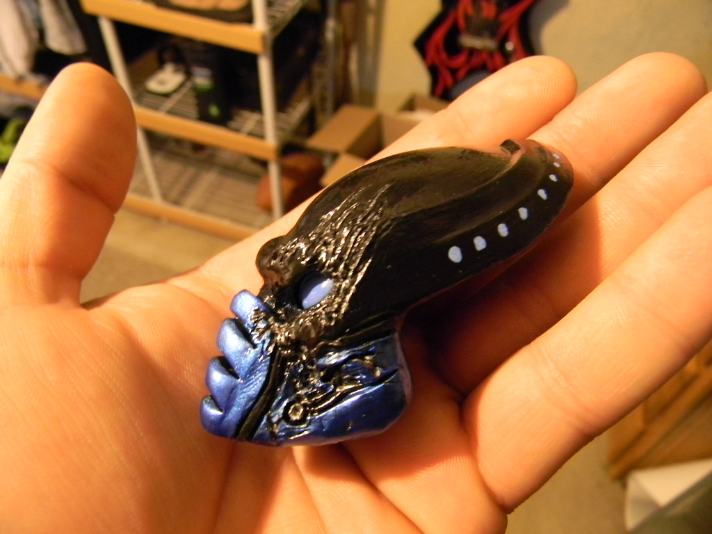
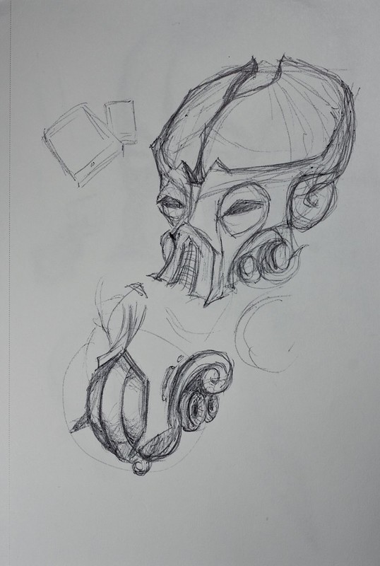
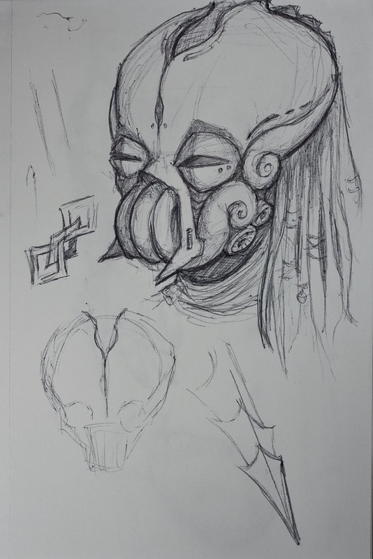
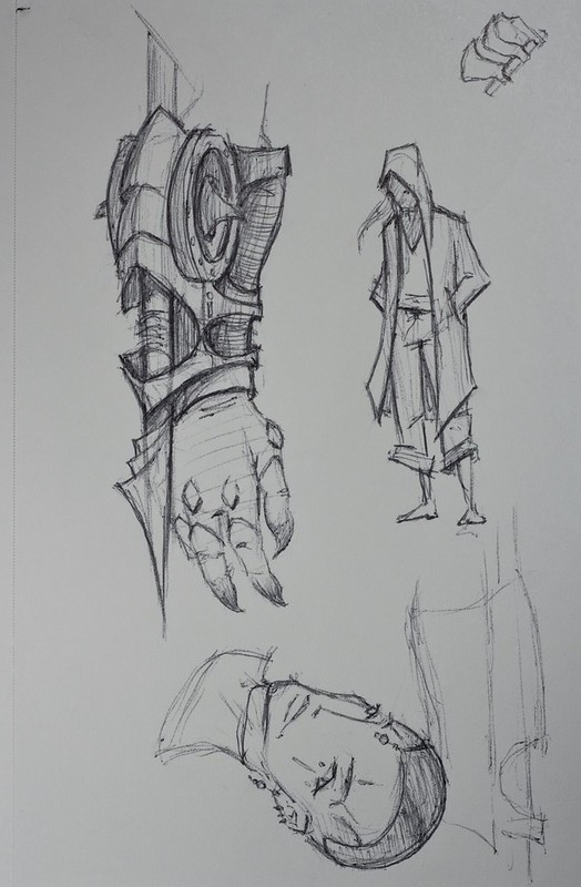
No idea how/if I'm going to be able to make this mask. I don't have the patience or skill to sculpt it myself. I'm liking the design though, needs refinement. I've only done these three sketches. The gauntlet was just an idea for a harpoon gauntlet.

IMG_0005 by dangercorpse, on Flickr

IMG_0006 by dangercorpse, on Flickr

IMG_0007 by dangercorpse, on Flickr
As I often do, last night while trying to fall asleep I was thinking about conceptual design. The original Predator design and it's iterations in particular. Winston and his people never design things without some sort of logical through-line to the choices made in design.
The Predator is a good example of this. On it's most basic level it's styled after a tribal hunter. All the weapons it carries are based on weapons used traditionally in hunting. This is even true of the Predator 2 who has a bunch of new weapons. By Predator 2 he is armed with the knife, gun, spear, net, and even the disc which appears based on a boomerang which is also a hunting weapon.
Now I was thinking about the armor and where in hell the starting point for that came from. It's clearly not based on anything huntery. Then it occurred to me that it probably came from the mouth design. It's mouth is very mollusky in design. It's not based on anything specific but does give the impression of something sea-dwelling.
So now, with that in mind, the armor is very mollusk inspired. You have all of the scalloped edges and overlapping plates that are reminiscent of a variety of shelled mollusks and the med kit on the back is in shape and appearance is very similar to a nautilus or snail shell. Even the body netting gives it a nautical air.
I was thinking about all of this since I was thinking on doing more custom Predators and I think it's very important to understand something before you attempt to copy and iterate on it. There's quite a few really cool looking Predator designs people have done but they lack the intrinsic Predator-ness that the first film's design established and I think that's because they're missing that element of a cohesive look all based on a single source.
I think the Predators designs are also lacking due to that. What I call "copying without understanding". They have almost completely discarded the mollusk shell armor which is all fine and good but what they replace it with doesn't have that same single source inspiration. Mostly the armor is just random plates looking more like they constructed their armor from scrap metal than anything. If you're going to replace that element it needs to be replaced by something equally cohesive.
The most notable example of "copying without understanding" is the film adaptation of Avatar: the Last Airbender though that's getting a bit off topic.
edit: It also now occurs to me that the coloring of the Predator's skin is very much like which you seen on octopi and squid. That's another reason why the Predators "Super" Predators don't really look like Predators to me. Instead of mollusk coloring and skin textures they have reptilian with pronounced scales and green coloration. The original Predators all have smooth skin as best I can tell, lacking any semblance of scales.
Some examples of mollusk skin patterns that are very evokative of P1 and P2 designs.
https://www.animalstown.com/animals/s/squid/wallpapers/squid-wallpaper-4.jpg
https://static.ddmcdn.com/gif/ocotopus-disguise-1.jpg
https://fc06.deviantart.net/fs71/i/2012/328/8/8/octopus__red_sea_by_danibarchana-d5m01hb.jpg
Yes, I'm not saying there can't or shouldn't be variety, I'm say that the original designs started from a place of a central cohesive concept. While later designs are iterations on that concept and eventually start to loose that in translation devolving into just random design elements and details.
