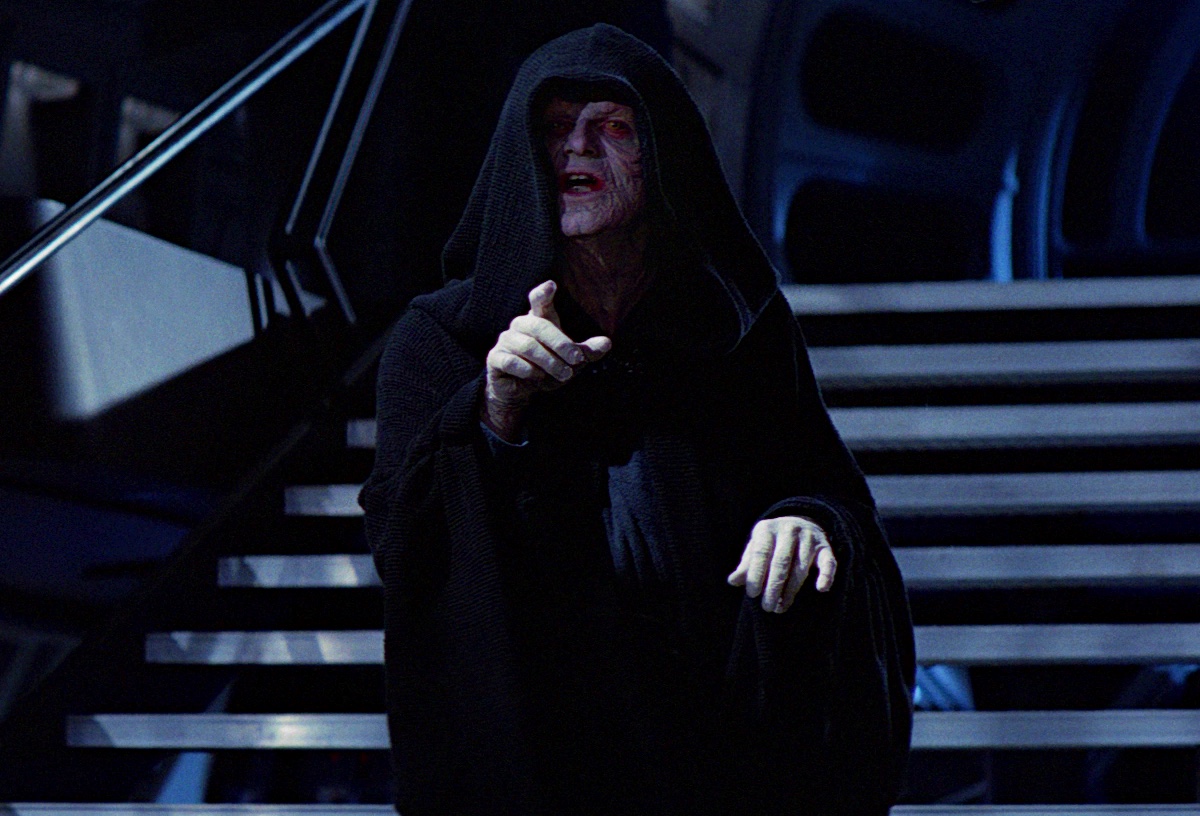
Hot Toys ROTJ Emperor Palpatine

Collector Freaks Forum

Help Support Collector Freaks Forum:

This site may earn a commission from merchant affiliate links, including eBay, Amazon, and others.
He could have just pretended to be an AT-ST driver wearing the smuggler vest as a trophy (like the Stormtrooper who inexplicably holds Han's own gun on him instead of his officially issued blaster, lol.)


Yep. :lol

I always thought that guy had had his Imperial blaster taken off him earlier by the rebels and then was like "I'll just take this rebel guy's cool gun then." Pragmatically it was also done so that Han could believably and quickly get his own blaster back to use it in the forest battle - the guy with Han's pistol "just so happens" to be pointing it at Han up-close when the Ewoks attack.

It's a mixed up sequence for sure - rebel dressed up as a biker scout, a stormie using Han's pistol (a stormie also has Chewy's rifle) and then Han returning the favor to dress up as an ATST driver.:lol


And re: lowering the throne height, it almost appears that the HT throne actually needs to be raised slightly, not lowered, to make it screen accurate (the Sideshow throne is maybe 3/16" higher off the floor than the HT.) This pic also shows how HT's paint app is a bit too black vs a more sliver/gunmetal finish - the SSC throne has a more silvery/gunmetal look versus the HT that reads as black with only a slight metallic sheen. As I mentioned earlier, a more slivery look might have contrasted better with the black robes as you can see in the screen pic (I've obviously lightened the screen pic to make it more visiible though.)

H8f6Yv1.jpg
 
Some great movie shots comparing the chair vs ROTJ. Not sure I expected this to be 100% accurate but paint aps should be close right?

I also think that his face could have been "weathered" a bit. There's literally no depth imo. Eyes could have been done better but again I think it comes down to paint aplication which they dropped the ball on. Maybe all the good paint/face artists are on the marvel side now?
 
Has anyone heard from Timewalker toys about the emperor and throne shipping? All I saw was the regular was shipping soon. I emailed them a week or so ago and they said when they know I will know..... I hope that's the case because I never heard they were charging my card with the guards.
 
I just think that the only pics where the seated-on-throne set-up looks good is where the lighting is very, very carefully managed (ie. mimicking the onscreen look) - which is hard in most displays, which either just have natural daylight or the Detolf top lighting. Under that "regular" lighting, even with the pose mega-carefully tweaked, it still looks underwhelming. Both Palps and the Palps/throne combo is a "less light the better" situation, and you can fool the eye by really working the lighting.

The throne room IS dark. So if you want to recreate that scene in the movie and do your memory justice, you surely need less light, or it might never look right :)

I think irezumi's display is still awesome, even under daylight.

 
Thanks yy0925! There’s also a good contrast in the colours purple, grey, black all mix really well together.
 
The throne room IS dark. So if you want to recreate that scene in the movie and do your memory justice, you surely need less light, or it might never look right :)

No, it's not just dark, or "less light." It's the careful addition of light that creates the specific look of the scene: the soft face light, the high key from above, the throne light hitting just right. Replicate that - accidentally or (more difficult for most people) by design and it "pops" as Palps, even if the figure itself has many problems.

It's like when people place a 1/6 Vader into one of those 1/6 death star environments that creates the "zebra stripes" reflections on Vader's dome - it fools your eye into making it look just like onscreen Vader from normal viewing distance, even if the figure sculpt itself isn't great.

I agree that many SW characters require certain lighting to help sell them as looking right - Yoda really needs harsh light from above because that's how he's always lit on film - but an amazing Yoda sculpt/paint still stands on its own regardless of lighting. Jabba is only ever seen in dim lighting, but you don't need a dark room to make a great 1/6 Jabba look good, right?

in the comp pics below, the set-up on the left, with lighting that roughly mimics the film (accidental or planned) looks great, the set-up on the right with a combo of artificial and day light, what most collectors have - ie the exact same thing under different lighting - is what I was working with and getting frustrated with. ie what the figure really looks like.

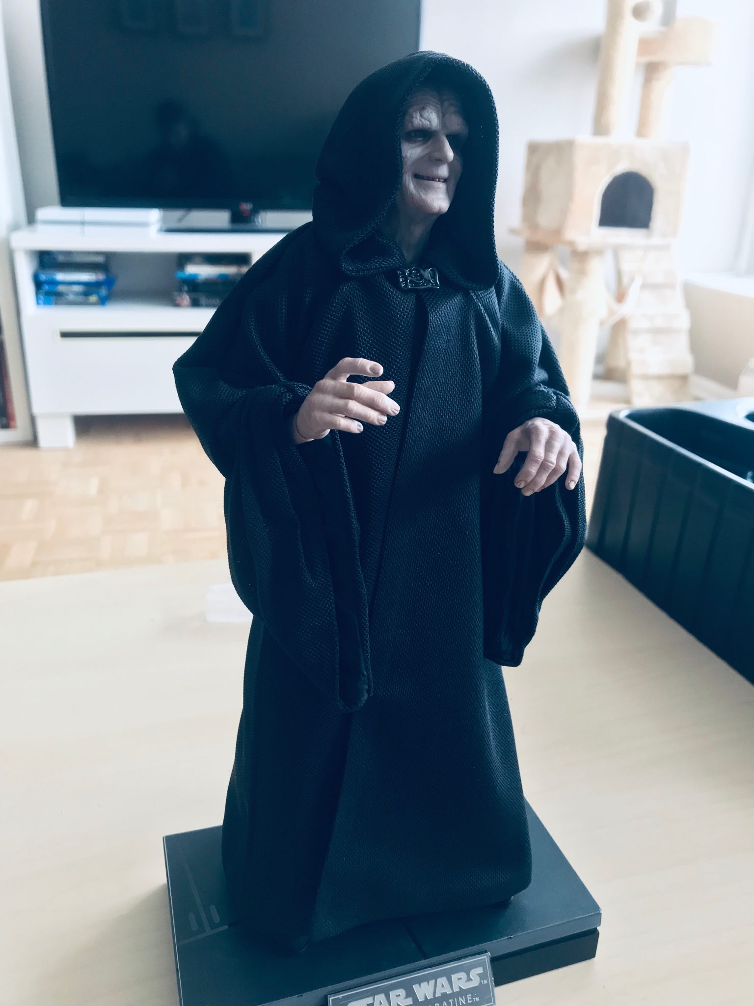
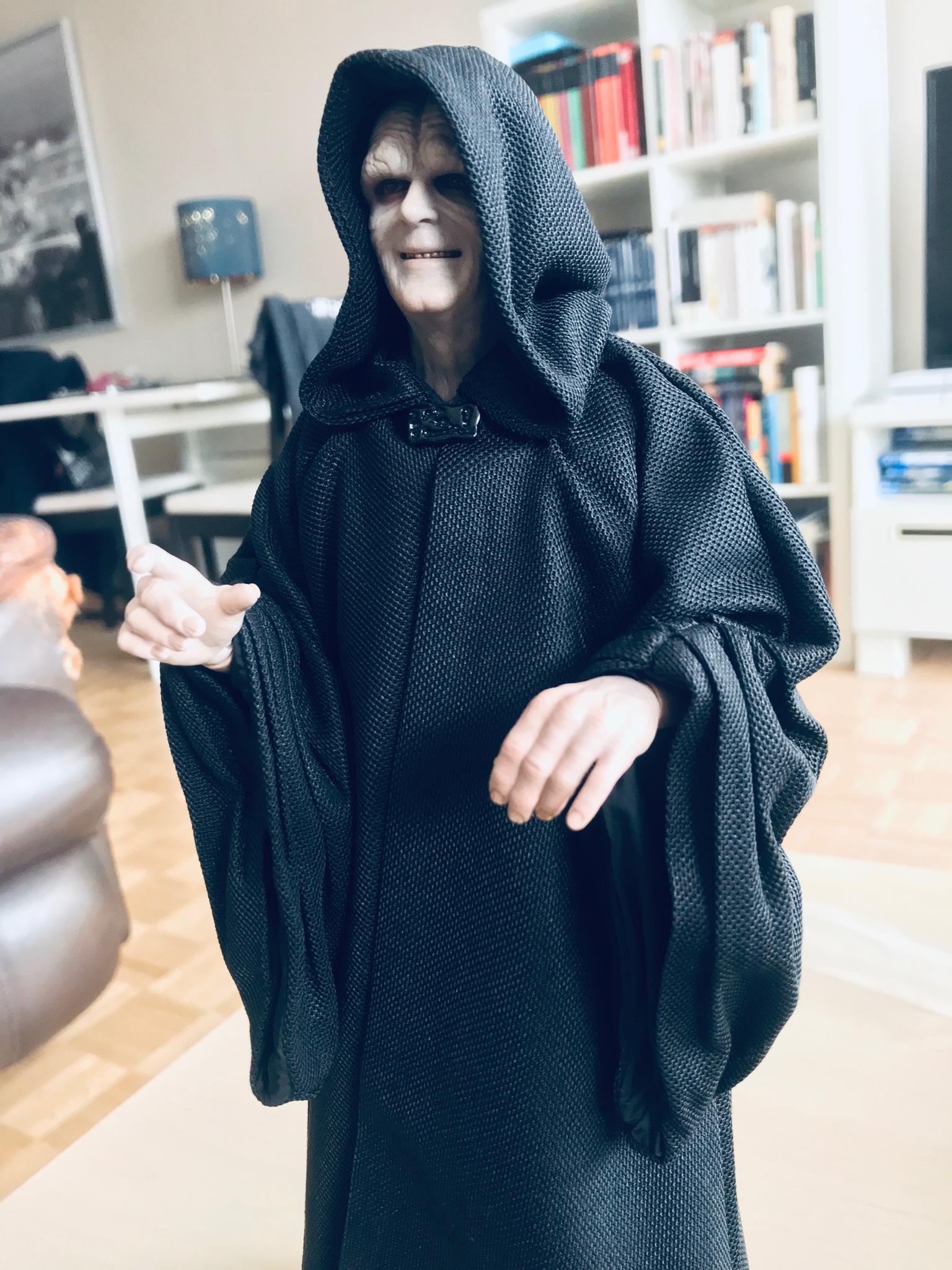
The figure has issues - the often silly-looking grin, the dangling legs (strangely, on a throne that's actually inaccurately low,) the futz-ability of the robe fabric (and very thick sleeve seams plus hood issues,) the oversized hands that also don't capture many classic Palps hand poses, the darkness of the throne paint that tends to absorb the black robes too much under some lighting - and putting it in a very dark room, a set-up that most people can't practically do for normal display, only makes them less easy to see.

That being said, if you are willing to set up a display that mimics the film lighting and very carefully pose the figure to catch that lighting, many of the flaws are simply not visible, and what you can see of the figure really looks great as irezumi has shown beautifully. What I like is how he's found the "sweet spot" where the head should sit under the throne roof, and bent the figure to achieve less of the "watching the game" look the figure often has, a more natural flow to the body.:clap

BBS60fv.jpg
 
@TaliBane True. With "less light" I actually simplified what you described. Indeed you also need to recreate the light sources and so on to achive that exact look in the movie.

I only addressed this to you because I read that you couldn't find the right Palp/throne combination since days, which also had me worried that, if an experienced collector can't get it right, would I? (even doubted if deluxe was the right choice).

But irezumi demonstrated how it can be done :)
 
Yeah for those of you with brightly lit display rooms I suspect this figure won't look nearly as good to you under that washed out lighting. Fortunately mine tends to be a bit darker and moodier so I'm not worried about that aspect. It's just the robe and futzing issues I'm mostly concerned with.
 
Loving all these pics, but the more I see them the more happy I am with my decision to pass on this guy. As Talibane said in the post above, in some lighting conditions he looks great, others you see all his flaws. I also feel he looks better standing than seated in his throne. But he's still just an old wrinkly man with a weird smile/grin and a cane. This, while the version of Palps I prefer, is boring. I'd rather wait for an EP 3 version with the much cooler cloak and a lightsaber. That was badass Sith Palps. And something that would look better on the shelf with Vader, Maul, Dooku and Sith Anakin.

But still happy for those that enjoy him. Keep the pics coming so I can feel at peace... :lol
 
26ca80cd1ea4309cbd4172d880faa7c7.jpg

ad8ede9b5f682a9791c08ae9e7d71c5b.jpg
57edd22adebe52f4a76cb4a9f7ae4b9d.jpg


Just got him today.
Not bad. I’m happy with him for sure.

I do wish this one had another neutral head sculpt. I’ll definitely be posting more pics soon.


Sent from my iPhone using Tapatalk
 
my deluxe arrived from Timcent ( that ebay guy) but I cant open until Christmas -- far out what a long what that will be !!!!!
 
OH OH ,

I just realised a major inaccuracy . The cloth pattern on his robes doesnt match the screen used cloak. Patterns should be horizontal lines not diagonal giving the illusion his cloak is made from a large Tea Towel. ( hard to describe) look at the screen used version and then look at the hot toys cloak. It is inaccurate. ***@!
 
For those that have Deluxe, has anyone had issues with the throne lights? Mine won’t light up at all. Tried new batteries, cleaning the contact points and leaving it with the switch on and nothing still.


Sent from my iPhone using Tapatalk Pro
 
...This pic also shows how HT's paint app is a bit too black vs a more sliver/gunmetal finish - the SSC throne has a more silvery/gunmetal look versus the HT that reads as black with only a slight metallic sheen. As I mentioned earlier, a more slivery look might have contrasted better with the black robes as you can see in the screen pic (I've obviously lightened the screen pic to make it more visiible though.)

H8f6Yv1.jpg


Excellent point regarding the throne color. I didn't realize it until you brought it up. I immediately glanced over at my Jazz Inc. throne and fortunately, its the correct gunmetal color.
 
Back
Top