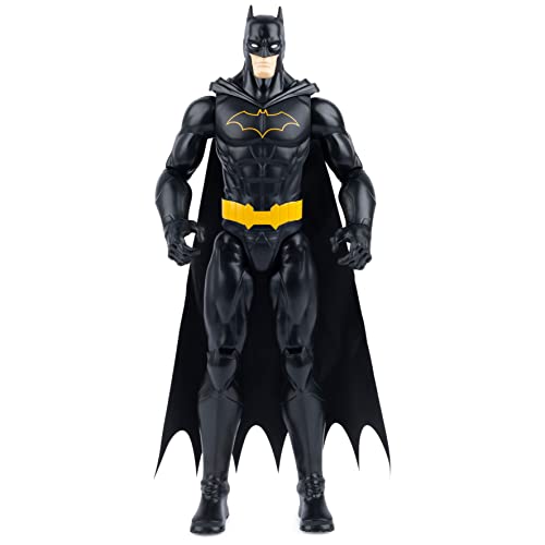
The first figure I ever bought was the Hot Toys Man of Steel. I had not taken it out of the box in quite a while so I decided to have a look at it again. After searching for it in my various closets, attic, basement and garage I found it in the basement. A spider was keeping it company. I killed the spider. I took the man of steel out of the box and behold, this figure still holds up very well today. So well, in fact, that my passion for the new InArt has subsided quite a bit. Looking at the Hot Toys MOS was like taking a cold shower. I don't think I will shell out the 350+ for the InArt.
You are using an out of date browser. It may not display this or other websites correctly.
You should upgrade or use an alternative browser.
You should upgrade or use an alternative browser.
InArt: 1/6 Superman (Cavill)
- Thread starter Nagoya
- Start date

Help Support Collector Freaks Forum:
This site may earn a commission from merchant affiliate
links, including eBay, Amazon, and others.
Hologram AI
Super Freak
- Joined
- May 7, 2013
- Messages
- 11,218
- Reaction score
- 14,279
Probably a personal thing but even with Hot Toys thickness being closer to how he was, it looks so cartoonish and off. The way they went about it gives me Rob Liefeld vibes.If you remove the shadows on IA's Superman's thighs, it doesn't seem as slim. Still not there though. I would give points to HT thighs as it is also closer to how the musculature shows on the actual suit.
View attachment 664957

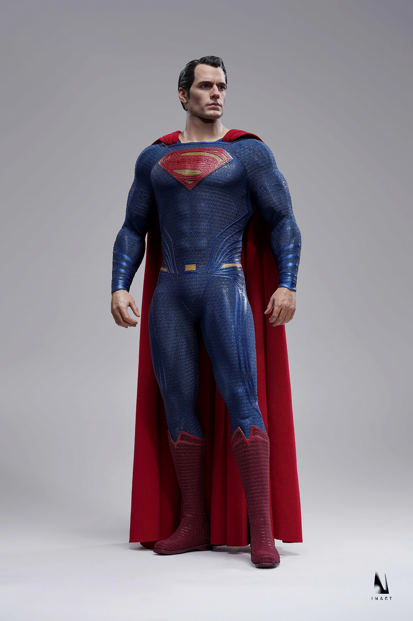
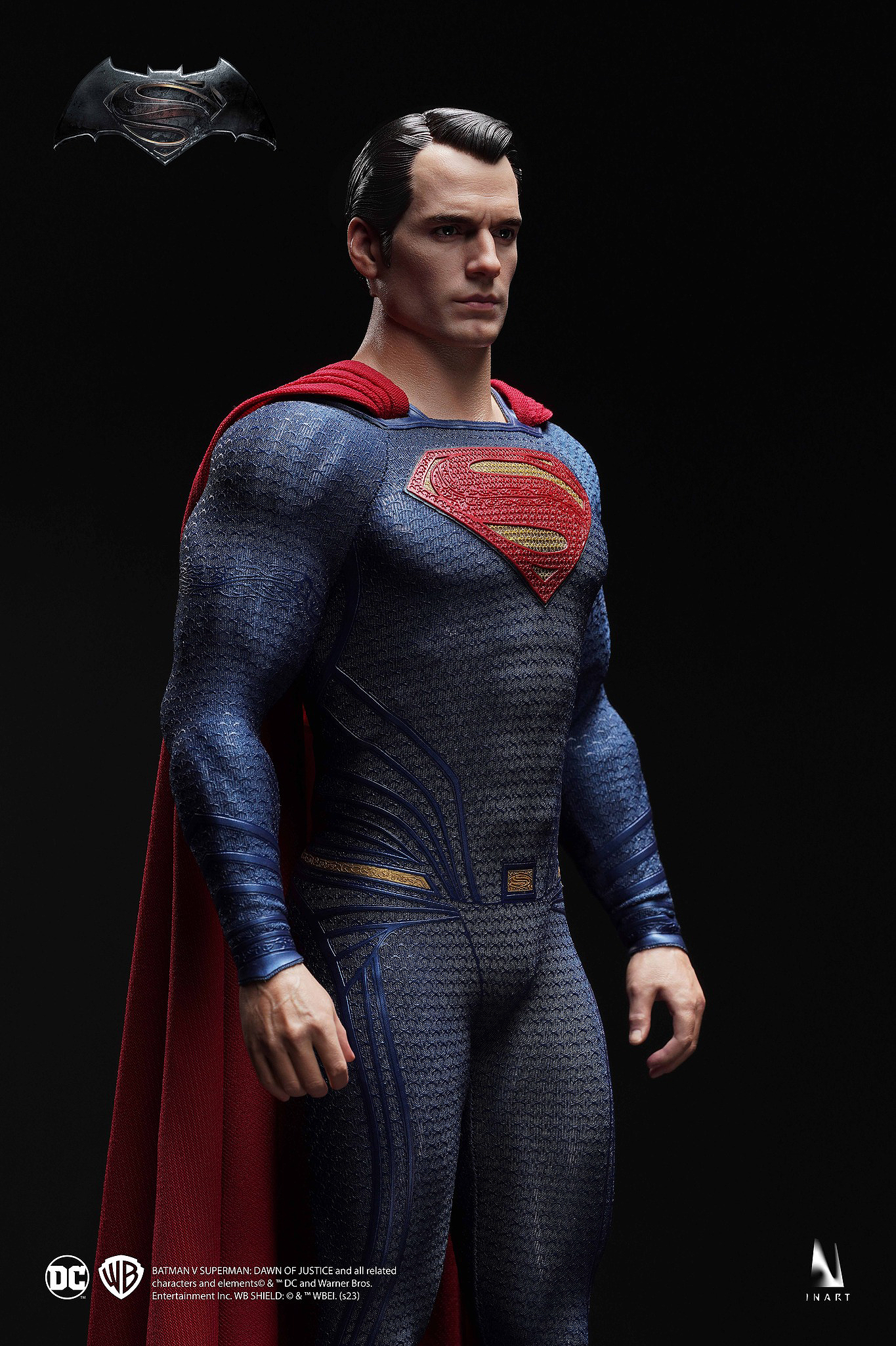
I've never once seen the Hot Toys body look like an actual human body like how the INART version looks below. It just comes off looking way more natural here. A very tiny bit of thickness added to the INART body would be perfect imo but not TOO much.
Last edited:
Probably a personal thing but even with Hot Toys thickness being closer to how he was, it looks so cartoonish and off. The way they went about it gives me Rob Liefeld vibes.

I've never once seen the Hot Toys body look like an actual human body like how the INART version looks below. It just comes off looking way more natural here. A very tiny bit of thickness added to the INART body would be perfect imo but not too much.


That Liefeld art is how I want IAs Affleck to look.

Someone have to post this on inart Facebook groupIf you remove the shadows on IA's Superman's thighs, it doesn't seem as slim. Still not there though. I would give points to HT thighs as it is also closer to how the musculature shows on the actual suit.
View attachment 664957
- Joined
- Sep 25, 2006
- Messages
- 5,222
- Reaction score
- 4,399
My nipples feel HT gonna respond with 2.0 MOS to this.Mark my words.

Expect a better than what they put out before portrait, most likely outsourced to a freelance artist, and no heat vision and comes with 1 accessory.
Artisan line, limited to 2500 pcs. Worldwide. With a video featuring Howard Chan and someone from the HK film industry revealing it.
Oh…sign me up <sarcasm>!
- Joined
- Sep 25, 2006
- Messages
- 5,222
- Reaction score
- 4,399
Oh yeah, I've been writing to InArt from the original FB open suggestions for figures post that they should do a Chris Reeve Superman and Clark Kent 2 pack.
Now that would be epic !!! Like JND did in larger scale.
View attachment 664958
Those are actually pretty good statues.
Hando
Super Freak
- Joined
- Jun 27, 2021
- Messages
- 2,301
- Reaction score
- 2,954
They don't approve anythingSomeone have to post this on inart Facebook group
- Joined
- Sep 25, 2006
- Messages
- 5,222
- Reaction score
- 4,399
Probably a personal thing but even with Hot Toys thickness being closer to how he was, it looks so cartoonish and off. The way they went about it gives me Rob Liefeld vibes.

I've never once seen the Hot Toys body look like an actual human body like how the INART version looks below. It just comes off looking way more natural here. A very tiny bit of thickness added to the INART body would be perfect imo but not TOO much.


Don’t forget those donkey Kong proportions. I never used his ‘relaxed’ hands…made those long arms even longer. It’s like he doesn’t have to tilt his body to scratch his knees.
- Joined
- Apr 25, 2015
- Messages
- 15,291
- Reaction score
- 4,375
Yeah looking at the InArt pics it's probably only enough wire to bunch it up a bit at the end. May need to relook into my JL Supes cape.Thanks! Thought you might have seen it on the MoS MMS200 thread.
I have been thinking about this. How good will the wired cape be? The poses look like HT black suit ZSJL style wired cape. Wired enough for it to bunch up a bit but not really dynamic posing.
Although I don't like the idea of the grippers on him for suit longevity or simple aesthetics.
I guess it would be also possible to pull it off with a standing pose.
- Joined
- Apr 25, 2015
- Messages
- 15,291
- Reaction score
- 4,375
Already a LOT of comments regarding that and other stuff. Go have a look. InArt is responding, so at least they are reading and listening which is positive.Someone have to post this on inart Facebook group
I guess they need to act quickly on some of this though as materials will need to be ordered for production relatively soon once they have a better indication of pre-order numbers.
Nine Inch Nails
Super Freak
- Joined
- Jun 13, 2018
- Messages
- 3,244
- Reaction score
- 2,008
Oh yeah, I've been writing to InArt from the original FB open suggestions for figures post that they should do a Chris Reeve Superman and Clark Kent 2 pack.
Now that would be epic !!! Like JND did in larger scale.
View attachment 664958
The clark kent blows the superman out of the water. Maybe its the hair thats throwing it off.
Hologram AI
Super Freak
- Joined
- May 7, 2013
- Messages
- 11,218
- Reaction score
- 14,279
Because for some reason they decided to make Superman look like his Evil SM3 drunk version.The clark kent blows the superman out of the water. Maybe its the hair thats throwing it off.


potatocorner4life
Super Freak
- Joined
- Jun 6, 2022
- Messages
- 736
- Reaction score
- 1,736
The more people are saying the same thing more likely they will listen!
Main thing they need to fix is the body proportions and colors. There are some people going very specific too so if they can fix those that’s great.
Main thing they need to fix is the body proportions and colors. There are some people going very specific too so if they can fix those that’s great.
Looks like a difference of a few more upright rows, some more bench press and squats
Nine Inch Nails
Super Freak
- Joined
- Jun 13, 2018
- Messages
- 3,244
- Reaction score
- 2,008
The color change in the suit in that example is soo minimal, its almost like its the lighting from the pictures Inart took is at play here. I honestly think the colors are good.
- Cape sits too low on the back of the neck.A friend made a modification on the Superman in order to have the perfect and accurate version.
He modified the shoulders to make them wider, and made the blue of the suit darker.
View attachment 664988
- Collar too wide at the front between the cape attachments
- Collar doesn't curve down at the front.
- Yellow on S not gold enough.
- Arm glyphs too low down.
- Suit lines all one colour instead of brighter blue inners.
- Buckle too square and not tapered.
- Leg lines shouldn't come round to the front.
- Boots chainmail should be black.
It's closer, but it's still a way to go to be accurate and perfect.
I'm thinking half way in between. He looks like he's auditioning for Super Mario Bros 2A friend made a modification on the Superman in order to have the perfect and accurate version.
He modified the shoulders to make them wider, and made the blue of the suit darker.
Here's the result:
View attachment 664987
View attachment 664988

Similar threads
- Replies
- 0
- Views
- 393
- Replies
- 99
- Views
- 13K
- Replies
- 1
- Views
- 268
- Replies
- 18
- Views
- 942


