InArt Phoenix Joker 1/6

Collector Freaks Forum

Help Support Collector Freaks Forum:

This site may earn a commission from merchant affiliate links, including eBay, Amazon, and others.
I’m blowing my cover here 😆 but Idc, I made this CF account to be more engaged with this awesome community. I kinda want to change my name a little though, it’s a bit much.

This is what I made and feel is what they should do. Namely, the diamonds should be more teal bluish-green. The white paint is too high and even the red ‘eyebrows’ too. They did say they’d revise the hairline which should help with that skin tone gap. For the mascara, I would’ve been content with them painting the eyelashes blue instead of leaving them alone.
 

Attachments

  • AB8D257E-043C-4421-9004-A209D9873BE1.jpeg
    AB8D257E-043C-4421-9004-A209D9873BE1.jpeg
    804.3 KB
I don't think I've seen a single person mention the pants. Would advise you guys to post it on their FB channels so that they see it and gets traction. I've only ever seen it mentioned here. Only ones I've seen get likes has been the coat/vest being longer and the face paint mentioned above.

I’ll end up letting them know on their pages and proceed to get even more mocked at! Ideally, I think it’d be cool if more people would also post on their channels.
 
Last edited:
I don't think I've seen a single person mention the pants. Would advise you guys to post it on their FB channels so that they see it and gets traction. I've only ever seen it mentioned here. Only ones I've seen get likes has been the coat/vest being longer and the face paint mentioned above.

I sent them the trouser refs before they even showed the proto and again since.

They responded both times, and not a generic HT style response.
 
I sent them the trouser refs before they even showed the proto and again since.

They responded both times, and not a generic HT style response.

Perhaps I’m in the wrong here, but I don’t think solely dm’ing them will yield results as much vs if the suggestions are to be publicly posted. John with INART said that they’ll address things if there’s a “general consensus” not just from “individuals here and there.” The more eyes are on it, the better it is to gain more traction (?)
 
I sent them the trouser refs before they even showed the proto and again since.

They responded both times, and not a generic HT style response.
I think John mentioned that they take the feedback and usually go with what are the most common complaints. As in, if only one person is telling them to fix something, it probably won't get much priority compared to something that more people collectively agree needs fixing. Better for it to have more exposure on their FB posts and social channels that can get likes than just a single submission. For example, the lack of a stand for the clown version was commented on a few times since the announcement, at least from what I saw. Along with the other things I mentioned earlier. Not one mention of pants though.

Although I guess more people in general just submitting that fix to them through IG/FB would also help? No clue how they have it set up really.


Exactly. It’s best to have more people post things and you betcha I’ll support it.

“Along with the other things I mentioned earlier. Not one mention of pants though.”

To be fair, I was the only one who asked about the costume stuff that I was personally seeing. So if I would’ve realized the pants had to be baggier, I would’ve been posting about that in their posts. But yeah, my waistcoat comparison grid picture got a dozen likes in support. A lot of people cared about that one. And I think it’s safe to assume they’ll optimize that. Who knows how they measure it all really and gauge priorities, but yes, it’s best to make these suggestions openly public vs privately messaging them.

If it helps:

I provided these refs to InArt previously as stated, as thought they may assist:

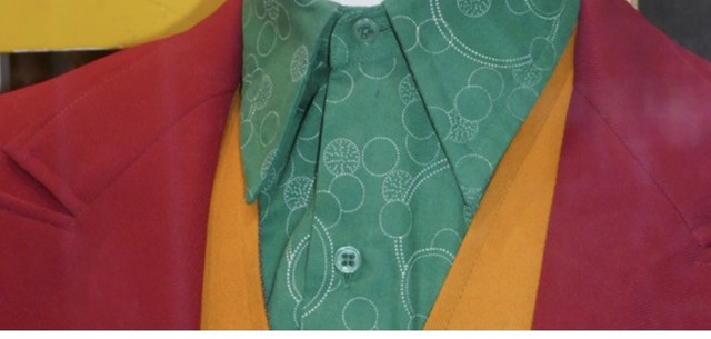
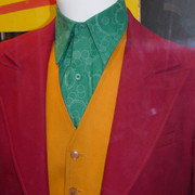
Shirt pattern:


Thickness of suit and collar stitching:


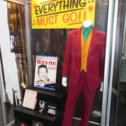
Full suit refs:


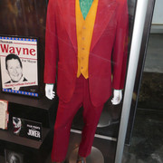
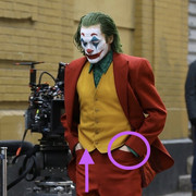
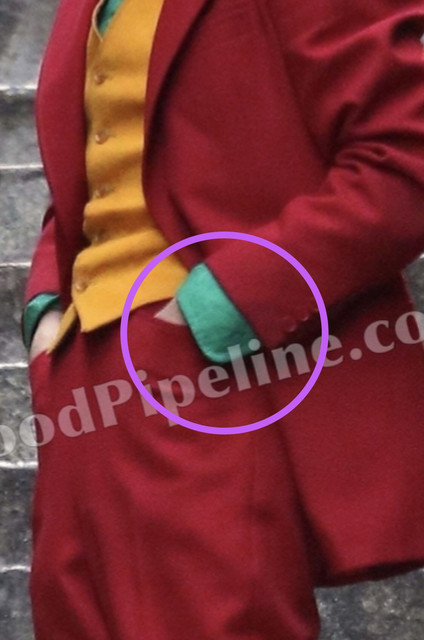
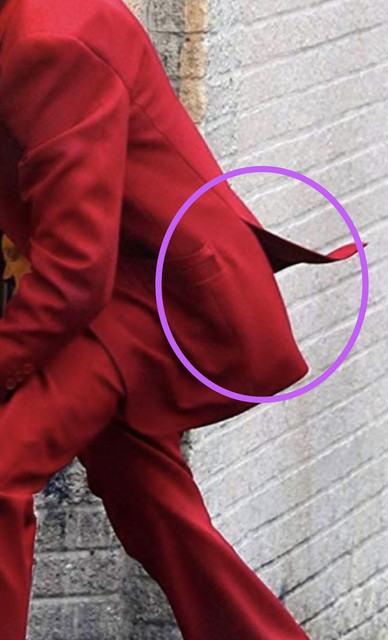
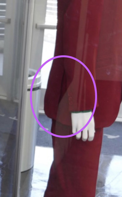
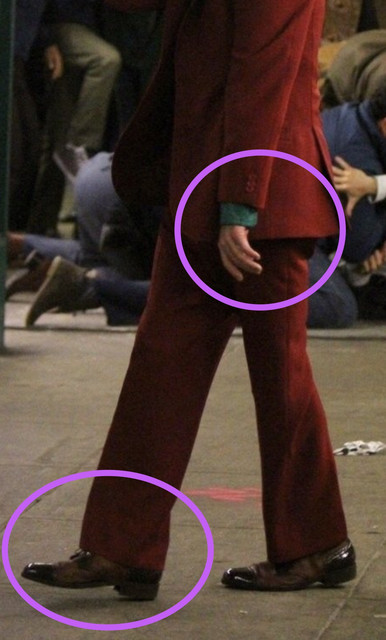
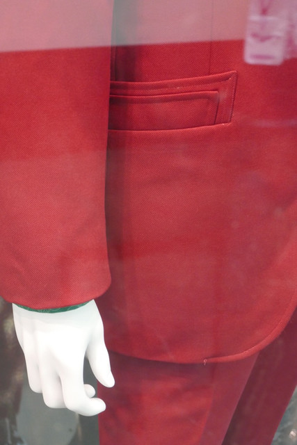
This is to show unique suit pockets. They are front slit pockets, not side. Also shows length of crotch/waist area. Again, this is usual for old 1970s suit fit:


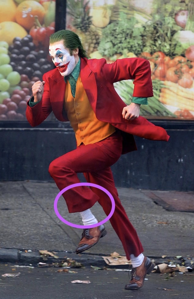
To show cut of trousers and flare out fashion:


Curved shirt cuffs:


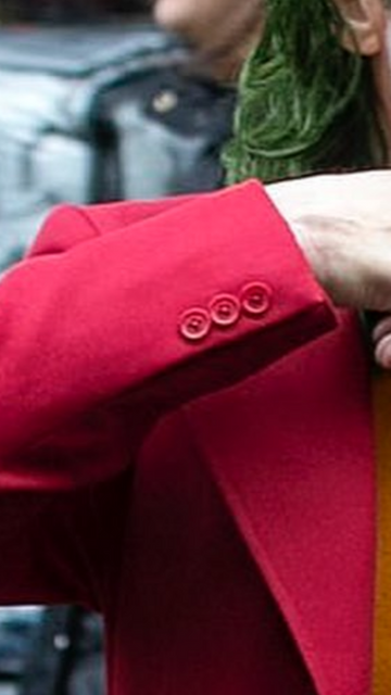
Three button cuffs on suit:


Back of suit is double vented (2 slits):


Again to show curved shirt cuff, length of shirt cuff outside of suit arm, slight narrow of suit arm from top to cuff, length of arms to suit length, and trouser shape at shoe:


Unique pocket detailing on suit and how seam from lapel finishes and bottom of suit:

 
@hyperaccuracydrive

I’d include that the shirt buttons need to be a milky glossy green as opposed to the completely transparent, wrong colored green they currently are.

IMG_9051.jpeg
 
This is where it gets really granular, as I’ve only been focusing on the larger/obvious items that should be addressed. But I will try to relay to them on the finer details.

I think publicly posting has always been the most beneficial thing opposed to lots of people individually messaging them. Makes total sense as to why I don’t see the suggestions people make here on their pages and it’s due to wanting to remain anonymous, which is entirely respectable and reasonable.

Seeing as I’ve blown my cover and don’t care to remain anonymous on this site, to that I say: “I will be your champion” on Facebook, the toxic cesspit.

I can’t insert photos on here anymore!
 

Attachments

  • 28C8E0BB-05D4-4909-A393-1594A3BBE375.gif
    28C8E0BB-05D4-4909-A393-1594A3BBE375.gif
    932.6 KB
This is where it gets really granular, as I’ve only been focusing on the larger/obvious items that should be addressed. But I will try to relay to them on the finer details.

I think publicly posting has always been the most beneficial thing opposed to lots of people individually messaging them. Makes total sense as to why I don’t see the suggestions people make here on their pages and it’s due to wanting to remain anonymous, which is entirely respectable and reasonable.

Seen as I’ve blown my cover and don’t care to remain anonymous on this site, to that I say: “I will be your champion” on Facebook, the toxic cesspit.

I can’t insert photos on here anymore!
Yea I don’t care about being anonymous here. Might be five people in total who have their name and face on their accounts here, which is a shame because it’s better to see who’s saying what.
 
Yea I don’t care about being anonymous here. Might be five people in total who have their name and face on their accounts here, which is a shame because it’s better to see who’s saying what.

I think it’s fine! But it does make sense that I never see the most invaluable suggestions and criticisms that are shared by fellow Freaks. I’ve always enjoyed reading on here to see what others are saying when it comes to the details and whatnot, and have always felt alone (if you will) on that front on FB/YouTube space.
 
I think it’s fine! But it does make sense that I never see the most invaluable suggestions and criticisms that are shared by fellow Freaks. I’ve always enjoyed reading on here to see what others are saying when it comes to the details and whatnot, and have always felt alone (if you will) on that front on FB/YouTube space.
It’s just a far better layout for posts than FB, Reddit, etc. having specific threads for each release, the use of pics and gifs, much more organized.
 
If it helps:

I provided these refs to InArt previously as stated, as thought they may assist:

Shirt pattern:


Thickness of suit and collar stitching:


Full suit refs:


This is to show unique suit pockets. They are front slit pockets, not side. Also shows length of crotch/waist area. Again, this is usual for old 1970s suit fit:


To show cut of trousers and flare out fashion:


Curved shirt cuffs:


Three button cuffs on suit:


Back of suit is double vented (2 slits):


Again to show curved shirt cuff, length of shirt cuff outside of suit arm, slight narrow of suit arm from top to cuff, length of arms to suit length, and trouser shape at shoe:


Unique pocket detailing on suit and how seam from lapel finishes and bottom of suit:


@Cap’n Cook

I can relay these to them on public posts, asking to get laughed to oblivion, but are all of these really wrong on the figure? I hadn’t even realized all this lmao
 
The three red buttons on the blazer sleeves are correct how they have them.

Stitching detailing isn’t accurate on the red blazer but they probably can’t get that correct for mass production.

The curved green shirt cuffs aren’t present on the InArt suit. Should be.

Green shirt buttons shouldn’t be transparent but a glossy milky effect.

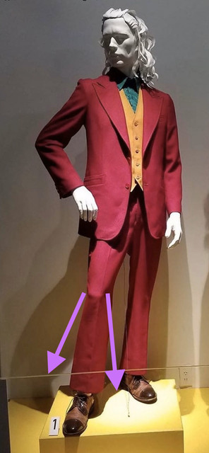
I’d use references of the pant flare how it appears on Phoenix standing straight up as opposed to the mannequin for accuracy.

They’ve already tackled the pants pockets to be sewn above like a pair of jeans as opposed to traditional slacks.

Not sure if belt loops should be present or not because I can’t find photos of the pants separate from the rest of the suit.

Shirt should be sewn shut at the collar to help tighten it up and not letting it pull away from the neck. This was a big problem on their Ledger Joker shirt, at least on the purple coat figure, making the collar a bit unruly, thankfully that suit wears a tie, this one however doesn’t have that support.
 
Well, with the help of @Cap'n Cook and @Nick D and others, I’ve made these mark ups to make it easier for them and have posted these on their recent post. I can’t find a good picture of the figure showing the double vents, did they not get that on the figure?
 

Attachments

  • AC863E72-15BE-4EDF-A0C9-8F5F3399FE2F.jpeg
    AC863E72-15BE-4EDF-A0C9-8F5F3399FE2F.jpeg
    365.5 KB
  • 5034DD11-85FA-432C-866A-E2D68A4871B0.jpeg
    5034DD11-85FA-432C-866A-E2D68A4871B0.jpeg
    380.1 KB
  • 21BF435C-DDCE-48AA-B91F-B9DC40757AA2.jpeg
    21BF435C-DDCE-48AA-B91F-B9DC40757AA2.jpeg
    379.7 KB
  • ABA9349D-D3AB-441C-A37B-3D93F96F82E4.jpeg
    ABA9349D-D3AB-441C-A37B-3D93F96F82E4.jpeg
    546.2 KB
Last edited:
Back
Top