Masters of the Universe Classics

Collector Freaks Forum

Help Support Collector Freaks Forum:

This site may earn a commission from merchant affiliate links, including eBay, Amazon, and others.
Yeah MOTU has had a legacy when it comes to art. Bill George this is not. Not a deal breaker by any means but it is noticeable.
 
That two pack art sucks. Plain and simple. The classic art, where someone had to actually sit down and paint it, was amazing! He-Man and Joes always had the best boxart.

That new weapons pak is pretty mediocre. Maybe cause all the colors just seem to blend. The black Roboto attachments might be cool for Trap Jaw but I'm pretty happy with what he's got already. Though iif anyone wants to ditch that silver She-Ra sword hit me up.
 
Has Teemu always been like this?


Yes it matters! As Kuzeh said, MOTU always had great art.
That was one of the things the made it so great to begin with.

Cheap looking packaging does not help with sales. And again, this is retail.

Sort of, he's not being very Minnesota Nice™. :wink1:
 
In "German Town" as he called it. I call it Canadia. But for reals Ski its beautiful country. I am even throwing around moving up there. Not sure, I need to go there when it's like "The Thing" in the middle of teh suck aka winter.
 
the Art isn't that bad Eamon....besides,who is buying these pieces for the Artwork anyway?

I agree. It's a very clean, 80's old school comic book style art. I don't see anything bad technically about it, like it was drawn by Liefeld or something.

Whether it's suitable or not for MOTU is a different story. Then again, it is also a DC Comics set, so maybe they wanted that comic book look more.
 
Has Teemu always been like this?


Yes it matters! As Kuzeh said, MOTU always had great art.
That was one of the things the made it so great to begin with.

Cheap looking packaging does not help with sales. And again, this is retail.

LOL so I cant have an opinion? the Artwork is no big deal to me..I am not buying figures for Ink and Paper
 
I agree. It's a very clean, 80's old school comic book style art. I don't see anything bad technically about it, like it was drawn by Liefeld or something.

Then again, it is also a DC Comics set, so maybe they wanted that comic book look more.

And you think Rob Leifeld is a good artist? Oh dear! :monkey1

Technically bad would mean having characters that look nothing like the product and have incorrect anatomy.
Which these illustrations have.


LOL so I cant have an opinion? the Artwork is no big deal to me..I am not buying figures for Ink and Paper

You can but you tend do it in a way that's dismissive of other opinions. Who cares about that art says you??
A lot of people that are not you care about the art.
As I said, MOTU's origins are art based. I would've though a fan would be more appreciative of this.
You are not and that's... weird but cool i guess.:)

Tomorrow I am gonna show you guys what this box art should've have looked like. ;)
 
Opinions are like Star Wars figures. Everybody's got too many.

Anyhoo, I'm glad Merman is blue in the 2 pack, great option to show both headsculpts on your shelf.
 
Rob Leifeld IS........ DA MAN!!!!!!!!!!!!! :rock

Is he ***k!!!
Don't make come over there and slap you!! :wink1:


Opinions are like Star Wars figures. Everybody's got too many.

Anyhoo, I'm glad Merman is blue in the 2 pack, great option to show both headsculpts on your shelf.

Bad anatomy and off model characters is not opinion dude! :)

If you draw a foot, then it should look like a foot. If you are drawing MOTUC's Merman then it should look like a MOTUC's Merman.

BTW. Leifeld cannot draw feet or mouths or correct anatomy. That's not a style issue. That's a lack of awareness issue.
 
Is he ***k!!!
Don't make come over there and slap you!! :wink1:


Bad anatomy and off model characters is not opinion dude! :)

You're preaching to the choir, I once shot Rob Liefield in my dream.

I love classic MOTU box art in a huge way. It's the most beautiful toy art EVER, IMO. But I do think the 2 pack card art reflects the crap comic art of the era. It could be worlds better but it will sell to the TRU crowd nonetheless.
 
Who is this Rob guy, is he Toy Guru's or Pixel Matt's brother or cousin?
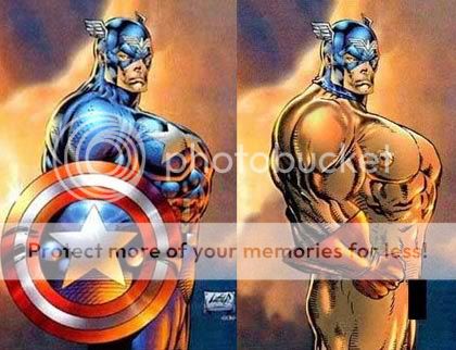
https://www.sideshowcollectors.com/forums/showthread.php?t=81860

Click at your own risk.


From that thread:

liefeldanatomy.jpg


:lol
 
Pffft...nice.

Pabst...

Rob Leifeld IS........ DA MAN!!!!!!!!!!!!! :rock

GTFO here sir!

Is he ***k!!!
Don't make come over there and slap you!! :wink1:


Bad anatomy and off model characters is not opinion dude! :)

If you draw a foot, then it should look like a foot. If you are drawing MOTUC's Merman then it should look like a MOTUC's Merman.

BTW. Leifeld cannot draw feet or mouths or correct anatomy. That's not a style issue. That's a lack of awareness issue.

I wonder what you said there eAmon. :lol
 
Back
Top