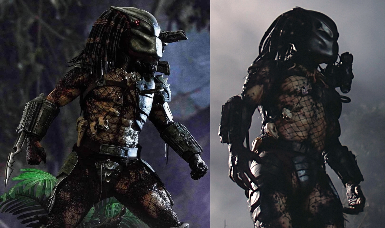
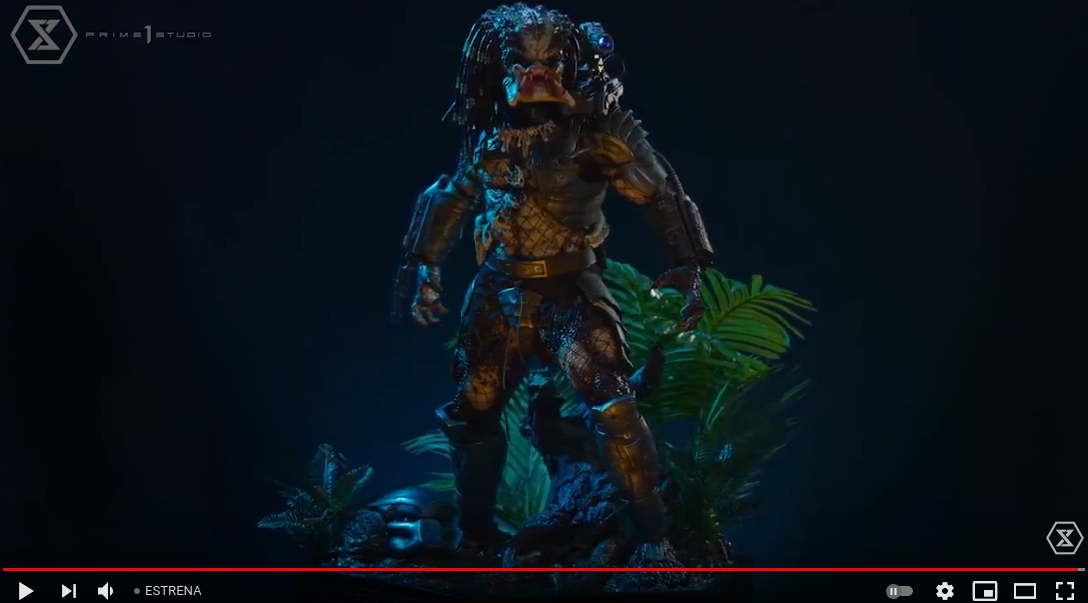
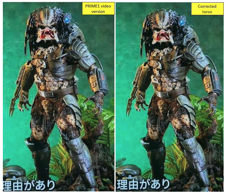
The more I look at it, the more it does look too thick, or too short between his belt and the lowest point of his chest armour, I can't really figure out which. However from other angles it looks okay, it's a weird one.
I'll say this, I think this is awesome over all and I'm hoping to get this and the 1/3 City hunter as my collection showstoppers. However, they have put so much effort into this, that a few minor tweaks could improve it immensely and might be worth considering simply to place the cherry on top of this potential masterpiece. With that in mind, what I'd love to see happen to really make this the ultimate, probably never to be bettered JH statue is the following.
Sort out the torso proportions if they are indeed an issue in person.
relax the arms slightly inwards to give it the more natural look and distinguish it further from the CM's pose.
Remove the sculpted damage from the bio mask
Offer a holstered cannon position option.
Swap that semi roar head for a fully closed mandible head. They're both too similar currently and fully closed offers a different look that many prefer.
remove the groove in the lower chin.
Do I expect any of this, no, but some of it would be nice. And pointless requests are what we like doing, so there's mine. It's exciting either way.
Side comparison is better than front for sure!


