RobertoBagg10
Super Freak
Hey buddy, i did this with mine also as i wasn't overly happy with the original stance...looks a much better pose now


nice, I do see yours a bit different, the stance tilt to left. You adjusted pelvis area? Can you share what you did?Hey buddy, i did this with mine also as i wasn't overly happy with the original stance...looks a much better pose now

nice, I do see yours a bit different, the stance tilt to left. You adjusted pelvis area? Can you share what you did?
 all i did was fiddle with the right leg and pelvis area to allow for a much more museum pose. Infact, i think i placed a small piece of putty inside the hole fitting of the right leg to allow a little more height to achieve the right balance for when you connect with the hip joint. Takes a little fiddling but looks so much better
 Thanks broyea, no drilling for me as i'm too scared to even touch this piece (seeing as its my most expensive collectible in my collection)
all i did was fiddle with the right leg and pelvis area to allow for a much more museum pose. Infact, i think i placed a small piece of putty inside the hole fitting of the right leg to allow a little more height to achieve the right balance for when you connect with the hip joint. Takes a little fiddling but looks so much better
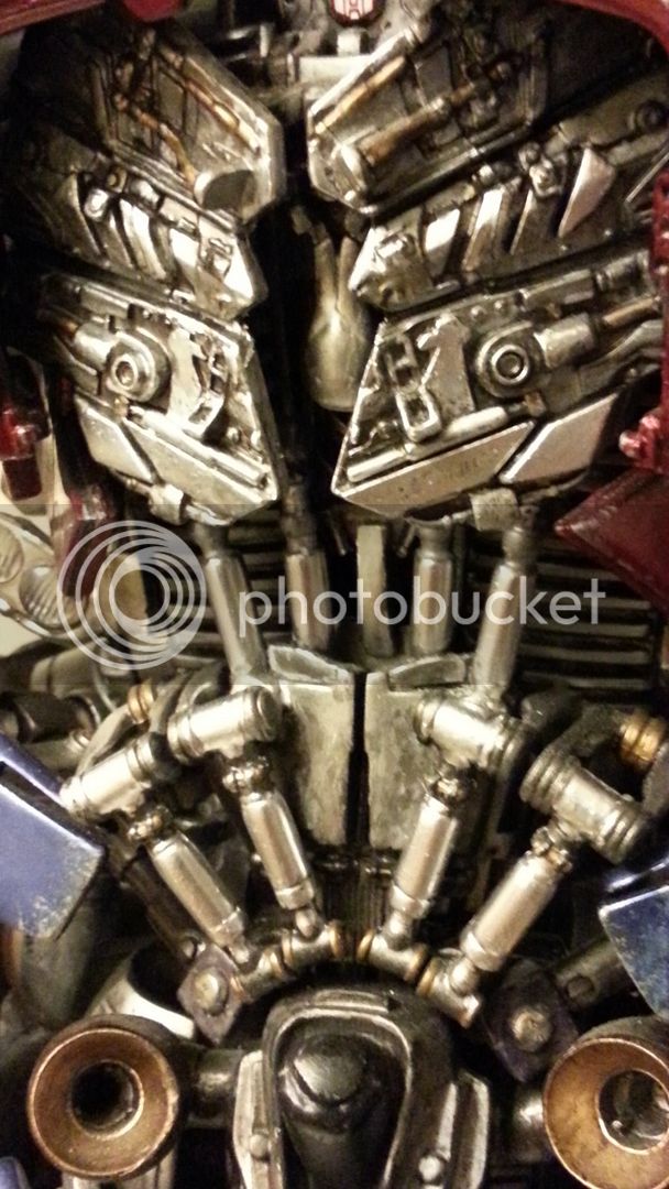
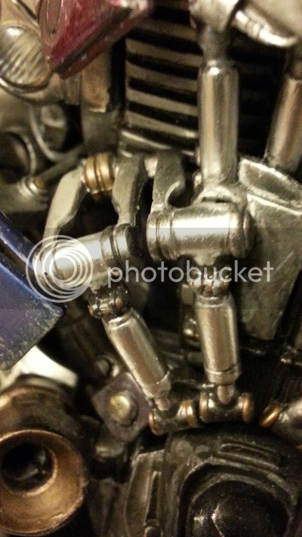
One thing i would like to do is to chrome out those pistons and cams in his chest area...the grey metallic look is nice but to get various parts chromed around the centre console would look awesome!
Good job to the hip touch bro. Yeah I also added some chrome paint on the mid section pistons. Not too much as too shinny is just not realistic nor natural.
Andy I don't think this is your most expensive piece lol.

 for the moment it is the most expensive piece in my collection buddy

Bravo work guys.
 Thanks Pau
I just saw this at my LCS today and its legit. I didn't think it was worth the price but after seeing him in person I think the price is appropriate. Its just a matter of how big an Optimus fan you are.
Thanks broappreciate that! Yea, i was gonna ask if you'd touched up the mid section cos yours looks brighter
Much better improvement...will maybe do this too


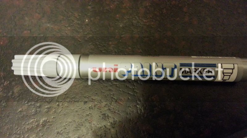
I have simple touch on those piston with silver marker only. It is not exactly like chrome, still pretty enough in the shinny effect I want


Maybe take a foto a the statue a the shield Andy.
 then i'd have to take the statue out the box
  Yea, might take it out around Christmas time once Bumblebee arrives
I think it's missing something. I get what you were going for, but it's too clean.
For example, originally the two "vents" at the top were shaded and now they're not. Being that clean makes it look fake/toy-ish.
Might be the picture, but it looks very washed out.
I think it's missing something. I get what you were going for, but it's too clean.
For example, originally the two "vents" at the top were shaded and now they're not. Being that clean makes it look fake/toy-ish.
Might be the picture, but it looks very washed out.
Got Optimus a few days ago ... Still in the box(es) Looking forward to bust him out ( after 8 months of flex pay !)
Sent from my iPhone using Tapatalk
