Sabertooth Classic Premium Format Figure

Collector Freaks Forum

Help Support Collector Freaks Forum:

This site may earn a commission from merchant affiliate links, including eBay, Amazon, and others.
I'm paying for it, why wouldn't I take it into account? Especially if it's an eyesore? Granted, in this case I don't think it looks too bad I agree with you but others obv dont. On others pieces like the IM Maquettes and the Br Wolvie the bowls look outright hideous.
I don't think the brown Wolvie looks bad either. Theres so much on that statue leading your eyes up that honestly its barely even noticable. The Iron man things I cant speak to. They havent made an Iron man I want in the last 5 years so I dont pay attention.
 
You guys really take the Bottom of the base that seriously? I mean I could maybe understand if all he was standing on was some disc, thats kind of lazy but this is just a base bottom. It just raises the rest of the statue up. I mean if the color is bothering you could always paint it black I guess but to me its just a danger room homage. One more element of the X-men added in to kinda finish off the statue. I just don't see the big deal

It's not a big deal to me either but it seems a little strange how it's such a trend with SSC these days...add the meaningless round metal base to EVERYTHING. Almost like they add it JUST to make the statue taller. A lot of these just look fine without it no? doesn't bother me much but it's a tad baffling why they add it so often for no reason.
 
I don't think the brown Wolvie looks bad either. Theres so much on that statue leading your eyes up that honestly its barely even noticable. The Iron man things I cant speak to. They havent made an Iron man I want in the last 5 years so I dont pay attention.

I think on this piece and the TDK's they added a little design which helps. Still, like sara said to chuck these bowls on the bottom of almost everything now just to prop the piece up is new and an odd choice as a base that ties into the character would be optimal imo. Were collectors complaining about their 1:4 statues being too short? :dunno

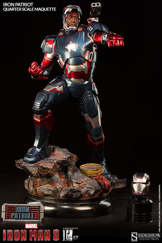
The IM bowls are horrible btw:

300370_press16.jpg
 
It's not a deal breaker for me but I don't like it, either. It's just weird, you have an environment that can completely stand on its own, yet for some reason feel the need to slide an extra base under there that has nothing to do with the scene and in some cases disrupts the scene. These aren't wet drinks, they don't need coasters.
 
I had to look up pictures to know what the hell you were all talking about. Neither in photos nor in person did I even notice this "doggie bowl". It's entirely meaningless to me.
 
The bowl won't stop me from ordering either piece but it certainly clashes with the environment of each base. With Wolvie you have an old school Japanese setting. Wooden bridge, Ninja arrows, and snow. Then SSC decides to put a high tech looking metal disc under it. This clashes with the statue. Same with Sabes and his rock/snow base. On Wolvie, I'd rather they take the high tech lines out of the disc and paint it black or the same color as the wooden bridge. On Sabes, the disc is useless. Just remove it and have him standing on some rocks. I know some peeps here are saying the bases are a tip of the hat to the danger room. However, that implies that the settings are holograms or fake. That just takes away from the pieces for me personally.

If I like a statue enough, the disc/bowl base bottoms won't stop me from picking them up. However, there's no doubt in my mind that the bases would look better without them or having them altered so they don't clash with the environmental bases both of these figures are on.
 
I absolutely hate them. They are doing it on some of the star wars statues as well. I wish someone from SS could chime in to explain why they are going this direction. It really makes no sense.
 
I think on this piece and the TDK's they added a little design which helps. Still, like sara said to chuck these bowls on the bottom of almost everything now just to prop the piece up is new and an odd choice as a base that ties into the character would be optimal imo. Were collectors complaining about their 1:4 statues being too short? :dunno

The IM bowls are horrible btw:

300370_press16.jpg

Okay see now that is a bit distracting. The Bottom of the Base is more shiney than Iron Patriot. See with the circular Base Bottoms that are Matte, they don't stand out and aren't really noticeable unless you really look at the bottom of the statue, but the color of the Statue Draws the eye up away from it. So it doesn't bother me, but that thing on the bottom of IP, you might as well paint it neon orange.
 
It's not a big deal to me either but it seems a little strange how it's such a trend with SSC these days...add the meaningless round metal base to EVERYTHING. Almost like they add it JUST to make the statue taller. A lot of these just look fine without it no? doesn't bother me much but it's a tad baffling why they add it so often for no reason.

It's not a deal breaker for me but I don't like it, either. It's just weird, you have an environment that can completely stand on its own, yet for some reason feel the need to slide an extra base under there that has nothing to do with the scene and in some cases disrupts the scene. These aren't wet drinks, they don't need coasters.

The bowl won't stop me from ordering either piece but it certainly clashes with the environment of each base. With Wolvie you have an old school Japanese setting. Wooden bridge, Ninja arrows, and snow. Then SSC decides to put a high tech looking metal disc under it. This clashes with the statue. Same with Sabes and his rock/snow base. On Wolvie, I'd rather they take the high tech lines out of the disc and paint it black or the same color as the wooden bridge. On Sabes, the disc is useless. Just remove it and have him standing on some rocks. I know some peeps here are saying the bases are a tip of the hat to the danger room. However, that implies that the settings are holograms or fake. That just takes away from the pieces for me personally.

If I like a statue enough, the disc/bowl base bottoms won't stop me from picking them up. However, there's no doubt in my mind that the bases would look better without them or having them altered so they don't clash with the environmental bases both of these figures are on.

I absolutely hate them. They are doing it on some of the star wars statues as well. I wish someone from SS could chime in to explain why they are going this direction. It really makes no sense.

Okay see now that is a bit distracting. The Bottom of the Base is more shiney than Iron Patriot. See with the circular Base Bottoms that are Matte, they don't stand out and aren't really noticeable unless you really look at the bottom of the statue, but the color of the Statue Draws the eye up away from it. So it doesn't bother me, but that thing on the bottom of IP, you might as well paint it neon orange.

Useless bottom doggy bowl base.

:exactly:

Useless, often fugly and doesn't tie into the characters at all.
 
It's just the latest catchphrase fad.. :rolleyes2

:lol I see it this way too.

I honestly do not even notice those parts of the statue that much anyway. I mean, if you guys were displaying your Sabretooth on some type of giant rock environment in your house to make it into a larger diorama or if Wolverine was going to be put in a Japanese garden in winter time, then yea I could see why you'd have an issue with it. But if it's just sitting on a shelf what's the difference? The continuity is breaking in some place anyway either part of the base or the shelf.

It's not like Sabretooth looks more realistic sitting on a besta shelf without the silver base as opposed to with it.
 
[emoji38] I see it this way too.

I honestly do not even notice those parts of the statue that much anyway. I mean, if you guys were displaying your Sabretooth on some type of giant rock environment in your house to make it into a larger diorama or if Wolverine was going to be put in a Japanese garden in winter time, then yea I could see why you'd have an issue with it. But if it's just sitting on a shelf what's the difference? The continuity is breaking in some place anyway either part of the base or the shelf.

It's not like Sabretooth looks more realistic sitting on a besta shelf without the silver base as opposed to with it.
True but now you have the continuity breaking twice and giving you three plains. The shelf, the disc, the environment and then half a foot later the actual statue.
 
I think someone understand something wrong. :wink1:

At lunch they talk about based comic silver area and the guy understand silver base. :rotfl

Yea I think so. I think no one understands you with this sentence.

True but now you have the continuity breaking twice and giving you three plains. The shelf, the disc, the environment and then half a foot later the actual statue.

The half a foot is quite exaggerated here. It's 2-3 inches max.

But hey, we all look at things differently. I was just pointing out my perspective.
 
Yea I think so. I think no one understands you with this sentence.

"A statue based on the Silver Age comics, but instead got a silver base." It was pretty clear what was being said, and that it was from someone not a native English speaker.
 
Case and point is the superman reeves statue, it is something added to the bottom that could easily be alleviated and instead had some weird bowl thing. Just design the base better. If something is on my shelf and I look at it on a daily basis something small turns into something bigger over time.
 
True but now you have the continuity breaking twice and giving you three plains. The shelf, the disc, the environment and then half a foot later the actual statue.
Yep.

Also, it isn't "2- 3 inches". The stupid bowls extend both in height and and width and that crap wraps around the entire statue and shines in your face at any angle viewed. Pretty funny the same people who can freely rip a 2 millimeter monotooth claim a huge doggie bowl this size can be easily overlooked. :rotfl

"A statue based on the Silver Age comics, but instead got a silver base." It was pretty clear what was being said, and that it was from someone not a native English speaker.
:lecture

Case and point is the superman reeves statue, it is something added to the bottom that could easily be alleviated and instead had some weird bowl thing. Just design the base better. If something is on my shelf and I look at it on a daily basis something small turns into something bigger over time.

This.
 
Last edited:
Back
Top