"The Predator" by Shane Black (2018)

Collector Freaks Forum

Help Support Collector Freaks Forum:

This site may earn a commission from merchant affiliate links, including eBay, Amazon, and others.
Was responding to Gaspar and his BVS nonsense, dood.
Boy you still wrong tho.

I think Alec Gillis agrees with you - he was FAST to get his name off the suit design :lol
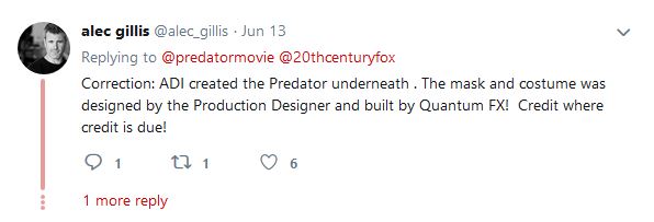

Alec_Gillis_getting_FAR_away_from_the_Pred_design.jpg


.

We got the culprits people, now on to place the guilt for the direction of the franchise on the right people, the yautja fans.
 
Last edited:
She ruined her face. :(
They all do eventually. She went full on Megan Fox.


Was responding to Gaspar and his BVS nonsense, dood.
Then why did you quoted me? :lol

Proportions look the way they do because its the Super Predator holding the smaller one's head, hence the red stripes and spikes on the hands.
Ok, now you're talkin' to me as if I'm a clueless casual fan. I'm def takin' that as an insult! :lol

Orange because, like green of the blood, it's a secondary color and the two look good together. You seem to know this, judging by your edit. Rather than yellow and teal, we're getting orange and green like we did with the Kong: Skull Island. The colors work, it's just a different scheme from the primary colors for which Hollywood marketers have had a hardon for the last 20 years.
The oposite of green is red. Orange is the oposite to blue. There's pretty much no green in the original poster, the blood is barely visible and too dark. The forefront figures are mostly grey and black, with pinkish purple for highlights. Absolutely no reason for orange to be in there in any way. And KSI posters are all teal and orange, with the exception of one that has green smoke and no warm colors at all.
 
Sorry I drag this further, just wanna be sure I'm not crazy. :)
Here's full quote history, you can click on small blue arrows to go to original posts:


Official poster looks like a comic book cover!
Indeed it does. Yet another thing that is wrong with this franchise. :monkey4
Would you prefer a traditional edgy poster and a movie about muscle-bound dudes being hunted in a jungle? The franchise has been around for 30 years, I'm personally sick of remakes and "homages." Nothing will ever be as good as the first one, especially not if it's an imitation.
I would prefer movies that doesn't feel like stupid comic books written by a childish mind to suit the need of clueless producers and dumb fanbase. Nowhere I said that I want more of the same. I am the one who likes P2 more than the original because it wasn't typical sequel, remember? :wink1:
Was responding to Gaspar and his BVS nonsense, dood.

You probably mixed up things you've read, it's ok. :duff
 
Sorry I drag this further, just wanna be sure I'm not crazy. :)
Here's full quote history, you can click on small blue arrows to go to original posts:


You probably mixed up things you've read, it's ok. :duff

Ah, so I did. My bad. :lol I should work on being less standoffish; hard to keep track of each debate.
 
30062018_03.png


30062018_04.png


New three meters "Ultimate Hunter" in the center of this backstage photo.
Yes, we're finaly there - a fully CG Perdator. So exciting, right? RIGHT???
 
we're finaly there - a fully CG Perdator. So exciting, right? RIGHT???


I actually didn't think this day would come. The one thing the Predator movies have had going for them (even the bad ones) Is good practical suit work. A CGI Predator is just wrong in every way.
 
Like I have trouble calling NECA's Predator figures 1:4 scale. I'm always looking for ways around it because they're more like 1:5. But if I say that people won't know what I'm talking about :lol
 
I just call them 18" figures.
If the scale doesn't matter to the production company why should it matter to me?! :)
 
Back
Top